• Skip to primary navigation
  • Skip to main content
  • Skip to primary sidebar
  • Skip to footer
Jennifer Marohasy

Jennifer Marohasy

a forum for the discussion of issues concerning the natural environment

  • Home
  • About
  • Publications
  • Speaker
  • Blog
  • Temperatures
  • Coral Reefs
  • Contact
  • Subscribe

Temperatures

Satellite-based global temperatures, trending up

March 16, 2016 By jennifer

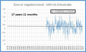
LEADING climate scientists were not acknowledging “the pause” in global warming, even though it was very apparent in the satellite-based temperatures of the lower troposphere. That was until last month.

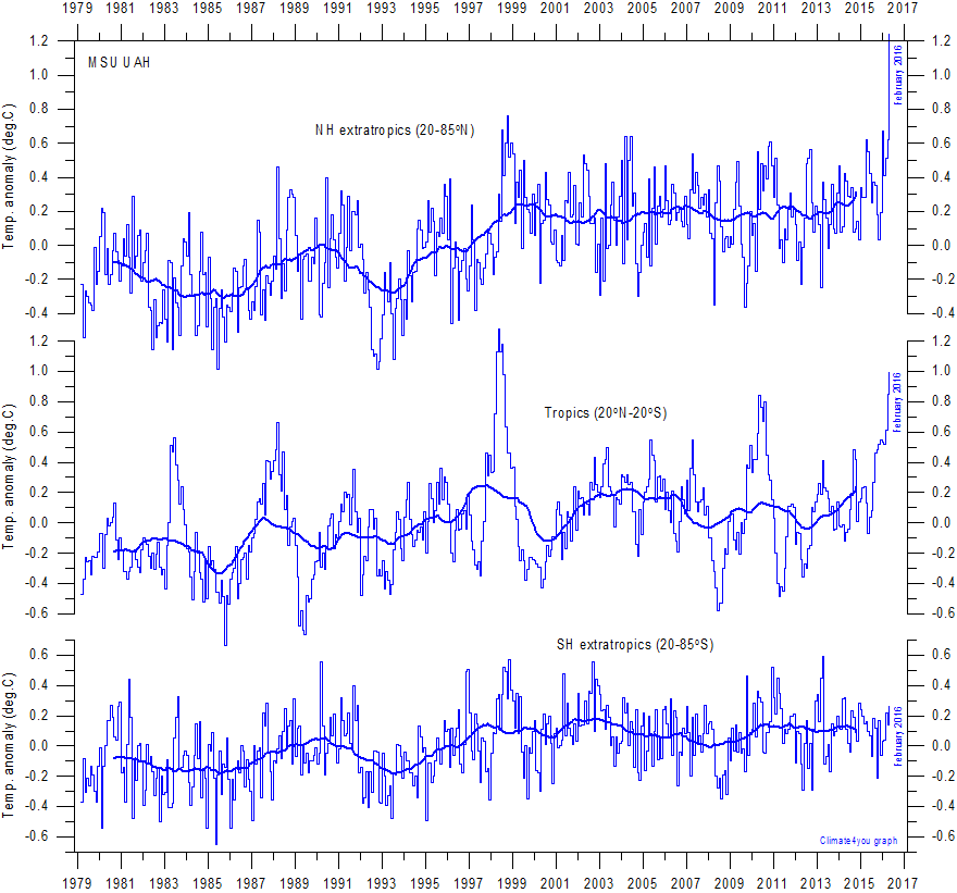
The February update to this satellite record has broken previous records for the northern hemisphere, and indicates that global temperatures are once again on the rise, Chart 1.

chart from http://www.climate4you.com/
Chart 1, from http://www.climate4you.com/

Some have attributed this warmth to an El Nino. Mean sea level pressures, and sea surface temperatures, are consistent with an El Nino, but not a super-El Nino that would result in record high temperatures.

Most of the warmth in the lower troposphere appears to have been recorded in the northern hemisphere, Chart 1 (top).

The super-El Nino in 1997, manifested as a record hot year in the tropics in 1998, Chart 1 (middle). This is what we might expect of an El Nino, which is often defined as extensive warming of the central and eastern tropical Pacific.

The apparent lack of warming in the southern hemisphere in February, could be due to the huge recent melt at the Antarctic. Yes, melt. While the Artic has been melting, there had been growth in the extent of ice at the Antarctic over recent years.  Until February 2016, when it crashed, Chart 2.

chart from https://nsidc.org/data/seaice_index/
Chart 2, from https://nsidc.org/data/seaice_index/

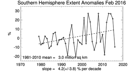
A friend, Lance Pidgeon, emailed me: “The heat sucked into the melting ice would be a very large amount. It looks like the southern hemisphere sea ice anomaly went rapidly from about +1.8 million square kilometers to -0.5. This is 2.3 million of the total southern hemisphere area (255 million). Close enough to 1% of the area suddenly also began to absorb rather than reflect back due to the decrease in albedo.”

I can’t explain the apparent sudden surge in global warmth, and I don’t know anyone who predicted its magnitude.

Long range weather forecaster, Ken Ring, who bases his forecasts on lunar, solar and planetary cycles, correctly forecast the El Nino.

While the Australian Bureau of Meteorology started forecasting an El Nino from 2013, back in March 2014, Ken Ring is on record specifying that the next El Nino wouldn’t manifest until late 2015 to correspond with the minimum declination of the moon, and following what he predicted would be the year of Solar Minimum.  For those interested in lunar cycles, a minimum declination occurs every 18.6 years, so the last one corresponded with the super El Nino of 1997/1998.

The late Bob Carter would assure us that climate always changes, and that the warming that occurred this February 2016 is still very much within the range of natural variability.

I’m not going to quibble with this, and global temperatures may be dropping again by April, once the El Nino has decayed. Nevertheless, the capacity of sceptics to thumb their nose at the scientific consensus by drawing attention to “the pause” has been dealt a blow by the recent melt at the Antarctic, and the February update to the Satellite record.

Filed Under: Information Tagged With: El Nino, Temperatures

Rainfall Forecasts Should be Benchmarked

February 23, 2016 By jennifer

ACCORDING to Bill Gates, “You can achieve incredible progress if you set a clear goal and find a measure that will drive progress towards that goal.” This may seem basic, but it’s not practiced enough, and certainly not when it comes to rainfall forecasting.

John Abbot's corvette which was submerged in the Brisbane flooding of January 2011.
John Abbot’s corvette which was submerged in the Brisbane flooding of January 2011.

The Bureau of Meteorology increasingly use their weather and climate forecasts to warn of looming catastrophe. This use of ‘forecasts’ to advance an agenda is common in politics, but it’s not something the Bureau should be engaged in.

A key Bureau goal should be the best possible rainfall forecast for the public. Their rainfall forecast should be presented and reported in a measurable and understandable way. Instead we are given vague probabilities, which research has shown are often misinterpreted by farmers.

Furthermore, there should be some follow-up. For example, at the end of a week, a month, or a season we should be told how reliable their daily, monthly and seasonal forecasts have actually been.

Its five years now since Brisbane flooded, so about five years since I started working with John Abbot and artificial neural networks to see if was possible to actually forecast the extraordinary wet season of summer 2010/2011 in south eastern Queensland.

Back in 2010, sea surface temperature and sea surface pressures profiles across the Pacific suggested we were in for a big wet. Yet the Wivenhoe reservoir upstream of Brisbane, a dam actually built for flood mitigation, was kept full of water.

John Abbot’s little red corvette sports car was drown in the Brisbane flood. It was in a river-side garage in St Lucia, Brisbane, and totally submerged for 36 hours. He was heartbroken. The loss spurred us to see if we couldn’t apply the technique he had used to make the money to buy that car, to rainfall forecasting. In particular, we were keen to see if artificial neural networks with the right algorithms, and high quality historical temperature and rainfall data, could have forecast the flooding. John Abbot regularly used artificial neural networks and historical trading data to successful forecast directional trends in the share market.

By August 2011 we had monthly rainfall forecasts for 20 sites across Queensland, and we wanted for compare our output from the best general circulation model (POAMA) used by the Bureau of Meteorology. But try as we might we couldn’t actually get the taxpayer-funded Bureau to give us the data we needed to make proper comparisons.

The Bureau were not doing the one thing that Bill Gates says is critical to improvement: benchmarking.

After flying to Melbourne, and threatening to jump out a sixth floor window if the data wasn’t handed over (well I exaggerate somewhat), we got access to only enough data to enable us to publish a series of papers. Indeed, the Bureau still refuses to make available the most basic of data which would allow their rainfall forecasts to be objectively scored.

Back in 2011 it was evident that John Abbot and I could do a better monthly rainfall forecast than the Bureau. To our surprise key science managers at the Bureau agreed: conceding that our forecasts were more skillful. But, they argued, climate was on a new trajectory so our method would not work into the future!

This claim is, of course, based on the theory of anthropogenic global warming. This is the same theory that continues to underpin all the forecasts provided by the Bureau through the use of general circulation models.

An alternative approach using artificial neural networks, fits under the umbrella of ‘Big Data’ and ‘machine learning,’ that relies on pattern analysis, and is proving successful at forecasting, where results are properly benchmarked, in fields as diverse as medical diagnostics, financial forecasting and marketing analysis.

I will be in Deniliquin, NSW, on Friday 26th February, showing both temperature and rainfall data for the Murray Darling region that indicate our climate is not on a new trajectory. I will also be explaining the principles of rainfall forecasts using artificial neural networks, and making some forecasts.

I will also show how proxy data giving an indication of climate change over the last 2,000 years can be deconstructed into sine curves. Seven sine curves of different frequency and amplitude potentially corresponding to natural climate cycles driven by variations in the Earth’s orbit and solar activity (e.g. magnetic field) can be used to generate a sinusoidal projection, suggesting future global cooling. Cooling in the Murray Darling Basin is typically associated with period of below average rainfall.

Five sine curves which can be fitted to proxy data corresponding to a temperature reconstruction from a South African stalagmite.

The information session is being held by West Berriquin Irrigators at the local Deniliquin RSL from 6pm. RSVP to Linda Fawns on 0409 044 754 or westberriquinirrigators@gmail.com.

Filed Under: Information Tagged With: Floods, Temperatures

Why we should rally against homogenization, and I don’t mean of milk

February 9, 2016 By jennifer

I was invited to speak at the Liberal Democrats Conference in Sydney last Sunday.   I began by explaining that while the delegates may have though homogenization was a term used exclusively for milk, that homogenization is also a technical term used in climate science, but with an altogether different meaning. It allows scientists to remodel historical temperature data so it’s closer to the heart’s desire.

These few words – closer to the heart’s desire – have been borrowed from that famous poem the Rubaiyat of Omar Khayyam. The stanza reads:

Ah, Love! could thou and I with Fate conspire
To grasp this sorry Scheme of Things entire!
Would not we shatter it to bits-and then
Re-mould it nearer to the Heart’s Desire!

Omar used the word “remould”, climate scientists say they are improving the data.

The end result is the same: something has been changed.

The scientific revolution rejected unnatural causes to explain natural phenomena, rejected appeals to authority, and rejected revelation, in favor of empirical evidence. Today, the biggest threat to science is from the sophisticated remodeling of data, known in climate science as homogenization.

An analogy can be made between the remodeling of scientific data, which is now common in a variety of disciplines from conservation biology to climate science, and “fitting up” people the police know to be guilty, but for whom they can’t muster enough forensic evidence for a conviction. This is also a form of “noble cause corruption”.

Why is it a form of corruption? Because we expect the criminal justice system to be fair, to be based on legitimate evidence. Science should also be about facts, and evidence.

Let’s consider a real world example of homogenization, specifically the maximum temperature record for Darwin.

There are very few continuous, surface temperature recording from northern Australia that extend beyond 60 years. The Australian Bureau of Meteorology, Hadley Centre (UK Met Office), Goddard Institute for Space Studies (NASA GISS), and other institutions concerned with the calculation of global temperature trends, join temperatures recorded at the Darwin post office from 1882 until January 1942 with temperatures from the Darwin airport recorded from February 1941 to the present, and then make adjustments. There is no temperature record at the post office after 1942 because the Darwin post office was bombed in Japanese air raids.

Temperatures were recorded at the Darwin post office from 1882, but are only shown in Figure 1 from 1895, which is the first full year of recordings in a Stevenson screen.

Fig1

In the above chart I’m only showing the temperatures from 1895, even though they were measured from 1882, because I’ve excluded the early years when measurements were not recorded in a Stevenson screen. So, I’m only showing temperatures recorded from recognized official standard equipment.

The temperatures as recorded from the mercury thermometer in a Stevenson screen at the post office from 1895 to 1942 show statistically significant cooling of almost 2 degrees Celsius per century.

This clearly does not accord with the theory of anthropogenic global warming. And indeed these raw observational values are not incorporated into official temperature time series used to calculate national and global temperature trends. First the data is homogenized.

In particular, the Bureau of Meteorology truncate the record so it starts in 1910, rather than 1895. Then they drop down the temperatures as recorded at the post office by -0.18 degree for all values before February 1941, and by a massive -1.12 for all values before January 1937. This has the effect of creating a warming trend, as shown by the red line in the following chart, Figure 2.

Fig2

The homogenized series for Darwin, which is incorporated into official data sets, shows warming of 1.3 degree Celsius, which accord much better with global warming theory.

Is this drop-down justified? Let’s consider some other series from northern Australia.

There are very few long continuous temperature records for northern Australia. The records for Broome, Derby, Wyndham and Halls Creek in Western Australia, and for Richmond, Burketown and Palmerville in Queensland are the only continuous high quality series that extend from 1898 to at least 1941. This includes the period of the adjustments to the Darwin post office data. These towns are marked in red on the map of northern Australia, Figure 3.

Fig3

To be clear, I have compared Darwin post office against the series for these locations because they were recorded at the same site, in proper equipment (mercury thermometer in a Stevenson screen), and the individual series do not show any discontinuities when appropriate statistical tests are applied.

Considering the series from Western Australia, Figure 4, it is apparent that there is much inter-annual variation. This is typical of observational temperature data from around the world. While annual temperatures fluctuate from year to year, it is apparent that there is considerable synchrony between locations. Indeed, there are synchronous peaks in 1900, 1906, 1915, 1928, 1932 and 1936. Note that temperatures at Wyndham, Derby and Halls Creek all dip together in 1939, while temperature at Darwin decline from 1936, Figure 4.

Fig4

Temperatures at Darwin are less synchronous with temperatures from northern Queensland, Figure 5. In particular the peaks in the Darwin temperature series appear to lag the Queensland series.

Fig5

There is considerably synchrony between the Queensland locations with Burketown, Palmerville and Richmond all showing spikes in 1915. Of course this was an El Nino drought year, and the year that the Murray River ran dry in south eastern Australia. Interestingly the Queensland series all show a significant drop-down from 1939, Figure 5.

None of the temperature series, either from Western Australia or Queensand, show the expected global warming from 1898 to 1941.

Only one of these northern locations has a continuous temperature record from 1898 to the present, that location is Richmond in Queensland. The maximum temperature series for Richmond, which is shown by the green line in Figure 6, doesn’t actually look anything like the homogenized series for Darwin, which is shown by the red line.

Fig6

The series for Richmond, which represents temperatures for the one location recorded by a mercury thermometer in a Stevenson screen, is actually remarkably similar to the un-homogenized series for Darwin, Figure 7.

Fig7-V3

What I’ve discovered, after looking at hundreds of such raw time series from eastern Australia, is that they tend to follow a similar pattern: there is almost always cooling in the first part of the record and then warming at least from 1960. Yet whenever I look at the homogenized official records for these same locations they all show statistically significant warming from the beginning of the record.

Let’s now consider the Bureau’s justifications for the homogenization of Darwin.

The first thing that the Bureau does to the Darwin temperature series is discard all the data recorded before 1st January 1910 on the basis it might not be reliable. Yet we know that a mercury thermometer in a Stevenson screen was the primary instrument used to record temperatures at the Darwin post office from March 1894, and that there was no site move, or equipment change, for the period to 1910. Yet this valuable 15 whole years of data from 1895 to 1910 are just discarded.

Then the Bureau drop the maximum temperature series down by -0.18 degree Celsius for all data/all recorded observations from February 1941 back to January 1910, and then again by -1.12 degree Celsius for all data before January 1937 back to January 1910. So the adjusted/homogenized series has a statistically significant warming trend of 1.3 degree Celsius per century for the period from 1910 to 2014.

This largest drop-down of -1.12 degree Celsius is justified on the basis that the site became “overshadowed by trees, especially after 1937”. This is what is written in the official catalogue. If shading from trees were the cause of the cooling, then it’s curious that the adjustment is made for the period before the site ‘deteriorated’ because of shading. This is not rational. If the problem occurred from 1937, the correction should be for this period.

Furthermore, photographic evidence from the Northern Territory State Library does not support the hypothesis that the site became progressively more shaded, Figure 8.

PicsPO
In particular, the trees behind the Stevenson screen along the front of the post office building are tallest in the first photograph taken in 1890. In the middle 1930 photograph, the trees immediately in front of the post office appear to have been removed. In the 1940 photograph (third), the trees have apparently regrown in front of the post office and there appears to be some shrubbery where the modified Greenwich thermometer stand was positioned in 1890.

What all of this ignores, is the cyclone that hit Darwin on 10th March 1937. According to the Northern Standard newspaper reporting immediately after the cyclone, “it raged and tore to such vicious purpose that hardly a home or business in Darwin did not suffer some damage… Telephone wires and electric mains were torn down by falling trees and flying sheets of iron, windmills were turned inside out, garden plants and trees were ruined, roads and tracks were obstructed by huge trees…”.

Is it possible that rather than the cooling being due to ‘shading’ from 1937, there was actually less vegetation following the cyclone? In fact, the drop in maximum temperatures is likely to have been due to removal of trees and shrubbery by cyclonic winds. It is more likely that vegetation which had previously screened the post office from the prevailing dry-season south easterlies that have a trajectory over Darwin Harbor, was removed by the cyclone.

While shading can create cooling at a site, a similar effect can be achieved through the removal of wind breaks.
In a study of modifications to orchard climates in New Zealand it has been shown that screening could increase the maximum temperature by 1°C for a 10 meter high shelter.

In conclusion, the homogenization of the record at Darwin is by no means unusual. I used the example of Rutherglen, in north eastern Victoria, in my request late last year to the Auditor-General of Australia for a performance audit of the procedures, and validity of the methodology used by the Bureau of Meteorology.

At Rutherglen a cooling trend of 0.35 degree Celsius per century in the minimum temperature series is homogenized into warming of 1.73 degree Celsius.

In support of this request to the Auditor-General a colleague, Tom Quirk, showed how the raw record for Dubbo in NSW is changing from cooling of 0.16 into warming of 2.42 degree Celsius per century through homogenization. Brisbane in Queensland is changed from cooling of 0.68 to warming of 2.25. Warming at Carnarvon in Western Australia is increased from 0.18 degree per century to 2.02, and so the list goes on.

At an online thread at The Australian newspaper’s website last Monday – following a terrific article by Maurice Newman further supporting my call for an audit of the Bureau of Meteorology – I noticed the following comment:

“Don’t you love the word homogenise? When I was working in the dairy industry we used to have a homogeniser. This was a device for forcing the fat back into the milk. What it did was use a very high pressure to compress and punish the fat until it became part of the milk. No fat was allowed to remain on the top of the milk it all had to be to same consistency… Force the data under pressure to conform to what is required. Torture the data if necessary until it complies…”

Clearly the Bureau uses force to remodel historical temperature data so it’s closer to what they desire.

This is not science. But given the Bureau’s monopoly, and the extent of the political support they received from both Labor and the Coalition, they can effectively do whatever they want.

Western elites are beset by the fear of a coming environmental apocalypse, and climate scientists at the Bureau of Meteorology have undertaken industrial scale homogenization of the historical temperature data to support this phobia.

The late Professor Bob Carter wrote in 2003:

“To the extent that it is possible for any human endeavor to be so, science is value-free. Science is a way of attempting to understand the world in which live from a rational point of view, based on observation, experiment and tested theory.”

“The alternative to a scientific approach”, according to Prof Carter, “is one based on superstition, phobia, religion or politics.”

What the Bureau does to the data from Darwin could even be described as a form of art, based on a mix of desire and phobia. It is not science, and we need to rally against it, against this homogenization.

*****

A PDF version of this presentation with charts can be downloaded here:  https://jennifermarohasy.com.dev.internet-thinking.com.au/wp-content/uploads/2014/08/Marohasy-LibDemNationalConvention-Darwin-Feb2016-VERSIONF.pdf

Filed Under: Information Tagged With: Temperatures

Bob Carter Warms with Eiffel Tower Descent

November 29, 2015 By jennifer

THE Eiffel Tower was opened in 1889, and with an observation deck at about 300 m above ground level was then the highest human-construction on planet Earth.

Professor Bob Carter, former Head of the Department of Earth Sciences at James Cook University, now in Paris in advance of the COP-21 global warming talks, recently emailed me after descending the Tower:

“How many of the estimated other 39,999 persons attending the COP-21 talks in Paris will be aware that that when they descend from the Eiffel observation deck to the ground they will experience a warming of about 1.8 degree Celsius?”

“This is about twice the claimed global surface warming since the industrial revolution, based on thermometer measurements, yet very few tourists are observed to be shedding clothing against the increased heat as they dismount the tower at ground level.”

“It is this type of perspective and context that is so missing from the down-the-rabbit-hole nature of the climate political discussions, and related chicanery, that have preceded the COP-21 meeting,” wrote Bob.  EiffelTower2

Bob also sent me the program for the alternative conference in Paris:

The International Climate Science Coalition (ICSC) and its partners in the United Kingdom invite reporters, policy makers, and other interested parties to attend the Paris Climate Challenge (PCC) conference. It will be held at Espace La Rochefoucauld conference centre, 11 Rue La Rocheforcauld, Paris, from December 1 – 3, 2015.

The schedule of events may be seen at: http://pcc15.org/about/.

Tom Harris, ICSC executive director said, “In 2009 we presented the Copenhagen Climate Challenge which asked the United Nations to publicly substantiate each of ten fundamental assertions that underlie current climate concerns.”

“Endorsed by 161 science and technology experts well qualified in climate science, the challenge was presented as an open letter submitted to UN Secretary General Ban Ki-moon and reported on by prominent media across the world,” explained Harris.

Most significant among the challenges was for proponents of dangerous anthropogenic climate change theory to substantiate claims that:

1. Recent climate change is unusual in comparison with historical records;
2. Human emissions of carbon dioxide and other ‘greenhouse gases’ are dangerously impacting climate;
3. Computer-based models are reliable indicators of future climate.

Harris reports, “Mr. Ban never responded or even acknowledged the scientists’ open letter.”
PCC lead coordinator, the Reverend Philip Foster said, “We are back this year to ask the same and more questions, and challenge the climate ‘consensus’ in Paris at COP 21 with alternative, more realistic climate hypotheses.”

For further information, contact:
Tom Harris, B. Eng., M. Eng. (Mech. – thermofluids)
Executive Director, International Climate Science Coalition
Email: tom.harris@climatescienceinternational.net
** Phone (North America): 613-728-9200. From Europe: 001-613-728-9200, or from a mobile phone +-1-613-728-9200.

RELATED LINKS
www.climatescienceinternational.org

***
More information on how to calculate temperature gradients in the atmosphere here:
https://en.wikipedia.org/wiki/International_Standard_Atmosphere

Filed Under: Information Tagged With: Bob Carter, Temperatures

Sceptics and Alarmists, Together, Present to Coalition Environment Committee

October 23, 2015 By jennifer

ON Tuesday there was a Parliamentary Information Session in Canberra sponsored by the Global Change Institute and the University of Queensland at which many government-funded climate scientists told members and senators that the end is nigh. That is unless Australia signs on to the United Nations Sustainable Development Goals at the upcoming COP21 in Paris.

The night before the debate, on Monday, three of the alarmists (Ove Hoegh-Guldberg, John Church and Mark Howden), Bob Carter and I were invited to present information to the Coalition Environment Committee, where Craig Kelly MP facilitated some lively discussion.

It is significant that such a meeting was actually held in Parliament House at which both government-funded alarmists and credentialed independent sceptics were present; this is almost a world first and certainly an Australian first.

I emphasized the importance of distinguishing between real historical data as opposed to naively believing output from computer models that homogenize original measurements. I forcefully criticized both Hoegh-Guldberg and Church for not telling the members and senators that they had presented remodeled data, as opposed to actual measurements in their presentations, which preceded mine.

My presentation* focused on surface temperature data from Rutherglen, and how the Bureau of Meteorology has remodeled the observational temperature series, showing sustained cooling over the 20th Century, to show an apparent dramatic warming trend. This is achieved by the Bureau dropping down past temperatures and promulgating this effect backwards. In particular, the Bureau subtracts 0.57°C from all temperature minima recorded before 1974, subtracts 0.63°C from all minima before 1966, and subtracts 0.49°C from all minima before 1928. The net change back to the beginning of the record in 1912 is thus 1.69°C. This is an extraordinarily significant distortion of the record.

At the meeting, I explained how Rutherglen is one of 104 weather stations used to construct the contrived official temperature trend for Australia, and that every single temperature time series was adjusted. In general, like at Rutherglen, the adjustments have the effect of cooling the past and thus making the present appear relatively hotter.

I mentioned that it was a travesty that Minister Greg Hunt had prevented a proper inquiry into the Bureau last year, and suggested that the senators and members in the room needed to ‘wake-up’ and do something. Public policy, I suggested, needed to be based on real data/real evidence, not contrived temperature series.

After my presentation, Professor Howden began with slides indicating that because of climate change there had been a decline in crop yields. He was interrupted by one of the MPs who asked whether the charts on display represented actual real historical data, or output from a computer model. The Professor acknowledged that he was showing computer output.

At that point, I really wanted to applaud when several of the MPs promptly got up and walked out.

After the presentations there was some discussion of the satellite data at the request of the committee chair, Craig Kelly MP. Luckily, I had a supplementary slide showing the last 17 years of data for Australia to September 2015, that I had downloaded the day before from Ken Stewart’s blog, https://kenskingdom.wordpress.com/2015/10/16/the-pause-september-update/

Latest UAH satellite data for Australia, via Ken Stewart

This data, which measures radiance in the lower troposphere clearly shows that there has been no global warming for 17 years. However, Professor Howden from the Climate Change Institute at the Australian National University, claimed that if measurements from different altitudes were combined this data showed global warming. Perhaps he meant that that even this data could be remodeled to show global warming.

Of course, it is possible to change the trend in any time series by making specific adjustments to individual values, then combining measurement in particular ways, with arbitrarily assigned weightings. These are indeed the techniques mainstream climate science apply to data, and then justify the same on the basis it is ‘World’s Best Practice’ because it shows global warming, and any data that does not is just wrong.

Ansley Kellow in his book ‘Science and Public Policy: The Virtuous Corruption of Virtual Environmental Science’ labels this preference for virtual data that tells the “correct” story, over real measurements, as a form of “noble cause corruption”.

At the meeting on Monday night Professor Carter stressed the need to pay attention to the scientific method, and in particular the importance of testing the null hypothesis. Meanwhile Ove Hoegh-Guldberg continually pointed to a thick tome which apparently represented the consensus of all IPCC scientists. Of course, this consensus is all about politics, not evidence or science.

You might consider sending a note of thanks to one or more the following members and senators for attending. Craig Kelly MP, in particular, should be congratulated for organizing the meeting, and facilitating the discussion.

1. Senator Eric Abetz, Liberal, TAS
2. Dr Peter Hendy MP, Liberal, NSW
3. Senator Zed Seselja, Liberal, ACT
4. Craig Kelly MP, Liberal, NSW
5. Warren Entsch, LNP, QLD
6. Dr Denis Jensen MP, Liberal, WA
7. Bert van Manen MP, LNP, QLD
8. Nola Marino MP, Liberal, WA
9. Andrew Broad, National, VIC
10. Tony Pasin, Liberal, SA
11. Brett Whitely, Liberal, SA
12. Rick Wilson, Liberal, WA
13. George Christensen, LNP, QLD
14. Eric Hutchison, Liberal, TAS
15. Sharman Stone, Liberal, VIC
16. Mark Coulton MP, National, NSW

There is more information, and a link to an interview that I did with Alan Jones, 2GB, at Jo Nova’s blog, http://joannenova.com.au/2015/10/alan-jones-talks-climate-paris-mainstream-scientists-caught-out-by-marohasy-in-parliament/

Also, Brett Hogan from the Institute of Public Affairs was the sixth speaker. He gave an interesting talk about coal, and how it is helping the poor in places like India and China out of poverty.

———————————-

* My presentation included several charts of data from Rutherglen, and the nearby location of Beechworth, these charts with explanatory notes can be downloaded here: Notes-EnvironCommittee-October2015-V4

Filed Under: Information Tagged With: Temperatures

You Don’t Know the Half of It: Temperature Adjustments and the Australian Bureau of Meteorology

September 28, 2015 By jennifer

For the true believer, it is too awful to even consider that the Australian Bureau of Meteorology could be exaggerating global warming by adjusting figures. This doesn’t mean though, that it’s not true.

Look carefully and you will see Pinocchio.

In fact, under Prime Minister Tony Abbott, a panel of eminent statisticians was formed to investigate these claims detailed in The Australian newspaper in August and September 2014. The panel did acknowledge in its first report that the Bureau homogenized the temperature data: that it adjusted figures. The same report also concluded that it was unclear whether these adjustments resulted in an overall increase or decrease in the warming trend. No conclusions could be drawn because the panel did not work through a single example of homogenization, not even for Rutherglen. Rutherglen is of course in north eastern Victoria, an agricultural research station with a continuous minimum temperature record unaffected by equipment changes or documented site-moves, but where the Bureau nevertheless adjusted the temperatures. This had the effect of turning a temperature time series without a statistically significant trend, into global warming of almost 2 degrees per Century.

According to media reports last week, a thorough investigation of the Bureau’s methodology was prevented because of intervention by Environment Minister Greg Hunt. He apparently argued in Cabinet that the credibility of the institution was paramount. That it is important the public have trust in the Bureau’s data and forecasts, so the public know to heed warning of bushfires and cyclones.

This is the type of plea repeatedly made by the Catholic Church hierarchy to prevent the truth about paedophilia, lest the congregation lose faith in the church.

Contrast this approach with that by poet and playwright Henrik Ibsen who went so far as to suggest ‘the minority is always right’ in an attempt to have his audience examine the realities of 18th Century morality. Specifically, Ibsen wanted us to consider that sometimes the individual who stands alone is making a valid point which is difficult to accept because every culture has its received wisdoms: those beliefs that cannot be questioned, until they are proven in time to have been wrong. British biologist, and contemporary of Charles Darwin, Thomas Huxley was trying to make a similar point when he wrote, “I am too much of a skeptic to deny the possibility of anything.”

Mr Hunt defends the Bureau because they have a critical role to play in providing the Australian community with reliable weather forecasts. This is indeed one of their core responsibilities. They would, however, be better able to perform this function, if they used proper techniques for quality control of temperature data, and the best available techniques for forecasting rainfall [1]. Of concern, there has been no improvement in their seasonal rainfall forecasts for two decades because they use general circulation models [2]. These are primarily tools for demonstrating global warming, with dubious, if any skill, at actually forecasting weather or climate.

Consider for example, the Millennium drought and the flooding rains that followed in 2010. Back in 2007, and 2008, David Jones, then and still the Manager of Climate Monitoring and Prediction at the Bureau of Meteorology, wrote that climate change was so rampant in Australia, “We don’t need meteorological data to see it” [3], and that the drought, caused by climate change, was a sign of the “hot and dry future” that we all collectively faced [4]. Then the drought broke, as usual in Australia, with flooding rains. But the Bureau was incapable of forecasting an exceptionally wet summer, because such an event was contrary to how senior management at the Bureau perceived our climate future. So, despite warning signs evident in sea surface temperature patterns across the Pacific through 2010, Brisbane’s Wivenhoe dam, a dam originally built for flood mitigation, was allowed to fill through the spring of 2010, and kept full in advance of the torrential rains in January 2011. The resulting catastrophic flooding of Brisbane is now recognized as a “dam release flood”, and the subject of a class action lawsuit by Brisbane residents against the Queensland government.

Indeed despite an increasing investment in super computers, there is ample evidence that ideology is trumping rational decision making at the Bureau on key issues that really matter, like the prediction of drought and flood cycles. Because a majority of journalists and politicians desperately want to believe that the Bureau knows best, they turn away from the truth, and ignore the facts.

News Ltd journalist Anthony Sharwood got it completely wrong in his weekend article defending the Bureau’s homogenization of the temperature record [5]. I tried to explain to him on the phone last Thursday, how the Bureau don’t actually do what they say when they homogenize temperature time series for places like Rutherglen. Mr Sharwood kept coming back to the issue of ‘motivations’. He kept asking me why on earth the Bureau would want to mislead the Australian public. I should have kept with the methodology, but I suggested he read what David Jones had to say in the Climategate emails. Instead of considering the content of the emails that I mentioned, however, Sharwood wrote in his article that, “Climategate was blown out of proportion”, and “independent investigations cleared the researchers of any form of wrongdoing”.

Nevertheless, the content of the Climategate emails includes quite a lot about homogenization, and the scientists’ motivations. For example, there is an email thread in which Phil Jones (University of East Anglia) and Tom Wigley (University of Adelaide) discuss the need to get rid of a blip in global temperatures around 1940-1944. Specifically Wigley suggested they reduce ocean temperatures by an arbitrary 0.15 degree Celsius. These are exactly the types of arbitrary adjustments made throughout the historical temperature record for Australia: adjustments made independently of any of the purported acceptable reasons for making adjustments, including site moves, and equipment changes.

Sharwood incorrectly wrote in his article that: “Most weather stations have moved to cooler areas (i.e. areas away from the urban hear island effect). So if scientists are trying to make the data reflect warmer temperatures, they’re even dumber than the sceptics think.” In fact, many (not most) weather stations have moved from post offices to airports, which have hotter, not cooler, day time temperatures. Furthermore, the urban heat island creeps into the official temperature record for Australia, not because of site moves, but because the temperature record at places like Cape Otway lighthouse is adjusted to make it similar to the record in built-up areas like Melbourne, which are clearly affected by the urban heat island [6].

I know this sounds absurd. It is absurd, and it is also true. Indeed, a core problem with the methodology that the Bureau uses is its reliance on “comparative sites” to make adjustments to data at other places. I detail the Cape Otway lighthouse example in a recent paper published in the journal Atmospheric Research, volume 166, page 145 [6].

It is so obvious that there is an urgent need for a proper, thorough and independent review of operations at the Bureau. But it would appear our politicians and many mainstream media are set against the idea. Evidently they are too conventional in their thinking to consider that such an important Australian institution could now be ruled by ideology.

This article was first published at On Line Opinion.  A shorter versions was subsequently published at The Australian, with the wonderful cartoon of Greg Hunt by Eric Lobbecke.

References/Links

1. Marohasy, J. 2014. Letter to Simon Birmingham, Re: Corruption of the official temperature record, and increasing unreliability of official seasonal rainfall forecasts.
https://jennifermarohasy.com.dev.internet-thinking.com.au/wp-content/uploads/2014/03/Birmingham_2014_08_12.pdf

2. Abbot, J. and Marohasy J. 2014. Input selection and optimisation for monthly rainfall forecasting in Queensland, Australia, using artificial neural networks. Atmospheric Research, 138, 166-178. http://www.sciencedirect.com/science/article/pii/S0169809513003141

3. Jones, D. 2007. Email to Phil Jones, Re: African stations used in HadCRU global data set. http://www.ecowho.com/foia.php

4. Jones, D. 2008. Our hot, dry future, The Sydney Morning Herald. http://www.smh.com.au/federal-politics/our-hot-dry-future-20081005-4udg.html

5. Sharwood, A. 2015. Why are they messing with the data? http://www.news.com.au/technology/environment/the-cyclone-tracy-of-ideological-battles-does-the-weather-bureau-tweak-data-or-is-our-government-paranoid/story-fnjwvztl-1227545670243?sv=a58a1574c4a196289acf208f11fc2d2b

6. Marohasy, J. and Abbot, J. 2015. Assessing the quality of eight different maximum temperature time series as inputs when using artificial neural networks to forecast monthly rainfall at Cape Otway, Australia. Atmospheric Research, 166, 141-149. http://www.sciencedirect.com/science/article/pii/S0169809515002124

Filed Under: Information Tagged With: Temperatures

  • « Go to Previous Page
  • Go to page 1
  • Interim pages omitted …
  • Go to page 4
  • Go to page 5
  • Go to page 6
  • Go to page 7
  • Go to page 8
  • Interim pages omitted …
  • Go to page 13
  • Go to Next Page »

Primary Sidebar

Recent Comments

  • Ian Thomson on Vax-ed as Sick as Unvax-ed, Amongst My Friends
  • Dave Ross on Vax-ed as Sick as Unvax-ed, Amongst My Friends
  • Dave Ross on Vax-ed as Sick as Unvax-ed, Amongst My Friends
  • Alex on Incarceration Nation: Frightened of Ivermectin, and Dihydrogen monoxide
  • Wilhelm Grimm III on Incarceration Nation: Frightened of Ivermectin, and Dihydrogen monoxide

Subscribe For News Updates

  • This field is for validation purposes and should be left unchanged.

December 2025
M T W T F S S
1234567
891011121314
15161718192021
22232425262728
293031  
« Jan    

Archives

Footer

About Me

Jennifer Marohasy Jennifer Marohasy BSc PhD has worked in industry and government. She is currently researching a novel technique for long-range weather forecasting funded by the B. Macfie Family Foundation. Read more

Subscribe For News Updates

Subscribe Me

Contact Me

To get in touch with Jennifer call 0418873222 or international call +61418873222.

Email: jennifermarohasy at gmail.com

Connect With Me

  • Facebook
  • LinkedIn
  • RSS
  • Twitter
  • YouTube

Copyright © 2014 - 2018 Jennifer Marohasy. All rights reserved. | Legal

Website by 46digital