• Skip to primary navigation
  • Skip to main content
  • Skip to primary sidebar
  • Skip to footer
Jennifer Marohasy

Jennifer Marohasy

a forum for the discussion of issues concerning the natural environment

  • Home
  • About
  • Publications
  • Speaker
  • Blog
  • Temperatures
  • Coral Reefs
  • Contact
  • Subscribe

Temperatures

Somewhat Contrived: The Bureau’s Approach to Calculating Warmest Years

January 6, 2017 By jennifer

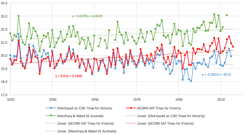
Media reports yesterday claimed that 2016 was another record hot year. However, close scrutiny of all the temperature data from the state of Victoria paints quite a different picture. When all 289 temperature series from Victoria are simply combined, the hottest years are in the early part of the record. In particular, 1914 is very evidently the hottest year on record – see blue time series in Chart 1. This finding builds on a recently published book chapter focused on south-east Australia, and is part of a larger study working towards a realistic reconstruction of Australia’s temperature history.

Chart 1. Two temperature reconstructions for the state of Victoria (blue and red lines), and also a reconstruction for the south-east of Australia (green line) – showing annual mean maximum temperatures from 1910. The three time-series are based on very different methodologies, and show a high degree of inter-annual synchrony – but very different overall temperature trends. The different methods used to construct these three series, and the resulting statistics, are detailed in Table 1.

Yesterday the Australian Bureau of Meteorology released its Annual Climate Statement, claiming 2016 to be the fourth-warmest year on record for Australia – and also an unusually wet year. Wet years are usually much cooler years, but because the overall trend in the ACORN-SAT* time series shows significant warming, even a wet year comes out as relatively hot.

Of course there is no one place in Australia where the average temperature can be measured; so the Bureau relies on a reconstruction to determine how hot 2016 was, relative to the historical record. Their method, however, is quite subjective in terms of choice of locations to include, the method used to remodel the individual temperature series before they are combined (this is refered to as homogenisation*), and the area weighting applied – with the weighting changing on a daily and monthly basis.

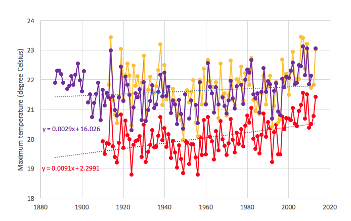
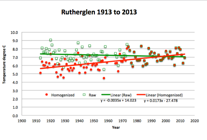
Late last year, I had a book chapter, co-authored with John Abbot and published by Elsevier*, which shows historical temperature trends for south-east Australia from 1887 to 2013 based on a more transparent system – that can be easily replicated. We choose the longest continuous series, used the same series to calculate every value, and applied an area weighting based on topography and landuse – and did not remodel individual temperature series. In the chapter we conclude that temperature trends for south-east Australia are best described as showing statistically significant cooling (yes cooling) of 1.5 degree Celsius from 1887 to 1949, followed by warming of nearly 2 degrees Celsius from 1950 to 2013. The warmest year in this reconstruction is 2007, followed very closely by 1914.

A colleague at the University of Tasmania, Jaco Vlok, has compared our south-east reconstruction with a reconstruction based on all 289 temperature series for Victoria – but only from 1910. The different methodologies used to generate these reconstructions, and also the official ACORN-SAT series for Victoria, which is the series used by the Bureau to calculate the official statistics for Australia, are detailed in Table 1.

Table 1.  Statistics for the three temperature reconstructions, and contrasting methods used to construct the series.
Table 1. Statistics for the three temperature reconstructions, and contrasting methods used to construct the series.

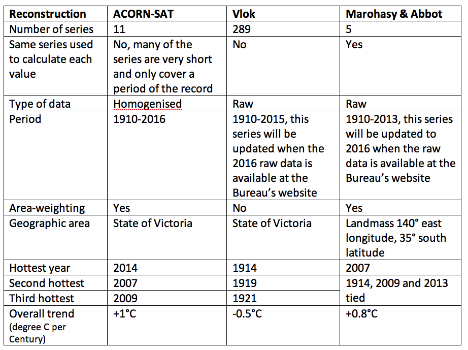
There is a very high degree of synchrony between the reconstructions, though when all the raw data is simply combined – Vlok’s approach – the hottest years are all in the earlier part of the record: 1914 (hottest) followed by 1919, 1921, 1938, 1961 and then 2014.

Postscript: I have expanded on this analysis in an article just now published by Graham Young at OLO. Jennifer, Noosa, Monday 9th January, 2017.

_____

* ACORN-SAT stands for Australian Climate Australian Climate Observations Reference Network – Surface Air Temperature and is a dataset developed by the Bureau based on a subset of available temperature series, almost all homogenised, and then combined with an area weighting and used to report climate variability and change. The annual climate statement for 2016, based on this ACORN-SAT dataset, is here: http://media.bom.gov.au/releases/333/2016-a-year-of-extreme-weather-events/

* Homogenisation involves changes to measured temperature values ostensibly to correct for non-climatic variables. These changes to the observational data are quite different from quality assurance. For example, the need for homogenisation most often results from a ‘statistical test’ detecting a break point, these breakpoints often occur after a period of missing data. In response all values preceding the breakpoint are often reduced by a specific amount back to 1910. The amount by which the measured observational values are reduced is determined through the application of algorithms and calculated relative to what are referred to as ‘neighbouring’ stations, which may be Urban Heat Island (UHI) effected, and/or located many hundreds of kilometers from the target location.

* Marohasy, J. & Abbot, J. 2016. Southeast Australian Maximum Temperature Trends, 1887–2013: An Evidence-Based Reappraisal.  In: Evidence-Based Climate Science (Second Edition), Pages 83-99. http://dx.doi.org/10.1016/B978-0-12-804588-6.00005-7 You can read more about this series here: https://jennifermarohasy.com.dev.internet-thinking.com.au/2016/12/temperatures-trends-southeast-australia-1887-part/

Filed Under: Information Tagged With: Temperatures

Temperatures Trends, Southeast Australia from 1887 – Part A

December 17, 2016 By jennifer

Charts that show year-on-year increases in temperature have become a symbol of all that is wrong with the world – or at least modernity and Western Civilization. So, why then, when such a chart was shown to a studio audience of opinion leaders, did it caused them to break-out in spontaneous applause? The Sydney Q&A audience could not conceivably have been applauding global warming – more likely this audience was applauding the affirmation that was being afforded their belief in global warming?


Of course, the chart that particle physicist Brian Cox held-up to the audience (as shown in the above Youtube video) is an historical reconstruction. There is no one place on Earth where the world’s temperature can be measured – and this particular chart is based on a variable number of homogenised temperatures series. By ‘homogenised’ I mean remodelled – ostensibly to ensure “non-climatic influences are minimised”; but in the process trends are changed.

I’ve just had a book chapter, which I co-authored with John Abbot, published that shows historical temperature trends for southeast Australia back to 1887 – using unhomogenised temperature series.

This reconstruction is shown by the purple line in Chart 1 (see below). It suggests a rate of warming less than half that shown in Cox’s global homogenised reconstruction; and might be better described as exhibiting considerable inter-annual variability – with cycles of cooling and warming.

Chart 1. Southeast Australian temperature reconstruction (based on area weighting of maximum temperature series from Melbourne, Echuca, Deniliquin, Cape Otway and Wilson Promontory lighthouses), compared with the shorter Rutherglen series, and also ACORN-SAT maximum temperatures just for the state of Victoria.

The method used to develop this reconstruction perhaps represents an important first step in developing an Australian-wide reconstruction based on un-homogenised data.

Our chapter concludes that the series for southeast Australia is best described as showing statistically significant cooling (yes cooling) of 1.5 degree Celsius to 1949, followed by warming of nearly 2 degrees Celsius to the present. (If you would like a pdf copy of the chapter, email me: j.marohasy at climatelab.com.au).

The official Bureau of Meteorology reconstruction for the state of Victoria is shown in red in Chart 1; and is based on ACORN-SAT. The homogenised ACORN-SAT database only begins in 1910. It is used by the Bureau, and also CSIRO, to report climate variability and change. Eleven locations are used in the ACORN-SAT reconstruction for Victoria – with some of the series from these locations very short, and with a lot of missing data; all were remodolled.

Our southeast reconstruction is based on the same five long and continuous series with only three adjustments made to two of the series (Deniliquin and Cape Otway) to correct for equipment changes in 1908 and 1898 – as detailed in the chapter.

Despite the very different methodologies used, the reconstructions are surprisingly similar. Both reconstrucions show considerable inter-annual variability, with almost synchronous peaks and troughs: see Chart 1. In both reconstructions, 2007 is the hottest recent year, though temperatures were almost as hot back in 1914. In large part because the ACORN-SAT database only starts in 1910, which corresponds with a dip in the record, this official series for Victoria indicates an overall rate of warming of 0.9 degree Celsius per century – compared to 0.3 degree Celsius for the southeast reconstruction.

Both reconstructions are of maximum temperatures. Global warming is typically reported as an increase in the mean temperature, which is the average of the maximum and minimum temperatures. The maximum temperature is the daytime temperature; and an arguably better measure of regional temperature variation because of the higher rates of turbulent mixing of the atmosphere during the day time.

In Chart 1, I’ve also plotted temperature maxima as measured at the agricultural research station near Rutherglen in northern central Victoria – this is the series shown in yellow. This is an exceptionally high quality series because it has been measured using standard equipment at the same rural site for over 100 years. But it was not part of the southeast reconstruction because we only used series that began on, or before, 1887 for the southeast reconstruction.

Temperature minima and maxima do not always trend in the same direction. In the case of Rutherglen, temperature minima actually show cooling – consistent with other series from this region. This cooling is most obvious in spring, and probably associated with the extensive development of irrigation. Through the homogenisation process the Bureau change the cooling in the Rutherglen temperature minima to warming before including Rutherglen in the official ACORN-SAT database. I’ve written extensively about this, including in a recent research paper entitled simply ‘Temperature change at Rutherglen in south-east Australia’.


Key Reference/New book chapter

Marohasy, J. & Abbot, J. 2016. Southeast Australian Maximum Temperature Trends, 1887–2013: An Evidence-Based Reappraisal.  In: Evidence-Based Climate Science (Second Edition), Pages 83-99. http://dx.doi.org/10.1016/B978-0-12-804588-6.00005-7

Filed Under: Information Tagged With: Temperatures

Understanding the Wild, Wet Weather across Southern Australia

October 4, 2016 By jennifer

The wild, wet weather across southern Australia this spring is a consequence of an unusually strong temperature gradient, especially evident in the following chart as warm water to the north of Australia (especially in the Timor and Arafura Seas), and the cold waters off the southwest of Australia.

Thanks to NOAA, http://www.esrl.noaa.gov/psd/map/clim/sst.shtml

Former head of Australia’s National Climate Centre, Bill Kininmonth, recently emailed me:

The warm water has increased the supply of moisture feeding into the airflow over Australia. The moisture increases by nearly 7 percent with each degree C temperature rise. The cold water to the south and west of Australia tightens the temperature gradient and increases the potential for storm development (technically it is called increasing baroclinic instability). It is normal to have a period of tightening temperature gradient during spring time – the nearby ocean and land of southern Australia are cold after winter but the approach of summer is warming ocean and water of north Australia. Because of this annual tightening of the gradient, spring is the wettest period with often strong storms over southeast Australia. This year has been particularly wet and stormy because of the pattern of sea surface temperature anomalies. It is not climate change.

As the oceans have a critical influence on land temperatures, this same pattern is evident in the surface temperature data for Western Australia. While Perth has had its coldest September on record, it’s actually been very warm in the north of the state.

A colleague has plotted the following fascinating chart which shows a running yearly average of mean temperatures from 180 sites as recorded by the WA Agriculture Department.

Thanks to a friend and colleague, who wishes to remain anonymous

The top line is Kununurra, in the far north, showing temperatures are still rising. The next line is Carnarvon. The great mass of lines are the southwest corner of WA from just north of Geraldton to east of Esperance and these show temperatures are all falling. The coldest lines are at elevated places like Mt Barker. The brown line starting around 2008, and at 16.7C, is South Perth.

There is a remarkable consistency about the southwest corner where the coolest 12 months ended in mid-2006 and the average then climbed around 2.5C to a peak in late 2014 and has dropped by a little over 1C since then.

So what happens next?

The water to the far northwest is very warm as can be seen by the rise in Kununurra surface temperatures, and the orange in the NOAA sea surface temperature map.  The Leeuwin current that brings the warm water down the coast is normally weakest in the summer months and strongest over the autumn and winter.

Filed Under: Information Tagged With: Temperatures

Speaking Truth to Power, and Correcting Brian Cox

August 19, 2016 By jennifer

IN the comments thread following my article published at On Line Opinion yesterday, someone asked:  “Does Jennifer believe that NASA and the UN are faking temperature data?”

I replied: “I don’t believe that NASA and the IPCC are faking the data: I provide compelling evidence to show this. Indeed, they, and the Bureau of Meteorology are remodelling temperature series so that they fit the theory of anthropogenic global warming.  In the case of both Amberley and Rutherglen cooling trends have been changed into warming trends without any reasonable justification.”

You can read the article here: http://onlineopinion.com.au/view.asp?article=18459

And I’m republishing it here:

CELEBRITY physicist Brian Cox misled the ABC TV Q&A audience on at least 3 points-of-fact on Monday night. This is typical of the direction that much of science is taking. Richard Horton, the current editor of the medical journal, The Lancet, recently stated that, “The case against science is straightforward: much of the scientific literature, perhaps half, may simply be untrue.”

Prof Brian Cox, image courtesy of the BBC

Firstly, Cox displayed an out-of-date NASA chart of remodelled global temperatures as proof that we have catastrophic climate change caused by industrial pollution. Another panellist on the program, One Nation Senator Malcolm Roberts, tried to raise the issue of cause and effect: querying whether there really was a link between rising temperature and carbon dioxide. This is generally accepted without question. But interestingly – beyond experiments undertaken by a chemist over 100 years ago – there is no real proof only unreliable computer simulation models.

Indeed, in 2006, John Nicol (a former Dean of Science at James Cook University) wrote to Penny Whetton (then meteorologist-in-charge of the climate science stream at CSIRO) asking if she could provide him with copies notes, internal reports, references (“peer reviewed” of course) which would provide details of the physics behind the hypothesis of global warming. She wrote back immediately promising to find some – which he thought was odd since he had assumed her office was stacked-to-the-ceiling with such literature.

Whetton even went to the trouble of contacting other colleagues – one of whom sent Nicol an inconsequential article in a Polish journal. After eighteen months of their exchanging letters and all of her promises to be helpful, all she could finally offer was the “scientific” section of “Climate Change in Australia 2007”. There, to Nicol’s amazement he found nothing apart from the oft quoted: “We believe that most of the increase in global temperatures during the second half of the 20th century was very likely due to increases in the concentration of atmospheric carbon dioxide”.

“Believe”, “most”, and “very likely” are jargon, perhaps meaning “we don’t have a clue”.

The chart Cox held up on Monday night – now all-over-the-internet as proof of global warming – essentially represents a remodelling of observed surface temperature measurements to confirm a belief, that we most likely have catastrophic global warming.

The accurate UAH satellite record shows a spike in temperatures in 1997-1998 associated with the El Nino back then, followed by a long pause of about 17 years, before the recent spike at the end of 2015-beginning of 2016. The recent spike was also caused by an El Nino event. Global-temperatures have been plummeting since March, and are now almost back to pause-levels. Indeed, Roberts was more correct than Cox, when he claimed there had been no warming for about 21 years – despite the rise in atmospheric levels of carbon dioxide.

The second misleading statement from Cox on Monday night concerned the nature of the modern sceptic – often harshly labelled a denier. Cox suggested that sceptics were the type of people that would even deny the moon-landing. In making this claim he was no doubt alluding to research, since discredited, funded by the Australian Research Council, that attempted to draw a link between scepticism of anthropogenic global warming and believing in conspiracies.

In fact, astronaut Harrison Schmitt – who actually stood on the moon, drilled holes, collected moon rocks, and has since returned to Earth – is a well-known sceptic of anthropogenic global warming. In short, Astronaut Harrison knows the moon-landing was real, but does not believe carbon dioxide plays a significant role in causing weather and climate change. In fact, Schmitt has expressed the view – a very similar view to Roberts – that the risks posed by climate change are overrated. Harrison has even suggested that climate change is a tool for people who are trying to increase the size of government – though he does not deny that he has been to the moon and back.

Thirdly, Cox has qualifications in particle physics, yet on Monday night he incorrectly stated that Albert Einstein devised the four-dimensional-space-time continuum. Those with a particular interest in the history of relativity theory know that while Einstein reproduced the Lorenz equations using a different philosophical interpretation, he was not the first to put these equations into the context of the 4-dimensional continuum – that was done by Hermann Minkowski. Minkowski reformulated in four dimensions the then-recent theory of special relativity concluding that time and space should be treated equally. This subsequently gave rise to the concept of events taking place in a unified four-dimensional space-time continuum.

Then again, Cox may not care too much for facts. He is not only a celebrity scientist, but also a rock star. Just the other day I was watching a YouTube video of him playing keyboard as the lead-singer of the band screamed, “We don’t need a reason”.

There was once a clear distinction between science – that was about reason and evidence – and art that could venture into the make-believe including through the re-interpretation of facts. This line is increasingly blurred in climate science where data is now routinely remodeled to make it more consistent with global warming theory.

For example, I’m currently working on a 61-page expose of the situation at Rutherglen. Since November 1912, air temperatures have been measured at an agricultural research station near Rutherglen in northern Victoria, Australia. The data is of high quality, therefore, there is no scientific reason to apply adjustments in order to calculate temperature trends and extremes. Mean annual temperatures oscillate between 15.8°C and 13.4°C. The hottest years are 1914 and 2007; there is no overall warming-trend. The hottest summer was in 1938-1939 when Victoria experienced the Black Friday bushfire disaster. This 1938-39 summer was 3°C hotter than the average-maximum summer temperature at Rutherglen for the entire period: December 1912 to February 2016. Minimum annual temperatures also show significant inter-annual variability.

In short, this temperature data – like most of the series from the 112 locations used to concoct the historical temperature record by the Australian Bureau of Meteorology – does not accord with global warming theory.
So, adjustments are made by the Australian Bureau of Meteorology to these individual series before they are incorporated into the Australian Climate Observations Reference Network – Surface Air Temperature (ACORN-SAT); and also the UK Met Office’s HadCRUT dataset, which informs IPCC deliberations.

The spike in maximum temperatures in 1938-1939 is erroneously identified as a statistical error, and all temperatures before 1938 adjusted down by 0.62°C. The most significant change is to the temperature minima: all values before 1974, and 1966, are adjusted-down by 0.61°C and 0.72°C, respectively. For the year 1913, there is a 1.3°C difference between the annual raw minimum value as measured at Rutherglen and the remodelled value.

The net effect of the remodelling is to create statistically significant warming of 0.7 °C in the ACORN-SAT mean temperature series for Rutherglen: in general agreement with anthropogenic global warming theory.

NASA applies a very similar technique to the thousands of stations used to reproduce the chart that Cox held-up on Monday night during the Q&A program. I discussed these change back in 2014 with Gavin Schmidt, who oversees the production of these charts at NASA. I was specifically complaining about how they remodel the data for Amberley, a military base near where I live in Queensland.

Back in 2014, the un-adjusted mean annual maximum temperatures for Amberley – since recordings were first made in 1941 – showed temperatures trending up from a low of about 25.5°C in 1950 to a peak of almost 28.5°C in 2002. The minimum temperatures – minima are a measure of lowest temperatures – for Amberley showed cooling from about 1970. Of course this does not accord with anthropogenic global warming theory. To quote Karl Braganza from the Bureau as published by that online rag The Conversation, “Patterns of temperature change that are uniquely associated with the enhanced greenhouse effect, and which have been observed in the real world include… Greater warming in winter compared with summer… Greater warming of night time temperatures than daytime temperatures”.

So, the Bureau has “corrected” this inconvenient truth at Amberley by jumping-up the minimum temperatures twice through the homogenisation process: once around 1980 and then around 1996 to achieve a combined temperature increase of over 1.5°C.

This is obviously a very large step-change, remembering that the entire temperature increase associated with global warming over the 20th century is generally considered to be in the order of 0.9°C.

According to various peer-reviewed papers, and technical reports, homogenisation as practiced in climate science is a technique that enables non-climatic factors to be eliminated from temperature series – by making various adjustments.

It is often done when there is a site change (for example from a post office to an airport), or equipment change (from a Glaisher stand to a Stevenson screen). But at Amberley neither of these criteria can be applied. The temperatures have been recorded at the same well-maintained site within the perimeter of the air force base since 1941. Through the homogenisation process the Bureau have changed what was a cooling trend in the minimum temperature of 1.0°C per century, into a warming trend of 2.5°C per century. This has not resulted in some small change to the temperatures as measured at Amberley, but rather a change in the temperature trend from one of cooling to dramatic warming; this is also what was done to the minimum temperature series for Rutherglen – and also without justification.

NASA’s Goddard Institute for Space Studies (GISS) based in New York also applies a jump-up to the Amberley series in 1980, and makes other changes, so that the annual average temperature for Amberley increases from 1941 to 2012 by about 2°C.

The new Director of GISS, Gavin Schmidt, explained to me on Twitter back in 2014 that: “@jennmarohasy There is an inhomogenity detected (~1980) and based on continuity w/nearby stations it is corrected. #notrocketscience”.

When I sought clarification regarding what was meant by “nearby” stations I was provided with a link to a list of 310 localities used by climate scientists at Berkeley when homogenising the Amberley data.

The inclusion of Berkeley scientists was perhaps to make the point that all the key institutions working on temperature series (the Australian Bureau, NASA, and also scientists at Berkeley) appreciated the need to adjust-up the temperatures at Amberley. So, rock star scientists can claim an absolute consensus?

But these 310 “nearby” stations, they stretch to a radius of 974 kilometres and include Frederick Reef in the Coral Sea, Quilpie post office and even Bourke post office. Considering the un-adjusted data for the six nearest stations with long and continuous records (old Brisbane aero, Cape Moreton Lighthouse, Gayndah post office, Bundaberg post office, Miles post office and Yamba pilot station) the Bureau’s jump-up for Amberley creates an increase for the official temperature trend of 0.75°C per century.

Temperatures at old Brisbane aero (the closest of these stations), also shows a long-term cooling trend. Indeed perhaps the cooling at Amberley is real. Why not consider this, particularly in the absence of real physical evidence to the contrary? In the Twitter conversation with Schmidt I suggested it was nonsense to use temperature data from radically different climatic zones to homogenise Amberley, and repeated my original question asking why it was necessary to change the original temperature record in the first place. Schmidt replied, “@jennmarohasy Your question is ill-posed. No-one changed the trend directly. Instead procedures correct for a detected jump around ~1980.”

If Twitter was around at the time George Orwell was writing the dystopian fiction Nineteen Eighty-Four, I wonder whether he might have borrowed some text from Schmidt’s tweets, particularly when words like, “procedures correct” refer to mathematical algorithms reaching out to “nearby” locations that are across the Coral Sea and beyond the Great Dividing Range to change what was a mild cooling-trend, into dramatic warming, for an otherwise perfectly politically-incorrect temperature series.

Horton, the somewhat disillusioned editor of The Lancet, also stated recently that science is, “Afflicted by studies with small sample sizes, tiny effects, invalid exploratory analyses, and flagrant conflicts of interest, together with an obsession for pursuing fashionable trends of dubious importance, science has taken a turn towards darkness.” I would not go that far! I am not sure it has taken a turn for darkness – perhaps just a turn towards the make-believe. Much of climate science, in particular, is now underpinned with a postmodernist epistemology – it is simply suspicious of reason and has an acute sensitivity to the role of ideology in asserting and maintaining particular power-structures including through the homogenisation of historical temperature data.

Filed Under: Information Tagged With: Temperatures

Auditor-General Dismisses Need for Scrutiny of Bureau’s Homogenization Methodology

June 21, 2016 By jennifer

SURFACE air temperatures, as measured at weather stations across Australia, are routinely remodeled through a process of homogenization.  After the remodeling of approximately 100 individual temperature series, various area weightings are applied to these individual series, then the average annual temperature is calculated for each state and territory, the entire continent, and used to report climate change.

Issues of concern are the process of homogenization, the choice of stations, the way the homogenized data series are combined, and whether this provides an accurate representation of the historic temperature record for Australia.

There has been no independent assessment of this methodology.  I made a request for the same in a letter to Grant Hehir, Auditor-General of Australia, with supporting information on 11th November 2015.  This requested was rejected without any consideration of the evidence.  I used Rutherglen as a case study, and queried the rational for dropping down temperatures in the early part of the Rutherglen record when their had been no site move or equipment change.  These adjustments turned a slight cooling trend in the minimum temperatures as recorded at Rutherglen, into dramatic warming, as illustrated in this chart.

Green squares show annual mean minimum temperatures, red dots show these values after homogenization. In dropping down the early mean minima the Bureau changes slight cooling at Rutherglen, into warming of 1.7 degrees Celsius per century.

My submission to the Auditor General can be downloaded here.

I am currently working on an alternative temperature reconstrution for Australia.   By the end of the year I hope to be able to publish an accurate reconstruction for the state of Victoria, and also Australia’s East Coast lighthouses.

Filed Under: Information Tagged With: Temperatures

Accepting Regional Variability in Global Temperatures

April 11, 2016 By jennifer

IN the very first report from the United Nation’s Intergovernmental Panel on Climate Change (IPCC) the Medieval Warm Period was evident as a period, about as warm as the present, occurring from AD 950 to 1250. In subsequent IPCC reports there is no such warm period in this historical record. Instead there is a graph, shaped like an ice-hockey stick, which suggests temperatures were flat until the 20th Century, when sudden and sustained warming occurs.

Roy Spencer and John Christy are responsible for compiling the UAH Satellite record.

The change, from the presence of a clear warm period about 1000 years ago to none at all in more recent reports, is justified by the IPCC on the basis that while it may have been warmer in Europe when the Vikings founded settlements on Greenland, and England was exporting wine to France, this warming was not global. The warming, according to the IPCC, was restricted to the North Atlantic region. Which begs the question, how important is regional variability when we are discussing global warming?

Furthermore, no-one lives in a world climate. It’s what happens locally and regionally that is most important to individual communities. We should expect that an El Nino event in the Pacific Ocean, for example, is going to affect the western United States very differently from eastern Australia. Indeed, such events are often associated with wetter conditions in southwest USA, and hotter, drier conditions in eastern Australia.

The focus on mean global temperatures, rather than regional variability, has been a consequence of the politicization of climate science and the desire to use the authority of science to force political change. Many of those opposed to this political agenda, often labelled sceptics or deniers, have focused on temperature series that show little or no global warming, while the mainstream climate science community has gone to ever more extreme lengths to make particular temperature time series conform to their theory of anthropogenic global warming.

Some so-called sceptics had been focusing on the satellite record over recent years, because that component of this record based on the mean global temperature, showed no increase since the El Nino event of 1997/98, Chart 1a. However, more recently, and largely as a consequence of the relatively warm and wet winter in the northern hemisphere, there has been another spike in the global mean temperature based on this satellite record.

This signifies the end of “the pause” in the mean global temperature for the UAH satellite record. Though, interestingly, some have simply changed their geographic focus, much as the IPCC did with the Medieval Warm Period.  In particular, some so-called sceptics now emphasis the geographic variability in the satellite record, in particular, that southern hemisphere temperatures showing no recent spike.

This is the lower troposphere component of the UAH satellite record, for select regions.
CHART 1. This is the lower troposphere component of the UAH satellite record.  Anomalies, not actual temperatures are plotted.

The satellite record as compiled by scientists John Christy and Roy Spencer, at the University of Alabama (UAH), Huntsville, includes monthly updates for the entire globe, for the northern and southern hemispheres, the south and north poles, the tropics, the United States of America, and also for Australia. The UAH satellite record also separates out ‘land’ and ‘ocean’. So, for the northern hemisphere, as an example, it is possible to understand temperature trends for the land versus ocean components of this record. When we consider the land component of the UAH satellite record for the northern hemisphere, the recent spike in temperatures is particularly pronounced, Chart 1b. Meanwhile, for Australia, there is no such recent spike in temperatures. Rather temperatures appear to cycle within an approximate 4 degree Celsius band, Chart 1c.

Patterns in the historical temperature record, and geographic variability in temperature trends, potentially gives us insight into the drivers of climate change. Many, however, would argue that as the satellite temperature record only goes back 38 years to 1978, that this is too short a period for discerning correlations with sunspots, and other extraterrestrial phenomena. In fact, consistency between the UAH satellite record for Australia, and records from individual weather station in Australia over this same period (December 1978 – March 2016), potentially gives us the opportunity to infer what temperatures would have been like at least back to when these weather stations were first installed. There is, for example, a reliable thermometer temperature record for Richmond in north eastern Australia back to 1893. Considering just the trends, not the absolute temperatures, the thermometer record for this location shows a remarkably good correlation with the satellite record for all of Australia for the period December 1978 to March 2016, Chart 2.

The monthly thermometer record for Richmond, NE Australia, compared with the UAH satellite record for all of Australia. [Note, chart 1 was a plot of anomalies, this is a plot of actual temperatures.]
CHART 2.  The monthly thermometer record for Richmond, NE Australia, compared with the UAH satellite record for all of Australia.  While chart 1 was a plot of anomalies, this is a plot of actual temperatures.  The satellite measurements are significantly cooler than surface measurements as they are measuring a volume of lower atmosphere extending up about 10 kilometers. 
The much longer unadjusted historical temperature record for Richmond also shows significant intra-annual variability but broadly with a cooling trend to 1950, following by warming to the present. The hottest year in the entire record for Richmond, consistent with many locations in eastern Australia, is 1915.

The pattern in the unadjusted thermometer record for Richmond, and the shorter satellite records for all of Australia, the northern hemisphere and the globe, are not consistent with carbon dioxide as a significant driver of temperature change.

Additional Information: 

For more information on the UAH satellite record compared with other global data bases consider reading a recent post by Bob Tisdale at WUWT: https://wattsupwiththat.com/2016/03/12/february-2016-global-surface-landocean-and-lower-troposphere-temperature-anomaly-update/

For more information on the temperature record for Richmond, and why this unadjusted series is so unique and important consider reading a recent post focused on Darwin, but also considering other sites in northern Australia, here:  https://jennifermarohasy.com.dev.internet-thinking.com.au/2016/02/12910/

I have commented in more detail on the ‘end of the pause’ and the likely reason for the recent surge in the global mean temperature, as measured by satellites, in a recent popular article at On Line Opinion here: http://www.onlineopinion.com.au/view.asp?article=18111

Filed Under: Information Tagged With: Temperatures

  • « Go to Previous Page
  • Go to page 1
  • Interim pages omitted …
  • Go to page 3
  • Go to page 4
  • Go to page 5
  • Go to page 6
  • Go to page 7
  • Interim pages omitted …
  • Go to page 13
  • Go to Next Page »

Primary Sidebar

Recent Comments

  • Ian Thomson on Vax-ed as Sick as Unvax-ed, Amongst My Friends
  • Dave Ross on Vax-ed as Sick as Unvax-ed, Amongst My Friends
  • Dave Ross on Vax-ed as Sick as Unvax-ed, Amongst My Friends
  • Alex on Incarceration Nation: Frightened of Ivermectin, and Dihydrogen monoxide
  • Wilhelm Grimm III on Incarceration Nation: Frightened of Ivermectin, and Dihydrogen monoxide

Subscribe For News Updates

  • This field is for validation purposes and should be left unchanged.

December 2025
M T W T F S S
1234567
891011121314
15161718192021
22232425262728
293031  
« Jan    

Archives

Footer

About Me

Jennifer Marohasy Jennifer Marohasy BSc PhD has worked in industry and government. She is currently researching a novel technique for long-range weather forecasting funded by the B. Macfie Family Foundation. Read more

Subscribe For News Updates

Subscribe Me

Contact Me

To get in touch with Jennifer call 0418873222 or international call +61418873222.

Email: jennifermarohasy at gmail.com

Connect With Me

  • Facebook
  • LinkedIn
  • RSS
  • Twitter
  • YouTube

Copyright © 2014 - 2018 Jennifer Marohasy. All rights reserved. | Legal

Website by 46digital