• Skip to primary navigation
  • Skip to main content
  • Skip to primary sidebar
  • Skip to footer
Jennifer Marohasy

Jennifer Marohasy

a forum for the discussion of issues concerning the natural environment

  • Home
  • About
  • Publications
  • Speaker
  • Blog
  • Temperatures
  • Coral Reefs
  • Contact
  • Subscribe

temperates

Lady Elliot, Temperature Trends

August 3, 2019 By jennifer

THERE is concern that if global warming exceeds 2°C per 100 years, there will be catastrophe. There are various ways of anticipating this… I tend to favour the empirical. Indeed, running a ruler over a temperature series can be useful, if we want perspective.

Considering the maximum temperature record available for Lady Elliot Island — an isolated coral cay off the Australian east coast — and after running a trend line through the numbers, we find that we are almost at this tipping point of 2°C, as shown in Figure 1.

Figure 1. Maximum annual mean temperatures as measured at Lady Elliot Island charted for the period 1940 to 2018.

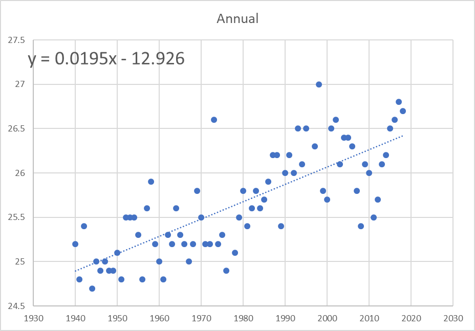
There has been a consistent annual temperature rise of 0.0195°C since 1940, which would translate into a rise 1.95°C per hundred years.

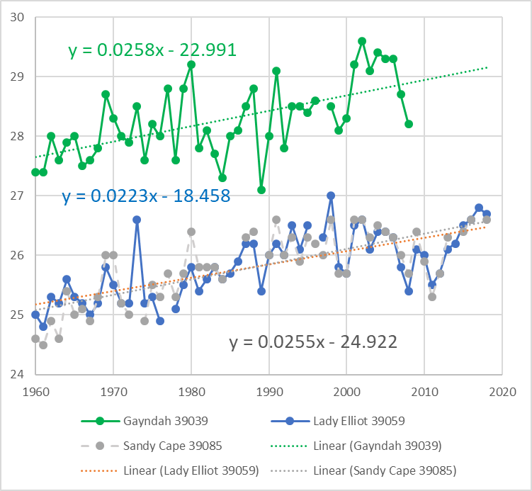
The situation appears even worse if we just consider temperatures from 1960. Then the temperature trend for Lady Elliot is more than 2°C per hundred years, as shown in Figure 2.

The mean annual maximum temperature series from the nearby Sandy Cape lighthouse has a very similar pattern for this period from 1960. There is more inter-annual variation in the temperature series from nearby Gayndah, which is typical of land series that will be more affected by droughts and floods.

Figure 2. Temperature change as measured by the annual mean maximum since 1960 at Lady Elliot and also nearby Gayndah and Sandy Cape Lighthouse

I’ve spent many years poring over temperature data from a diversity of locations across Australia, and what I’ve found is that when such records are extended back in time — even just a few decades — the overall temperature trend is quite different and ‘the catastrophe’ disappears.

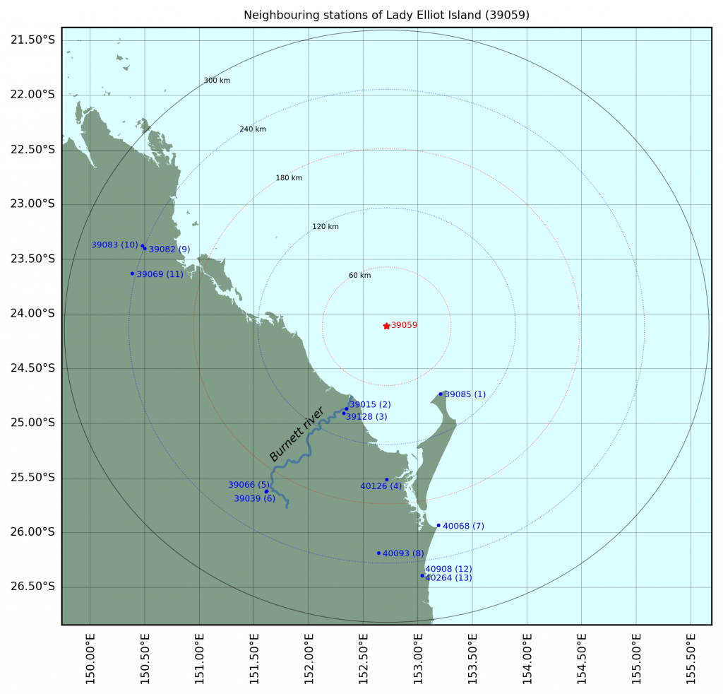
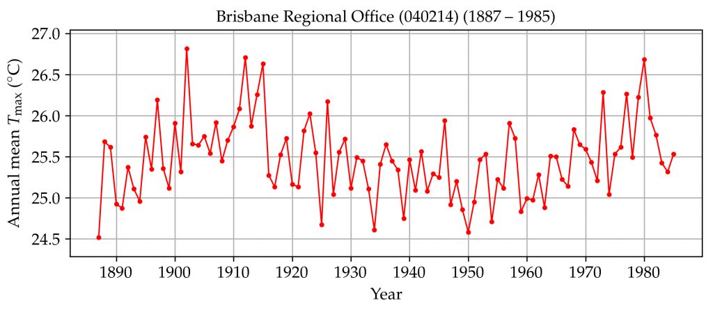
The record for Lady Elliot Island only starts on 1 July 1939. To understand what temperatures were like in this region before then, we need to consider temperature measurements from neighbouring stations that begin in the late 1800s.

There are several weather stations within a 300 km radius of Lady Elliot Island that have long temperature records.

Locations within a 300 km radius of Lady Elliot with long and continuous series. Drawn by Jaco Vlok.

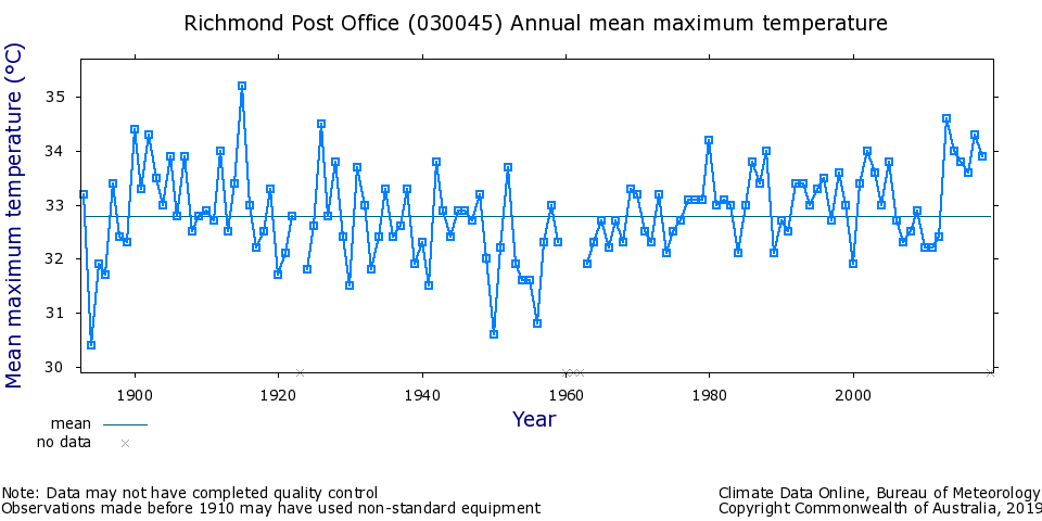
The temperature record as measured at the Gayndah Post Office (number 39039) actually begins in June 1893, and the record for Bundaberg (number 39015) in 1892, as shown in Figure 3. There is a single breakpoint in the early record for each of these two locations, marked by a circle when a Stevenson screen was installed.

Figure 3. Annual mean maximum temperatures for the 14 stations with long and continuous records within a 300 km radius of Lady Elliot. Drawn by Jaco Vlok.

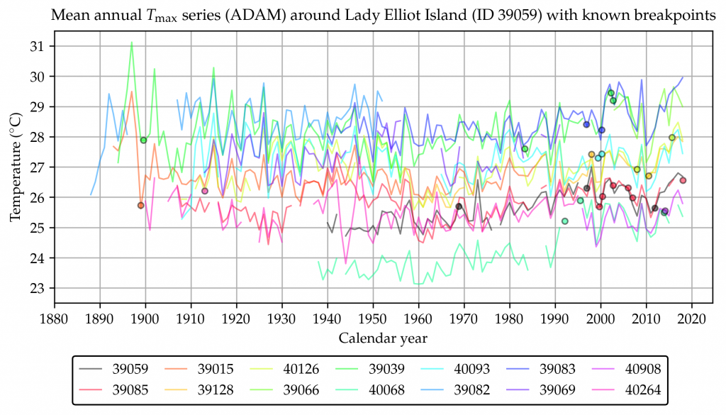
Considering the longer records within the 300 km radius, maximum temperatures have sometimes fluctuated by more than 2°C within a few years. This is evident from the detail in the individual series in Figure 3. The more than 2°C variation in temperatures as measured at Gayndah between 1900 and 1904, for example, is more than the overall warming trend at Lady Elliot of 1.95°C per hundred years since 1940.

Maximum temperatures for Gayndah and Bundaberg spiked in 1915, as they did for all the other stations recording within a 300 km radius of Lady Elliot Island at that time.

So, we can perhaps assume it was also a relatively hot year at Lady Elliot Island … back in 1915. Perhaps it was as hot back then as it is now, which is quite hot considering the longer records. Then again the spike may have been a consequence of the land drought, and places like Sandy Cape Lighthouse and Lady Elliott less affected. There is no mean annual maximum value for Sandy Cape Light House (number 39085) for 1915 because of missing values … but these could be infilled (using regression and/or an artificial neural network), to better estimate the likely temperature history for this region over land and also sea.

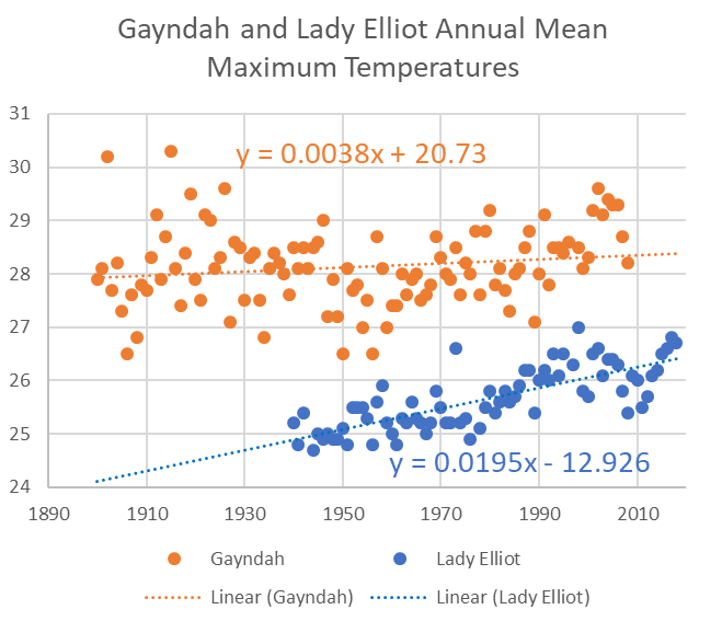
It can be difficult separating out the individual series in Figure 3. The squiggly lines are a representation of individual annual mean maximum temperatures. In Figure 4, I plot these individual values for just the Gayndah Post Office (number 39039) from 1900 (after the breakpoint, only after the Stevenson screen was installed) and for Lady Elliot (number 39059) from the beginning. Both series are plotted with trend lines.

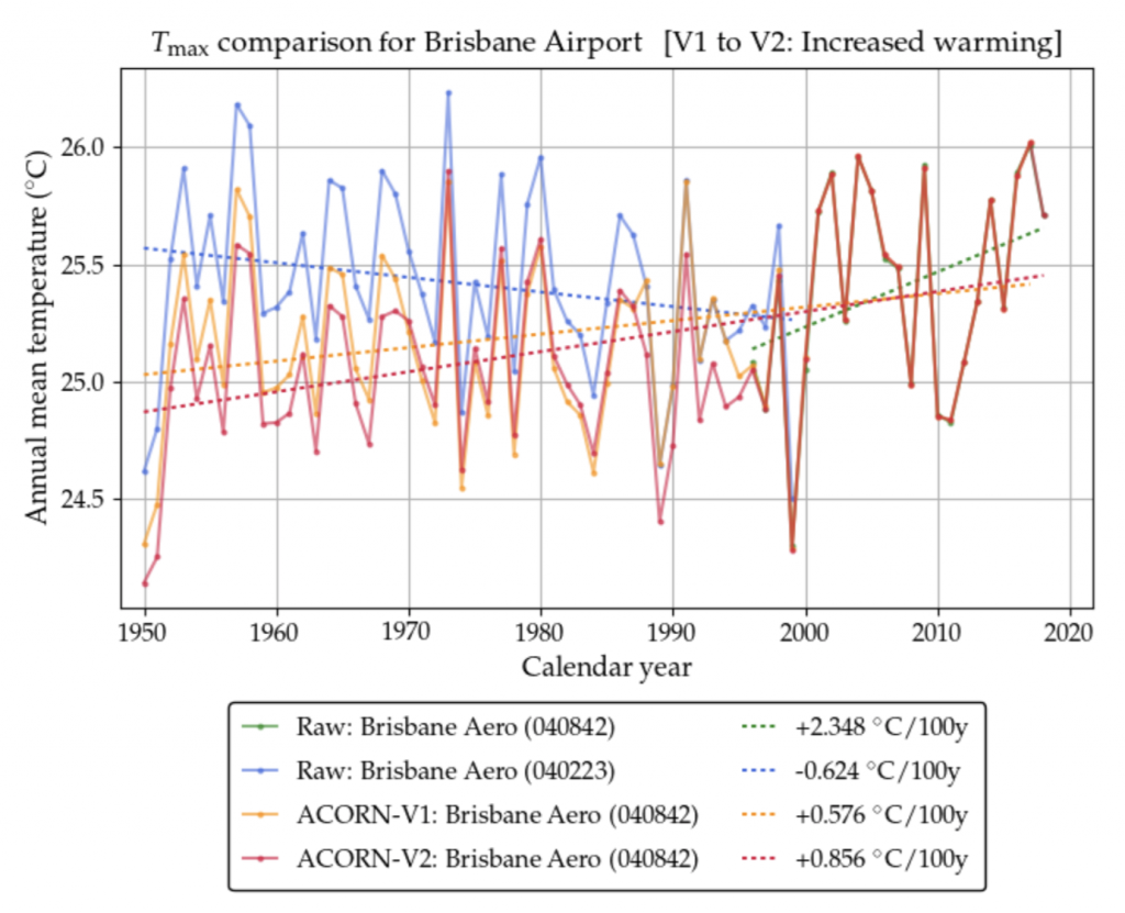
The overall temperature trend for Gayndah Post Office, considering this longer record, is just 0.38°C per hundred years, as shown in Figure 4. This contrasts significantly with the value of 2.58°C per hundred years when we plot the same values for Gayndah but only for the interval from 1960 to 2009, as shown in Figure 2.

Figure 4. Annual mean maximum temperatures as recorded at Gayndah (after installation of Stevenson Screen) and the entire record at Lady Elliot

Whenever I take the time to run a ruler over temperature series for any particular region and considering a long enough time period not artificially warmed by a combination of Urban Heat Islands (UHI) and homogenisation, I have trouble finding catastrophe. Rather I’m inspired by the extent of the available data and the degree of synchrony between the series that tend, if anything, to be simply moving sideways.

Lady Elliot Island. Photo credit Clint Hempsall.

____

This is the third post in my ‘GAT in the Hat’ series, which began when Huck suggesting we get on and develop a simple temperature index based on a good sample of well-sited stations. Jaco Vlok and I are working our way around Australia with such an index in mind … we are working anti-clockwise from Brisbane.

Thanks to the Australian Bureau of Meteorology for making all this data available at http://www.bom.gov.au/climate/data/

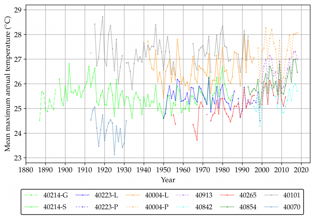
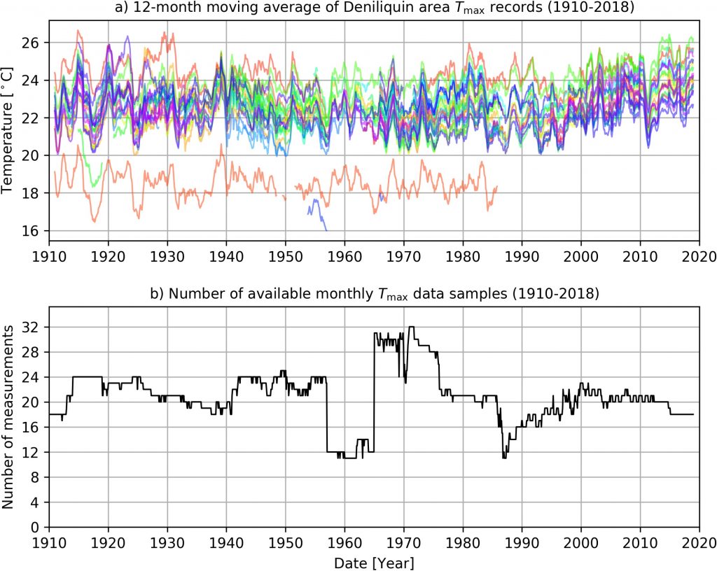
The feature image (very top of this blog post) is a plot of all the available maximum temperature data (from 59 weather stations) within a 300 km radius of Lady Elliot as 12-month moving averages, with the data compiled and plotted by Jaco Vlok.

This post was updated at midnight on 3rd August, with figures added, the picture changed, and the title modified …

Filed Under: Information Tagged With: temperates

Understanding Brisbane’s Temperature History (Part 1)

July 19, 2019 By jennifer

DECONSTRUCTION can be affirmation rather than questioning. Jaco Vlok and I have been deconstructing various temperature series from the Brisbane region with a view to developing an index that is an accurate, and affirming, representation of Brisbane’s temperature history.

To progress this work, we are making the following two recommendations, that concern the Australian National Archive:

RECOMMENDATIONS

1. The Australian National Archive needs to digitise the long temperature series from the mercury thermometer that was recording temperatures at the Brisbane airport (station number 40842) from 9 June 2004 until 3 September 2014, as shown in the Gantt chart. Only when this data is available will it be possible to begin to know if measurements from electronic probes now recording official temperatures, have any equivalence with temperature measurements from 100 years ago.

When there is an equipment change, there should be some overlapping data to enable comparisons … and also a new number. In contravention of its own policies the Bureau has made major equipment changes and yet kept the same station number.

2. The first government weather station at Brisbane (station number 40214) opened in 1840, which is 179 years ago. The daily recordings from this mercury thermometer should be There may be daily temperature readings and they may be archived in the Australian National Archive. This needs to be confirmed, and the daily maximum values digitised to enable the current record for Brisbane to be extended back in time.

For the period from 1840 to 1896 the mercury thermometer was housed in a Glaisher stand rather than a Stevenson screen.* It is unknown how the thermometers where housed before the installation of the Stevenson screen in 1896.

There will potentially need to be an adjustment when joining the series. Adjustments are currently made by the Australian Bureau of Meteorology to all the Brisbane series for the period from 1950, through the process of homogenisation.

BACKGROUND

There is intense interest in climate change as a cause, but perhaps not enough interest in the quality of the data underpinning all the rhetoric. If we really care about this issue of global warming then we will want to know exactly how much temperatures have really warmed over recent decades. So, we will need to know the equivalence of temperatures now measured using electronic probes with temperatures previously measured using mercury thermometers.

The Australian Bureau of Meteorology measures temperatures from electronic probes that have not been calibrated relative to the mercury thermometers that were once used. Further, the Bureau makes adjustments to temperatures after they have been measured, recorded and archived in the creation of the new official temperature series, known as ACORN-SAT. These homogenised series are then used to calculate national and global averages.

Mark Huxley Akin (Huck) has suggested that we just get on and start constructing regional climate indices based on real and unadjusted/unhomogenised temperature series.

Specifically, he has suggested we use “a good sample of well-sited stations with long histories”, using the analogy of the Dow Jones Average. He writes:

No one ever tries to establish an impossible-to-define ‘average stock price’— including many stocks of doubtful provenance — and nobody cares. These pre-selected indexes of certain representative stocks, that are then followed over a long time-span, tell investors what they really want to know: how the market moves over time, relative to itself.

It is the case that for some Australian locations there are long consistent records through much of the twentieth century. For example, temperature data recorded at Brisbane (station number 40214) are currently publicly available from January 1887 to March 1986. This is one of the longest continuous high quality temperature records for anywhere in the Southern Hemisphere with measurements taken using the same mercury thermometer at the same place every day (although the Glaisher stand was replaced with a Stevenson screen in 1896).

Problems begin, however, around the late 1980s, when there are site moves and equipment changes. In the case of Brisbane, in order to continue any index beyond 1986, it is going to be necessary to join different temperature series and yet there is no data to quantify the equivalence of the measurements from electronic probes, mercury thermometers and also thermohygrographs — that were also used at Brisbane.

The first ever detailed list of the equipment used to measure temperatures at Brisbane has just been compiled by Jaco Vlok, as shown in master_table4 which is a work-in-progress.

BRISBANE MAXIMA IN THE RAW

According to the available metadata, maximum temperatures were measured at Brisbane (40214) from January 1840 until July 1994. There is only data available online, however, to construct an annual mean series from 1887 to 1985, as shown in Figure 1. For most of this record, from 1896, temperatures were recorded using the same mercury thermometer in a Stevenson screen. This very long continuous record does NOT show a pattern of warming consistent with human-caused global warming theory, Figure 1.

Figure 1.Maximum temperatures recorded at station number 040214, in a Stevenson screen with a mercury thermometer as downloaded from the Bureau’s ADAM database.

Consistent with many other such high-quality and long continuous records from Australia, this maximum temperature series shows cooling to about 1960 and then warming.

THE OFFICIAL BRISBANE RECORD

The official temperature record for Brisbane is from a combination of two official Bureau series both recorded at the airport (Series 40223 and 40842), and subsequently homogenised. The homogenisation method is outlined in general terms in a peer-reviewed article by Blair Trewin published in 2013.

In the case of Brisbane, Blair Trewin has decided to begin the official record in 1950, which is presented as a bar chart at the Bureau of Meteorology website, as shown in Figure 2.

Figure 2. The official annual mean maximum temperature record for Brisbane, as displayed at the Bureau of Meteorology website.

The temperature series used to construct this bar chart are shown in Figure 3, as well as the resulting ACORN-SAT versions 1 and 2.

ACORN-SAT version 2, as shown in Figure 3, represents the official record for Brisbane and data from this series is incorporated into international datasets.

Figure 3. The temperature series that are homogenised by Blair Trewin and then used to create the ACORN-SAT series, also shown.

The latest official ACORN-SAT maximum temperature series for Brisbane (version 2 in Figure 3) suggests warming of 0.9 degrees Celsius per century.

To be clear, this temperature series does not show the early measurements for Brisbane, so it does not show how hot temperatures were in 1902 and then again in 1912 and 1915. The official record also does not show the period of overall cooling, to about 1960.

CHANGING SITES AND CHANGING EQUIPMENT

It is a fact that understanding the true temperature history of a place can be difficult because of: site moves, changes in equipment, changes in the method of recording for the same equipment, and homogenisation of the raw data.
A true representation of temperatures over the last 100 years for Brisbane would not ignore the long series beginning in 1840. Nor would a true representation gloss over the many equipment changes particularly since 1995, as shown in the first Gantt chart, and that Jaco Vlok has began to document in Table 1.

Since 1996 the Australian Bureau of Meteorology has been transitioning away from the use of traditional mercury thermometers to electronic probes in automatic weather stations for the measurement of maximum temperatures. This is a major change in equipment — a major change in how temperatures are measured — yet when this change occurs the Bureau keeps the same station number and just continues to add to the previous record.

This is in contravention of its own policies that clearly state that a new station number should be assigned, and that there should be at least three years (preferably five) of overlapping/parallel temperature recordings at the same location.

This parallel data exists for a limited number of stations, but the Bureau has so far not made the data accessible. Much of it is currently held by the Australian National Archive as manual recordings into observation books. The numbers need to be digitised so that we can see whether or not the measurements from the electronic probes are comparable to the measurements from the mercury thermometers.

After much effort, I obtained parallel data for Mildura – as thousands of photographed records. Manual transcribing of some of the data has established that the current electronic probe at Mildura often records 0.4 degrees Celsius hotter — for the same weather. The first electronic probe at Mildura actually recorded cooler. So, the custom-built probes installed sequentially at Mildura have different time constants. It was only possible to establish this after the parallel data was provided to me, and I began an analysis of some of the manually transcribed data.

We know that since 1996 the temperature record for the Brisbane airport (station number 040842) actually represents measurements from an electronic probe, not a mercury thermometer. We don’t know what the time constant is for this probe. We do know that there is parallel data available from 14 February 2000; that is temperature measurements taken from a mercury thermometer in the same shelter (Stevenson screen).

We know that there have been four different probes used at the Brisbane airport site, as shown in Table 1.
The Bureau has not published the time constants for these probes. Depending on the time-constant, a probe may be much more sensitive to temperature change than a mercury thermometer and thus record warmer temperatures for the same weather.

APPROPRIATE QUALITY ASSURANCE

Breaking down the Bureau’s series into their component parts and then plotting the available data on one chart, can give an indication of temperature change since 1897.

The extent to which the many different Brisbane series move in synchrony suggests they are an accurate representation of climate variability and change for this region, as shown in Figure 4. Consider, for example, the first three records in the table for the period from 1950 to 1986; including the Brisbane Regional Office (40214), Brisbane airport (40223) and Amberley (40004) series: they generally move in unison but do not show a consistent warming trend.

At the moment this is all a work in progress, with the labels for the series charted in Figure 4 not yet corresponding to the new codes/numbers in Table 1.

Figure 4. The longest continuous temperature series from the Brisbane regions, segmented by equipment and also when there was a site move.

MOVING FORWARD

Brisbane’s temperature record could form the basis of a new index of temperature change. The construction of such an index would be aided by the provision of parallel data, that is data from both a mercury thermometer and electronic probe recorded at the same time and place.

Specifically, the most useful data right now would be the mercury thermometer recordings from the Brisbane airport (station number 40842) from 9 June 2004 until 3 September 2014, as shown in the Gantt chart. This information is held by the Australian National Archive and needs to be made publicly available, and digitised.

*****
The image featured at the top of this blog post is from https://www.slq.qld.gov.au/blogs/jol/inclement-wragge-pioneer-weather-forecaster. It shows Clement Wragge, Government Meteorologist for Queensland, with temperature recording equipment, and the Brisbane Tabernacle Baptist Church in the background.

I would like to acknowledge all the advice from Lance Pidgeon regarding ‘Brisbane’ over the years. He will also be acknowleged in the more detailed report that Jaco and I are working-up.

Also, the final recommendations in this report, and the nature of our index may be informed/improved by your comments (and Lance’s comments/input) in the following thread.

Filed Under: Information Tagged With: temperates

The GAT in the Hat

June 26, 2019 By jennifer

The hopeless pursuit of a “Global Average Temperature” mirage makes mischief in meteorology. There is a better way. 

By Mark Huxley Akin

“I AM not a scientist, but a lay person who was lucky enough to grow up with a scientist father who taught us early-on the difference between Science and consensus.

I am particularly concerned with the corruption of data that is happening with the current climate debacle.

Over the years, countless dedicated individuals have given over substantial portions of their lives to the faithful monitoring of weather stations so that we might have the reliable body of data we have today. It is disheartening to see some petty apparatchik with an agenda and an eraser—or worse, an algorithm—wipe away all that careful labor, motivated by a politicized cause more pressing than humble accuracy. 

The crux of the difficulty, it seems to me, is the problematic pursuit of a mythical “Global Average Temperature (GAT).” This effort strikes me as a fool’s errand, and one which leaves the door wide open for all kinds of subjective mischief. 

Even if such a measurement could be defined, the results would be necessarily fuzzy, and the idea that one could extract from that imprecise conglomeration, comparative measurements accurate to fractions of a degree, is just plain silly. And, to get the comparative numbers we are actually interested in, totally unnecessary. There is a better way. 

What is really wanted is a simple index based on a good sample of well-sited stations with long histories, similar in concept to the Dow Jones Averages or the S&P 500. No one ever tries establish an impossible-to-define “average stock price”— including many stocks of doubtful provenance — and nobody cares. These pre-selected indexes of certain representative stocks, that are then followed over a long time-span, tell investors what they really want to know: how the market moves over time, relative to itself. 

Temperatures as measured at Richmond in Queensland, Australia, comprise an exceptionally long continuous series unaffected by any urban heat island (UHI) and measured from within a Stevenson screen since November 1889. Furthermore, maximum temperatures are still measured using a mercury thermometer. Like most such high quality, unhomogenised series for north eastern Australia it shows 1915 to have been a particularly hot year, an overall cooling trend to about 1960, and then warming to the present. This series could be the starting point for a northern Australian temperature index.

I suggest that these indexes be regionally-based. There might be a North American Weather-Records Index, (NAWRI), South American (SAWRI), Australian (AWRI), and so on. Scientists of good-will could join together into a private club with regional branches, with no necessary connection to any government agencies, and select the best collections of well-sited stations of long duration. This club would then publish results on a regular schedule. 

Although there should be a reasonable attempt to represent a variety of climate regions, it does not matter if the sitings are necessarily spotty, because we are only measuring the output of each station against itself. There should be no attempt to “homogenize” records or create “virtual stations,” because the mission of this endeavor has nothing to do with chasing some mythical GAT. 

For the oldest records, the numbers of stations in each region would be necessarily slim, but could be incrementally-increased as history advances. In areas with an abundance of good stations, some might be pre-selected to be set aside as “understudies,” or stand- ins in case of an interruption in the records of some neighboring station. (That is, the measurements are still recorded, of course, just not included in this particular index.) 

One benefit of this system is that the results obtained, including regional averages, would be exactly as precise as the original measurements themselves. There would be no guesswork and no fuzziness. 

Each region could publish graphs and averages for the index, but should probably not try to promote some “Global Average,” as that would be likely misconstrued. However, there would be nothing to stop any outside entities from doing their own “Global Index Average,” if they wished. (An “Index Average” is not a GAT, because it would not attempt to “reconstruct” (read “invent”) records for the vast areas of the globe where there are no records.) 

If any outside critics were to object to the particular collection of sites selected for the index, they could be told they were free to form their own club and create their own index. Although the group might attract a lot of good scientists who were also AGW sceptics, that should in no way serve as a definition or requirement of membership. I have no doubt there are many good scientists whose only failing is to trust some government agency more than, perhaps, they should. As long as a scientist has a true dedication to accuracy in the records, that is all that should matter. But, as a private association, the membership would be free to exclude any mischief-makers seeking to disrupt the effort.

Below is a clip of Dr. Jennifer Marohasy (recorded in early 2014) detailing one example of how the Australian Bureau of Meteorology has been cooking the books: they took a set of data from well-sited stations of long-standing in Queensland, which was too cold for their comfort, and “homogenized” it with data from far away, warmer climate zones (from a range of up to 600 miles in radius).

An important mission of this group and its work would be to serve as a central voice for those scientists who are fighting against corruption of the temperature record, and for whistleblowers who can point out specific abuses. Press conferences and an online newsletter could keep the public and other concerned scientists informed, and would also serve as a counterweight against the harassment of individual scientists who dare to challenge the political establishment. 

**** 

I have asked the author of this post, MHA, for a picture of himself … and some biographical information. It is pending. In the meantime, I’ll use this Cat, as a book mark.

More information on the feature image, the image at the very top of this blog post can be found here: https://jennifermarohasy.com.dev.internet-thinking.com.au/2017/02/australias-hottest-day-record-ever-deleted/

Filed Under: Information Tagged With: temperates

Robots Recreating Past Temperatures – Are Best to Avoid Australian Data

May 17, 2019 By jennifer

AT an artificial intelligence (AI) conference in New York recently, Sean Gourley explained Wiener’s Law: automation will routinely tidy up ordinary messes but will occasionally create an extraordinary mess – that so mimics what could have been, that the line between what is real, and what is fake, becomes impossible to decipher, even by the experts.

AI research over the last couple of years at the University of Tasmania could have been a check on the existing mess with historical temperature reconstructions. Reconstructions that suggest every next year is hotter than the last the world over. Except that Jaco Vlok began with the Australian Bureau of Meteorology’s temperature datasets without first undertaking adequate quality assurance (QA).

Remember the infamous Climategate emails, and in particular the ‘Harry read me files’? Harry, working at the Climate Research Unit (CRU) at the University of East Anglia, wrote:

Getting seriously fed up with the state of the Australian data. so many new stations have been introduced, so many false references … so many changes that aren’t documented. Every time a cloud forms I’m presented with a bewildering selection of similar-sounding sites, some with references, some with WMO codes, and some with both. And if I look up the station metadata with one of the local references, chances are the WMO code will be wrong (another station will have it) and the latitude/longitude will be wrong too.

For years, the Australian Bureau of Meteorology has been capitalizing on the mess that by its very nature throws up ‘discontinuities’ that can subsequently be ‘homogenized’ … so Blair Trewin is obliged to apply algorithms, to ensure every reconstruction shows steadily rising temperatures in accordance with theory.

As Christopher Booker explained some years ago:

What is tragically evident from the Harry Read Me file is the picture it gives of the CRU scientists hopelessly at sea with the complex computer programmes they had devised to contort their data in the approved direction, more than once expressing their own desperation at how difficult it was to get the desired results.

In short, Phil Jones at the Climatic Research Unit in the UK, Gavin Schmidt at GISS NASA in New York, and even David Jones at the Australian Bureau in Melbourne have overseen the reworking of climate data until it fits the theory of catastrophic anthropogenic climate change (AGW).

They have, in fact, become the masters of Wiener’s Law, without actually knowing the first thing about AI.

They have overseen the use of algorithms – independently of the checks and balances routinely applied in the mainstream AI community – to recreate past temperatures.  In the process the Medieval Warm Period (MWP) and the temperature extremes of the late 1930s, so evident in the raw data for both Australia and also the US, have been removed from our historical temperature records. Thus, we have the Paris Accord, and a federal election in Australia where both candidates for future Prime Minister are committed to saving the environment from rising temperatures even if it means ruining the economy.

The history of science would suggest that disproving a failed paradigm is always more difficult than replacing one, and so I have thought beginning afresh with the latest AI techniques had merit.   But this work is only likely to succeed if the Australian raw temperature database – known as ADAM – is reworked from the beginning.  Otherwise artificial warming from both the Urban Heat Island (UHI) effect and also the Bureau’s new electronic probes in Automatic Weather Stations (AWS), that record hotter for the same weather, will keep creating hockey sticks as inescapably as Groundhog day.

While artificial intelligence, and in particular ANNs, are now considered a mature technology used for a variety of tasks that require pattern recognition and decision making and forecasting – their capacity is denied by mainstream climate scientists.  One of the reasons is that leading climate scientists claim the natural climate cycles have been so perturbed by carbon dioxide that the patterns no longer persist.  This is of course little more than a hypothesis, which can be tested using ANNs as a research tool.

It has been my experience that the raw measurements of any variable associated with weather and climate, when arranged chronologically, show a pattern of recurring cycles.

These oscillations may not be symmetrical, but they will tend to channel between an upper and lower boundary – over and over again. Indeed, they can be decomposed into a few distinct sine waves of varying phase, amplitude and periodicity.  It could be the case that they represent actual physical phenomena, which drive continuous climate change.

If this is the case, it may be possible to forecast the climate including temperature, wind speed and direction and even rainfall, by understanding its component parts.  As long as the relationships embedded in the complex oscillation continue into the future, a skilful weather and climate forecast is theoretically mathematically possible using ANNs – despite chaos theory.

Skilful weather and climate forecasts using ANN represent a new application for an existing technology.  Indeed, if only a fraction of the resources spent applying this technology to mining social media data for advertising, could be diverted to the goal of better climate forecasting I’m sure more major advances would be made very quickly.  But in the case of Australia, the databases will first need to be reworked to install some integrity.

In particular, every time there is a significant equipment change (for example, a change from a mercury thermometer to an electronic probe in an automatic weather station) then that temperature series needs to be given a new ID.  In this way the ANN has some hope of finding the real patterns in climate change from the artificial warming embedded with the new equipment … or the growth of a city.

Innovation, while usually technological, often has a real political implication.  For example, with the invention of the printing press in the 1430s, suddenly there was an efficient way of replicating knowledge – it became harder to control the information available to the masses.

Since the printing press, there have been many other inventions that have dramatically improved our quality of life including the invention of the steam engine in 1712, the telephone in 1876, penicillin in 1928 and personal computing as recently as the 1970s.  Today more people are living longer, healthier and more connected lives thanks to these and other innovations.  But when we consider the history of any single invention we find that it rarely emerged easily: there was initially confusion, followed by resistance.

The history of innovation (and science) would suggest that only when there is opportunity for competition do new and superior technologies take hold.  Of course, this does not bode well for the adoption of AI for weather and climate forecasting by meteorological agencies because they are government-funded monopolies. Furthermore, they are wedded to general circulation modelling that is a completely different technique – based on simulation modelling and next year being hotter than the last.

To be clear, there is the added complication that simulation modelling is integral to demonstrating anthropogenic global warming, while ANN rely exclusively on assumptions about the continued existence of natural climate cycles.  To reiterate, it has been said that because elevated levels of carbon dioxide have perturbed weather systems, ANNs will not work into the future because the climate is on a new trajectory. Conversely, if ANN can produce skilful climate forecasts then arguably anthropogenic climate change is not as big an issue as some claim.  Clearly, as with the printing press, there are political consequences that would follow the widespread adoption of AI in climate science for historical temperature reconstructions and also weather and climate forecasting.  I’m hoping this could begin with more funding for the important work of Jaco Vlok – but perhaps not at the University of Tasmania or with Australian temperature data.

The new report by Jaco Vlok ‘Temperature Reconstruction Methods’ can be downloaded here, and my explanation of its importance and limitations ‘New Methods for Remodelling Historical Temperatures: Admirable Beginnings Using AI’ can be downloaded here.

The feature image (at the very top) shows Jaco Vlok (left) then Jennifer Marohasy, John Abbot and JC Olivier.

**********

Figure 50 from the new report by Jaco Vlok showing monthly mean maximum temperatures from the 71 locations used to recreated the temperature history at Deniliquin.

RP-AI-JVD-Overview-20190517-test

Filed Under: Information Tagged With: temperates

Hottest Summer in Australia was 1938/1939

March 12, 2019 By jennifer

THIS last summer has been hot in Australia. But was it the hottest ever? Summer 80 years ago was arguably as hot, if not hotter. Back then more ferocious bushfires burnt larger areas.

Yet Australia’s Environment Minister, Melissa Price, recently claimed this summer’s bushfires as a consequence of climate change. I grew up with stories from my late father of terrible bushfires – infernos – back in 1939. The Black Friday bushfires destroyed four times the area of farmland and forest as the devastating February 2009 fires – and twenty times as much as burnt this last summer. Ash from that bushfire fell as far away as New Zealand.

My father described hot and hungry years in rural Victoria back then – just as John Steinbeck described farm life in the mid-west of the US in the 1930s in his famous ‘Grapes of Wrath’. There was hardship, and there were dust storms in the US and also in south-eastern Australia.

In rural Victoria, the summer of 1938-1939 was on average at least two degrees hotter than anything measured with equivalent equipment since.

Mean maximum summer temperatures as measured at Rutherglen in rural Victoria for the period when mercury thermometers were used.

Yet Minister Price denies this history – my late father’s history. She is relying on temperature data that has been extensive remodelled. This remodelling is justified by the Australian Bureau of Meteorology on the basis that temperatures are now measured using a non-standard method (spot readings) from non-standard equipment (custom built probes in automatic weather stations). Apparently, we need to know how hot it was back then, relative to the equipment used now.

On 13 January 1939 my father was living not far from Rutherglen, near Australia’s longest river, the Murray River. He described a hot wind blowing from the north west.

The Rutherglen agricultural research station has one of the longest, continuous, temperature records for anywhere in rural Victoria. Minimum and maximum temperatures were first recorded at Rutherglen using standard and calibrated equipment back in November 1912. Considering the first 85 years of summer temperatures – unadjusted/not homogenized – the very hottest summer on record at Rutherglen is the summer of 1938/1939.
While this last summer of 2018/2019 was hotter according to Minister Price, such a claim would not pass scrutiny if assessed for the Guinness Book of records – because of all the changes to the way temperatures are now measured at Rutherglen relative to that summer back in 1938/1939.

At Rutherglen, the first big change happened on 29 January 1998. That is when the mercury and alcohol thermometers were replaced with an electronic probe – custom built to the Australian Bureau of Meteorology’s own standard, with the specifications still yet to be made public.

According to Bureau policy, when such a major equipment change occurs there should be at least three years (preferably five) of overlapping/parallel temperature recordings, except the mercury and alcohol thermometers (used to measure maximum and minimum temperatures, respectively) were removed on exactly the same day the custom-built probe was placed into the Stevenson screen at Rutherglen, in direct contravention of this policy.

In 2011, the Bureau made further changes in that it stopped averaging one-second readings from the probe at Rutherglen over one minute. The maximum temperature as recorded each day at Rutherglen is now the highest one-second spot reading from the custom-built probe. That is correct – spot reading.

So, to reiterate, we now have a non-standard method of measuring (spot readings) from non-standard equipment (custom-built probes) making it impossible to establish the equivalence of recent temperatures from Rutherglen – or any of the Bureau’s other 695 probes in automatic weather stations spread across the landmass of Australia – with historical data.

Then there is the remodelling – with the most recent remodelling creating Version 2 of ACORN-SAT. This has resulted in an overall 23 per cent increase in the rate of warming between Versions 1 and 2 for the 112 weather stations that comprise ACORN-SAT. This is the database used by the Bureau and the CSIRO to monitor climate change across Australia.

At Rutherglen, a modest rate of warming in the raw maximum temperatures of 0.7 degrees Celsius per Century has been changed to 1.3 degrees Celsius in ACORN-SAT Version 2. Changes to the minimum temperature trend are more dramatic: a slight cooling trend of 0.3 degrees Celsius has been changed to warming of 1.9 degrees in ACORN-SAT Version 2 for Rutherglen.

Annual mean minimum temperatures at Rutherglen (1913-2017). Raw temperatures (green) show a mild cooling trend, which is changed into warming in Version 1 of the remodeled ACORN-SAT. The warming is exaggerated in Version 2 of ACORN-SAT.

This remodelling – known as homogenisation – involves the detection of discontinuities and then adjustments which generally result in past temperatures being cooled relative to the present. By cooling the past, present temperatures appear hotter. For example, considering maximum temperatures at Rutherglen, the largest single drop-down (adjustment) to daily temperatures occurs from 1 January 1938 back in time. The Bureau classifies the hot summer of 1938/1939 as a ‘discontinuity’ that is ‘statistical’ in ‘cause’ and then cools all the days before 31 December 1938 by 0.6 degrees Celsius back to 1912 – the beginning of the record.*

This is an embarrassment to the scientific method, and an insult to the 71 lives lost on 13 January 1939.

To repeat, the Bureau does not deny making these changes. Rather it claims such changes to Rutherglen’s temperature history are necessary to show what the temperature would be back then, using today’s equipment. But there was no actual change in the equipment between Versions 1 and 2 of ACORN-SAT for Rutherglen. So, this reason makes no sense.

The remodelling of Rutherglen, and the other 111 stations that comprise ACORN-SAT is extensive and misleading. It was correctly described as ‘fraud’ by commentator Rowan Dean on Sky Television on Sunday 10th March.

So why did, for example, the Bureau drop the minimum daily temperatures by a further 2.6 degrees Celsius on the day of the Black Friday bushfire? To be clear, the minimum temperature on the day of the Black Friday bushfire at Rutherglen was measured as 28.3 degrees Celsius. This value is changed to 27.8 degrees Celsius in ACORN-SAT Version 1, a reduction of 0.5 degrees Celsius. In Version 2, the temperature is reduced further, now archived as just 25.7 degrees Celsius for 13 January 1939 – a reduction of 2.6 degrees from the original temperature as actually recorded on that day.

There is a real history of rural Victoria: 71 men and women did perished in that bushfire back on 13 January 1939. According to my late father, it was extraordinarily hot and the wind was blowing from the north west.

The Bureau has never put a media release out letting the Australian public know that there is a Version 2 of ACORN-SAT, with even cooler historical temperatures for Rutherglen and most of the rest of Australia than in Version 1 that was only published in 2012.

Just a few years ago, the minister then responsible for the Bureau, Greg Hunt, was claiming that ACORN-SAT Version 1 was the world’s best practice and the correct temperature history of Australia. Now, we have ACORN-SAT Version 2, and temperatures overall have been warmed a further 23 percent relative to Version 1.

The remodelling by the Bureau is industrial-scale: this is necessary to generate a consistent global warming trend that does not exist in the raw unhomogenized data from rural and regional Australia.

There are consequences for future generations in this remodelling. It affects how we understand the relationship between climate and bushfires. Also, by continually reducing past temperatures, there is potential for new record hot days, record hot summers and hottest years for even cooler weather. Recommend wellbutrin buy .

This is nonsense – consistent with how the Bureau now measures and remodels our temperature history.

A different version of this article was first published at The Spectator: https://www.spectator.com.au/2019/03/the-hottest-summer-on-record-except-for-the-ones-that-weve-changed/

—
*I’m quoting from the ‘Adjustment Summary’ for ACORN-SAT Version 1 published in September 2014.

Filed Under: Information, News Tagged With: temperates, Temperatures

Jones at Rutherglen – More Cooling Generates Global Warming

March 6, 2019 By jennifer

COOLING the past relative to the present has the general effect of making the present appear hotter – it is a way of generating more global warming for the same weather.

The Bureau of Meteorology has rewritten Australia’s temperature in this way for the second time in just six years – increasing the rate of warming by 23 percent between Version 1 and the new Version 2 of the official ACORN-SAT temperature record.

Temperatures from the Rutherglen research station in rural Victoria are one of the 112 weather stations that make-up ACORN-SAT. Temperature have been changed here by Blair Trewin, under the supervision of David Jones at the Bureau.

Dr Jones’s enthusiasm for the concept of human-caused global warming is documented in the notorious Climategate emails, during which he wrote in an email to Phil Jones at the University of East Anglia Climatic Research Unit on 7 September 2007 that:

“Truth be known, climate change here is now running so rampant that we don’t need meteorological data to see it.”

We should not jump to any conclusion that support for human-caused global warming theory is the unstated reason for the Bureau’s most recent remodelling of Rutherglen. Dr Jones is an expert meteorologist and an honourable man. We must simply keep asking,

“What are the scientifically valid reasons for the changes that the Bureau has made to the temperature records?”

In 2014, Graham Lloyd, Environmental Reporter at The Australian, quoting me, explained how a cooling trend in the minimum temperature record at Rutherglen had been changed into a warming trend by progressively reducing temperatures from 1973 back to 1913. For the year 1913, there was a large difference of 1.7 degrees Celsius between the mean annual minimum temperature, as measured at Rutherglen using standard equipment at this official weather station, and the remodelled ACORN-SAT Version 1 temperature. The Bureau responded to Lloyd, claiming that the changes were necessary because the weather recording equipment had been moved between paddocks. This is not a logical explanation in the flat local terrain, and furthermore the official ACORN-SAT catalogue clearly states that there has never been a site move.

Australians might nevertheless want to give the Bureau the benefit of the doubt and let them make a single set of apparently necessary changes. But now, just six years later, the Bureau has again changed the temperature record for Rutherglen.

In Version 2 of ACORN-SAT for Rutherglen, the minimum temperatures as recorded in the early 1900s, have been further reduced, making the present appear even warmer relative to the past. The warming trend is now 1.9 degrees Celsius per century.

The Bureau has also variously claimed that they need to cool that past at Rutherglen to make the temperature trend more consistent with trends at neighbouring locations. But this claim is not supported by the evidence. For example, the raw data at the nearby towns of Deniliquin, Echuca and Benalla also show cooling. The consistent cooling in the minimum temperatures is associated with land-use change in this region: specifically, the staged introduction of irrigation.

Australians trust the Bureau of Meteorology as our official source of weather information, wisdom and advice. So, we are entitled to ask the Bureau to explain: If the statements provided to date do not justify changing historic temperature records, what are the scientifically valid reasons for doing so?

The changes made to ACORN-SAT Version 2 begin with changes to the daily temperatures. For example, on the first day of temperature recordings at Rutherglen, 8 November 1912, the measured minimum temperature is 10.6 degrees Celsius. This measurement is changed to 7.6 degrees Celsius in ACORN-SAT Version 1. In Version 2, the already remodeled value is changed again, to 7.4 degrees Celsius – applying a further cooling of 0.2 degrees Celsius.

Considering historically significant events, for example temperatures at Rutherglen during the January 1939 bushfires that devastated large areas of Victoria, the changes made to the historical record are even more significant. The minimum temperature on the hottest day was measured as 28.3 degrees Celsius at the Rutherglen Research Station. This value was changed to 27.8 degrees Celsius in ACORN Version 1, a reduction of 0.5 degrees Celsius. In Version 2, the temperature is reduced by a further 2.6 degrees Celsius, producing a temperature of 25.7 degrees Celsius.

This type of remodelling will potentially have implications for understanding the relationship between past temperatures and bushfire behavior. Of course, changing the data in this way will also affect analysis of climate variability and change into the future. By reducing past temperature, there is potential for new record hottest days for the same weather.

Annual average minimum temperatures at Rutherglen (1913 to 2017). Raw temperatures (green) show a mild cooling trend of 0.28 degrees Celsius per 100 years. This cooling trend has been changed to warming of 1.7 degrees Celsius per 100 years in ACORN-SAT Version 1 (orange). These temperatures have been further remodeled in ACORN-SAT Version 1 (red) to give even more dramatic warming, which is now 1.9 degrees Celsius.

Filed Under: Information Tagged With: temperates

  • « Go to Previous Page
  • Go to page 1
  • Go to page 2
  • Go to page 3
  • Go to Next Page »

Primary Sidebar

Recent Comments

  • Ian Thomson on Vax-ed as Sick as Unvax-ed, Amongst My Friends
  • Dave Ross on Vax-ed as Sick as Unvax-ed, Amongst My Friends
  • Dave Ross on Vax-ed as Sick as Unvax-ed, Amongst My Friends
  • Alex on Incarceration Nation: Frightened of Ivermectin, and Dihydrogen monoxide
  • Wilhelm Grimm III on Incarceration Nation: Frightened of Ivermectin, and Dihydrogen monoxide

Subscribe For News Updates

  • This field is for validation purposes and should be left unchanged.

November 2025
M T W T F S S
 12
3456789
10111213141516
17181920212223
24252627282930
« Jan    

Archives

Footer

About Me

Jennifer Marohasy Jennifer Marohasy BSc PhD has worked in industry and government. She is currently researching a novel technique for long-range weather forecasting funded by the B. Macfie Family Foundation. Read more

Subscribe For News Updates

Subscribe Me

Contact Me

To get in touch with Jennifer call 0418873222 or international call +61418873222.

Email: jennifermarohasy at gmail.com

Connect With Me

  • Facebook
  • LinkedIn
  • RSS
  • Twitter
  • YouTube

Copyright © 2014 - 2018 Jennifer Marohasy. All rights reserved. | Legal

Website by 46digital