• Skip to primary navigation
  • Skip to main content
  • Skip to primary sidebar
  • Skip to footer
Jennifer Marohasy

Jennifer Marohasy

a forum for the discussion of issues concerning the natural environment

  • Home
  • About
  • Publications
  • Speaker
  • Blog
  • Temperatures
  • Coral Reefs
  • Contact
  • Subscribe

Blog

Her Best Memories Were of Lying on the Sand in Dry Creek Beds, Watching the Stars

June 18, 2016 By jennifer

When I was at University in Brisbane in the early 1980s, some of my friends used to going skiing during the winter holidays; the two or three weeks in June or July between semesters. I assumed I didn’t have enough money for skiing, and anyway I was looking for warmth. It was possible to get a discounted student ticket on the train, on the Sunlander north to Cairns. From there, I once hitchhiked to the hippy camps where we protested against a proposed road into the Daintree rainforest.

I also liked to go to Cairns because of my Aunty Diana, who lived there in a brightly-painted little wooden Queenslander on very high stilts. She collected all manner of things, but mostly old blue bottles, dug up from mining sites, which she stacked high on purpose build shelves. This shelving was concentrated against one wall of the dark interior living room where the bottles on the wooden shelves reached from the floor to the ceiling.

Aunty Diana, on her birthday, four years ago, just north of Cairns.

Aunty Diana never married, but had a partner who was once a brickies’ labourer. He was not always agreeable, but he tolerated me as a freckle-faced late teen with a large smile and no shoes who refused to shave her legs or under-arms. When I arrived once with Louise, a uni student studying architecture, Tony sat us at the kitchen table, gave us beers, and then went on about architects, and how most of them didn’t actually know the first practical thing about building a house.

The next day we went to Green Island with Diana, and the day after she insisted on hiring us a mini moke so we could explore the Atherton Tablelands. She hired it from the motel where she worked as a cook. We were just 18 years old, but I remember she ticked the box “over 21”, a condition of hire, while winking at me. Then she signed the document on my behalf.

On another visit, when I climbed their front wooden stairs late one night with a ‘Furious Turtles’ band member and some others, Tony let me in. But, despite my protests, he insisted that the boys could only stay until morning and they had to sleep under the house.

I turned-up over and over, because tropical Cairns was where I went in winter, and I enjoyed my Aunt’s company.

We would walk about her garden finding caterpillars. She deliberately planted particular native vines in her garden to attract the rarest of native butterfly species. When there were too many on a particular plant, she would move them. She would even bring home foliage to feed them in boxes.

Aunty Diana would keep the chrysalises safe until they hatched as butterflies, and then release them. Well not all of them. There was the odd butterfly that she killed, pinned and framed.

She was delighted when I decided to become an entomologist.

Reminiscing some years ago, Aunty Diana then in her early seventies, told me that her very best memories where of sleeping out in the ambien open, under the stars with Tony when they were young. She told me that they would spend the day digging like archeologists at abandoned mining sites in remote locations. Not for gold, but for the items the gold miners had discarded, especially old bottles. Then she said, it was wonderful to find a dry sandy creek bed, make a fire, and eventually fall asleep watching the stars.

Aunty Diana died Wednesday night.

She has arranged for there to be no funeral. She is just to be cremated, and then buried with her dog, in the back garden of the house in Cairns.

If I was 18 again, I would just turn up, and wait until that happened, so I could be there to say goodbye.

Instead, I simply put on the crystal earrings that she gave me so many years ago, and write something. Vale Aunty Diana.

Filed Under: News

Accepting Regional Variability in Global Temperatures

April 11, 2016 By jennifer

IN the very first report from the United Nation’s Intergovernmental Panel on Climate Change (IPCC) the Medieval Warm Period was evident as a period, about as warm as the present, occurring from AD 950 to 1250. In subsequent IPCC reports there is no such warm period in this historical record. Instead there is a graph, shaped like an ice-hockey stick, which suggests temperatures were flat until the 20th Century, when sudden and sustained warming occurs.

Roy Spencer and John Christy are responsible for compiling the UAH Satellite record.

The change, from the presence of a clear warm period about 1000 years ago to none at all in more recent reports, is justified by the IPCC on the basis that while it may have been warmer in Europe when the Vikings founded settlements on Greenland, and England was exporting wine to France, this warming was not global. The warming, according to the IPCC, was restricted to the North Atlantic region. Which begs the question, how important is regional variability when we are discussing global warming?

Furthermore, no-one lives in a world climate. It’s what happens locally and regionally that is most important to individual communities. We should expect that an El Nino event in the Pacific Ocean, for example, is going to affect the western United States very differently from eastern Australia. Indeed, such events are often associated with wetter conditions in southwest USA, and hotter, drier conditions in eastern Australia.

The focus on mean global temperatures, rather than regional variability, has been a consequence of the politicization of climate science and the desire to use the authority of science to force political change. Many of those opposed to this political agenda, often labelled sceptics or deniers, have focused on temperature series that show little or no global warming, while the mainstream climate science community has gone to ever more extreme lengths to make particular temperature time series conform to their theory of anthropogenic global warming.

Some so-called sceptics had been focusing on the satellite record over recent years, because that component of this record based on the mean global temperature, showed no increase since the El Nino event of 1997/98, Chart 1a. However, more recently, and largely as a consequence of the relatively warm and wet winter in the northern hemisphere, there has been another spike in the global mean temperature based on this satellite record.

This signifies the end of “the pause” in the mean global temperature for the UAH satellite record. Though, interestingly, some have simply changed their geographic focus, much as the IPCC did with the Medieval Warm Period.  In particular, some so-called sceptics now emphasis the geographic variability in the satellite record, in particular, that southern hemisphere temperatures showing no recent spike.

This is the lower troposphere component of the UAH satellite record, for select regions.
CHART 1. This is the lower troposphere component of the UAH satellite record.  Anomalies, not actual temperatures are plotted.

The satellite record as compiled by scientists John Christy and Roy Spencer, at the University of Alabama (UAH), Huntsville, includes monthly updates for the entire globe, for the northern and southern hemispheres, the south and north poles, the tropics, the United States of America, and also for Australia. The UAH satellite record also separates out ‘land’ and ‘ocean’. So, for the northern hemisphere, as an example, it is possible to understand temperature trends for the land versus ocean components of this record. When we consider the land component of the UAH satellite record for the northern hemisphere, the recent spike in temperatures is particularly pronounced, Chart 1b. Meanwhile, for Australia, there is no such recent spike in temperatures. Rather temperatures appear to cycle within an approximate 4 degree Celsius band, Chart 1c.

Patterns in the historical temperature record, and geographic variability in temperature trends, potentially gives us insight into the drivers of climate change. Many, however, would argue that as the satellite temperature record only goes back 38 years to 1978, that this is too short a period for discerning correlations with sunspots, and other extraterrestrial phenomena. In fact, consistency between the UAH satellite record for Australia, and records from individual weather station in Australia over this same period (December 1978 – March 2016), potentially gives us the opportunity to infer what temperatures would have been like at least back to when these weather stations were first installed. There is, for example, a reliable thermometer temperature record for Richmond in north eastern Australia back to 1893. Considering just the trends, not the absolute temperatures, the thermometer record for this location shows a remarkably good correlation with the satellite record for all of Australia for the period December 1978 to March 2016, Chart 2.

The monthly thermometer record for Richmond, NE Australia, compared with the UAH satellite record for all of Australia. [Note, chart 1 was a plot of anomalies, this is a plot of actual temperatures.]
CHART 2.  The monthly thermometer record for Richmond, NE Australia, compared with the UAH satellite record for all of Australia.  While chart 1 was a plot of anomalies, this is a plot of actual temperatures.  The satellite measurements are significantly cooler than surface measurements as they are measuring a volume of lower atmosphere extending up about 10 kilometers. 
The much longer unadjusted historical temperature record for Richmond also shows significant intra-annual variability but broadly with a cooling trend to 1950, following by warming to the present. The hottest year in the entire record for Richmond, consistent with many locations in eastern Australia, is 1915.

The pattern in the unadjusted thermometer record for Richmond, and the shorter satellite records for all of Australia, the northern hemisphere and the globe, are not consistent with carbon dioxide as a significant driver of temperature change.

Additional Information: 

For more information on the UAH satellite record compared with other global data bases consider reading a recent post by Bob Tisdale at WUWT: https://wattsupwiththat.com/2016/03/12/february-2016-global-surface-landocean-and-lower-troposphere-temperature-anomaly-update/

For more information on the temperature record for Richmond, and why this unadjusted series is so unique and important consider reading a recent post focused on Darwin, but also considering other sites in northern Australia, here:  https://jennifermarohasy.com.dev.internet-thinking.com.au/2016/02/12910/

I have commented in more detail on the ‘end of the pause’ and the likely reason for the recent surge in the global mean temperature, as measured by satellites, in a recent popular article at On Line Opinion here: http://www.onlineopinion.com.au/view.asp?article=18111

Filed Under: Information Tagged With: Temperatures

Imminent Catastrophe: a poem by Clive James

March 19, 2016 By jennifer

The imminent catastrophe goes on

Not showing many signs of happening.
The ice at the North Pole that should be gone
By now, is awkwardly still lingering,

And though sometimes the weather is extreme
It seems no more so than when we were young
Who soon will hear no more of this grim theme
Reiterated in the special tongue

Of manufactured fright. Sea Level Rise
Will be here soon and could do such-and-such,
Say tenured pundits with unblinking eyes.
Continuing to not go up by much,

The sea supports the sceptics, but they, too,
Lapse into oratory when they predict
The sure collapse of the alarmist view
Like a house of cards, for they could not have picked

A metaphor less suited to their wish.
A house of cards subsides with just a sigh
And all the cards are still there. Feverish
Talk of apocalypse might, by and by,

Die down, but the deep anguish will persist.
His death, and not the Earth’s, is the true fear
That motivates the doomsday fantasist:
There can be no world if he is not here.


clive james

Clive James’s Gate of Lilacs: a Verse Commentary on Proust will be published in April by Picador.

Filed Under: Books Tagged With: People

Satellite-based global temperatures, trending up

March 16, 2016 By jennifer

LEADING climate scientists were not acknowledging “the pause” in global warming, even though it was very apparent in the satellite-based temperatures of the lower troposphere. That was until last month.

The February update to this satellite record has broken previous records for the northern hemisphere, and indicates that global temperatures are once again on the rise, Chart 1.

chart from http://www.climate4you.com/
Chart 1, from http://www.climate4you.com/

Some have attributed this warmth to an El Nino. Mean sea level pressures, and sea surface temperatures, are consistent with an El Nino, but not a super-El Nino that would result in record high temperatures.

Most of the warmth in the lower troposphere appears to have been recorded in the northern hemisphere, Chart 1 (top).

The super-El Nino in 1997, manifested as a record hot year in the tropics in 1998, Chart 1 (middle). This is what we might expect of an El Nino, which is often defined as extensive warming of the central and eastern tropical Pacific.

The apparent lack of warming in the southern hemisphere in February, could be due to the huge recent melt at the Antarctic. Yes, melt. While the Artic has been melting, there had been growth in the extent of ice at the Antarctic over recent years.  Until February 2016, when it crashed, Chart 2.

chart from https://nsidc.org/data/seaice_index/
Chart 2, from https://nsidc.org/data/seaice_index/

A friend, Lance Pidgeon, emailed me: “The heat sucked into the melting ice would be a very large amount. It looks like the southern hemisphere sea ice anomaly went rapidly from about +1.8 million square kilometers to -0.5. This is 2.3 million of the total southern hemisphere area (255 million). Close enough to 1% of the area suddenly also began to absorb rather than reflect back due to the decrease in albedo.”

I can’t explain the apparent sudden surge in global warmth, and I don’t know anyone who predicted its magnitude.

Long range weather forecaster, Ken Ring, who bases his forecasts on lunar, solar and planetary cycles, correctly forecast the El Nino.

While the Australian Bureau of Meteorology started forecasting an El Nino from 2013, back in March 2014, Ken Ring is on record specifying that the next El Nino wouldn’t manifest until late 2015 to correspond with the minimum declination of the moon, and following what he predicted would be the year of Solar Minimum.  For those interested in lunar cycles, a minimum declination occurs every 18.6 years, so the last one corresponded with the super El Nino of 1997/1998.

The late Bob Carter would assure us that climate always changes, and that the warming that occurred this February 2016 is still very much within the range of natural variability.

I’m not going to quibble with this, and global temperatures may be dropping again by April, once the El Nino has decayed. Nevertheless, the capacity of sceptics to thumb their nose at the scientific consensus by drawing attention to “the pause” has been dealt a blow by the recent melt at the Antarctic, and the February update to the Satellite record.

Filed Under: Information Tagged With: El Nino, Temperatures

Rainfall Forecasts Should be Benchmarked

February 23, 2016 By jennifer

ACCORDING to Bill Gates, “You can achieve incredible progress if you set a clear goal and find a measure that will drive progress towards that goal.” This may seem basic, but it’s not practiced enough, and certainly not when it comes to rainfall forecasting.

John Abbot's corvette which was submerged in the Brisbane flooding of January 2011.
John Abbot’s corvette which was submerged in the Brisbane flooding of January 2011.

The Bureau of Meteorology increasingly use their weather and climate forecasts to warn of looming catastrophe. This use of ‘forecasts’ to advance an agenda is common in politics, but it’s not something the Bureau should be engaged in.

A key Bureau goal should be the best possible rainfall forecast for the public. Their rainfall forecast should be presented and reported in a measurable and understandable way. Instead we are given vague probabilities, which research has shown are often misinterpreted by farmers.

Furthermore, there should be some follow-up. For example, at the end of a week, a month, or a season we should be told how reliable their daily, monthly and seasonal forecasts have actually been.

Its five years now since Brisbane flooded, so about five years since I started working with John Abbot and artificial neural networks to see if was possible to actually forecast the extraordinary wet season of summer 2010/2011 in south eastern Queensland.

Back in 2010, sea surface temperature and sea surface pressures profiles across the Pacific suggested we were in for a big wet. Yet the Wivenhoe reservoir upstream of Brisbane, a dam actually built for flood mitigation, was kept full of water.

John Abbot’s little red corvette sports car was drown in the Brisbane flood. It was in a river-side garage in St Lucia, Brisbane, and totally submerged for 36 hours. He was heartbroken. The loss spurred us to see if we couldn’t apply the technique he had used to make the money to buy that car, to rainfall forecasting. In particular, we were keen to see if artificial neural networks with the right algorithms, and high quality historical temperature and rainfall data, could have forecast the flooding. John Abbot regularly used artificial neural networks and historical trading data to successful forecast directional trends in the share market.

By August 2011 we had monthly rainfall forecasts for 20 sites across Queensland, and we wanted for compare our output from the best general circulation model (POAMA) used by the Bureau of Meteorology. But try as we might we couldn’t actually get the taxpayer-funded Bureau to give us the data we needed to make proper comparisons.

The Bureau were not doing the one thing that Bill Gates says is critical to improvement: benchmarking.

After flying to Melbourne, and threatening to jump out a sixth floor window if the data wasn’t handed over (well I exaggerate somewhat), we got access to only enough data to enable us to publish a series of papers. Indeed, the Bureau still refuses to make available the most basic of data which would allow their rainfall forecasts to be objectively scored.

Back in 2011 it was evident that John Abbot and I could do a better monthly rainfall forecast than the Bureau. To our surprise key science managers at the Bureau agreed: conceding that our forecasts were more skillful. But, they argued, climate was on a new trajectory so our method would not work into the future!

This claim is, of course, based on the theory of anthropogenic global warming. This is the same theory that continues to underpin all the forecasts provided by the Bureau through the use of general circulation models.

An alternative approach using artificial neural networks, fits under the umbrella of ‘Big Data’ and ‘machine learning,’ that relies on pattern analysis, and is proving successful at forecasting, where results are properly benchmarked, in fields as diverse as medical diagnostics, financial forecasting and marketing analysis.

I will be in Deniliquin, NSW, on Friday 26th February, showing both temperature and rainfall data for the Murray Darling region that indicate our climate is not on a new trajectory. I will also be explaining the principles of rainfall forecasts using artificial neural networks, and making some forecasts.

I will also show how proxy data giving an indication of climate change over the last 2,000 years can be deconstructed into sine curves. Seven sine curves of different frequency and amplitude potentially corresponding to natural climate cycles driven by variations in the Earth’s orbit and solar activity (e.g. magnetic field) can be used to generate a sinusoidal projection, suggesting future global cooling. Cooling in the Murray Darling Basin is typically associated with period of below average rainfall.

Five sine curves which can be fitted to proxy data corresponding to a temperature reconstruction from a South African stalagmite.

The information session is being held by West Berriquin Irrigators at the local Deniliquin RSL from 6pm. RSVP to Linda Fawns on 0409 044 754 or westberriquinirrigators@gmail.com.

Filed Under: Information Tagged With: Floods, Temperatures

Why we should rally against homogenization, and I don’t mean of milk

February 9, 2016 By jennifer

I was invited to speak at the Liberal Democrats Conference in Sydney last Sunday.   I began by explaining that while the delegates may have though homogenization was a term used exclusively for milk, that homogenization is also a technical term used in climate science, but with an altogether different meaning. It allows scientists to remodel historical temperature data so it’s closer to the heart’s desire.

These few words – closer to the heart’s desire – have been borrowed from that famous poem the Rubaiyat of Omar Khayyam. The stanza reads:

Ah, Love! could thou and I with Fate conspire
To grasp this sorry Scheme of Things entire!
Would not we shatter it to bits-and then
Re-mould it nearer to the Heart’s Desire!

Omar used the word “remould”, climate scientists say they are improving the data.

The end result is the same: something has been changed.

The scientific revolution rejected unnatural causes to explain natural phenomena, rejected appeals to authority, and rejected revelation, in favor of empirical evidence. Today, the biggest threat to science is from the sophisticated remodeling of data, known in climate science as homogenization.

An analogy can be made between the remodeling of scientific data, which is now common in a variety of disciplines from conservation biology to climate science, and “fitting up” people the police know to be guilty, but for whom they can’t muster enough forensic evidence for a conviction. This is also a form of “noble cause corruption”.

Why is it a form of corruption? Because we expect the criminal justice system to be fair, to be based on legitimate evidence. Science should also be about facts, and evidence.

Let’s consider a real world example of homogenization, specifically the maximum temperature record for Darwin.

There are very few continuous, surface temperature recording from northern Australia that extend beyond 60 years. The Australian Bureau of Meteorology, Hadley Centre (UK Met Office), Goddard Institute for Space Studies (NASA GISS), and other institutions concerned with the calculation of global temperature trends, join temperatures recorded at the Darwin post office from 1882 until January 1942 with temperatures from the Darwin airport recorded from February 1941 to the present, and then make adjustments. There is no temperature record at the post office after 1942 because the Darwin post office was bombed in Japanese air raids.

Temperatures were recorded at the Darwin post office from 1882, but are only shown in Figure 1 from 1895, which is the first full year of recordings in a Stevenson screen.

Fig1

In the above chart I’m only showing the temperatures from 1895, even though they were measured from 1882, because I’ve excluded the early years when measurements were not recorded in a Stevenson screen. So, I’m only showing temperatures recorded from recognized official standard equipment.

The temperatures as recorded from the mercury thermometer in a Stevenson screen at the post office from 1895 to 1942 show statistically significant cooling of almost 2 degrees Celsius per century.

This clearly does not accord with the theory of anthropogenic global warming. And indeed these raw observational values are not incorporated into official temperature time series used to calculate national and global temperature trends. First the data is homogenized.

In particular, the Bureau of Meteorology truncate the record so it starts in 1910, rather than 1895. Then they drop down the temperatures as recorded at the post office by -0.18 degree for all values before February 1941, and by a massive -1.12 for all values before January 1937. This has the effect of creating a warming trend, as shown by the red line in the following chart, Figure 2.

Fig2

The homogenized series for Darwin, which is incorporated into official data sets, shows warming of 1.3 degree Celsius, which accord much better with global warming theory.

Is this drop-down justified? Let’s consider some other series from northern Australia.

There are very few long continuous temperature records for northern Australia. The records for Broome, Derby, Wyndham and Halls Creek in Western Australia, and for Richmond, Burketown and Palmerville in Queensland are the only continuous high quality series that extend from 1898 to at least 1941. This includes the period of the adjustments to the Darwin post office data. These towns are marked in red on the map of northern Australia, Figure 3.

Fig3

To be clear, I have compared Darwin post office against the series for these locations because they were recorded at the same site, in proper equipment (mercury thermometer in a Stevenson screen), and the individual series do not show any discontinuities when appropriate statistical tests are applied.

Considering the series from Western Australia, Figure 4, it is apparent that there is much inter-annual variation. This is typical of observational temperature data from around the world. While annual temperatures fluctuate from year to year, it is apparent that there is considerable synchrony between locations. Indeed, there are synchronous peaks in 1900, 1906, 1915, 1928, 1932 and 1936. Note that temperatures at Wyndham, Derby and Halls Creek all dip together in 1939, while temperature at Darwin decline from 1936, Figure 4.

Fig4

Temperatures at Darwin are less synchronous with temperatures from northern Queensland, Figure 5. In particular the peaks in the Darwin temperature series appear to lag the Queensland series.

Fig5

There is considerably synchrony between the Queensland locations with Burketown, Palmerville and Richmond all showing spikes in 1915. Of course this was an El Nino drought year, and the year that the Murray River ran dry in south eastern Australia. Interestingly the Queensland series all show a significant drop-down from 1939, Figure 5.

None of the temperature series, either from Western Australia or Queensand, show the expected global warming from 1898 to 1941.

Only one of these northern locations has a continuous temperature record from 1898 to the present, that location is Richmond in Queensland. The maximum temperature series for Richmond, which is shown by the green line in Figure 6, doesn’t actually look anything like the homogenized series for Darwin, which is shown by the red line.

Fig6

The series for Richmond, which represents temperatures for the one location recorded by a mercury thermometer in a Stevenson screen, is actually remarkably similar to the un-homogenized series for Darwin, Figure 7.

Fig7-V3

What I’ve discovered, after looking at hundreds of such raw time series from eastern Australia, is that they tend to follow a similar pattern: there is almost always cooling in the first part of the record and then warming at least from 1960. Yet whenever I look at the homogenized official records for these same locations they all show statistically significant warming from the beginning of the record.

Let’s now consider the Bureau’s justifications for the homogenization of Darwin.

The first thing that the Bureau does to the Darwin temperature series is discard all the data recorded before 1st January 1910 on the basis it might not be reliable. Yet we know that a mercury thermometer in a Stevenson screen was the primary instrument used to record temperatures at the Darwin post office from March 1894, and that there was no site move, or equipment change, for the period to 1910. Yet this valuable 15 whole years of data from 1895 to 1910 are just discarded.

Then the Bureau drop the maximum temperature series down by -0.18 degree Celsius for all data/all recorded observations from February 1941 back to January 1910, and then again by -1.12 degree Celsius for all data before January 1937 back to January 1910. So the adjusted/homogenized series has a statistically significant warming trend of 1.3 degree Celsius per century for the period from 1910 to 2014.

This largest drop-down of -1.12 degree Celsius is justified on the basis that the site became “overshadowed by trees, especially after 1937”. This is what is written in the official catalogue. If shading from trees were the cause of the cooling, then it’s curious that the adjustment is made for the period before the site ‘deteriorated’ because of shading. This is not rational. If the problem occurred from 1937, the correction should be for this period.

Furthermore, photographic evidence from the Northern Territory State Library does not support the hypothesis that the site became progressively more shaded, Figure 8.

PicsPO
In particular, the trees behind the Stevenson screen along the front of the post office building are tallest in the first photograph taken in 1890. In the middle 1930 photograph, the trees immediately in front of the post office appear to have been removed. In the 1940 photograph (third), the trees have apparently regrown in front of the post office and there appears to be some shrubbery where the modified Greenwich thermometer stand was positioned in 1890.

What all of this ignores, is the cyclone that hit Darwin on 10th March 1937. According to the Northern Standard newspaper reporting immediately after the cyclone, “it raged and tore to such vicious purpose that hardly a home or business in Darwin did not suffer some damage… Telephone wires and electric mains were torn down by falling trees and flying sheets of iron, windmills were turned inside out, garden plants and trees were ruined, roads and tracks were obstructed by huge trees…”.

Is it possible that rather than the cooling being due to ‘shading’ from 1937, there was actually less vegetation following the cyclone? In fact, the drop in maximum temperatures is likely to have been due to removal of trees and shrubbery by cyclonic winds. It is more likely that vegetation which had previously screened the post office from the prevailing dry-season south easterlies that have a trajectory over Darwin Harbor, was removed by the cyclone.

While shading can create cooling at a site, a similar effect can be achieved through the removal of wind breaks.
In a study of modifications to orchard climates in New Zealand it has been shown that screening could increase the maximum temperature by 1°C for a 10 meter high shelter.

In conclusion, the homogenization of the record at Darwin is by no means unusual. I used the example of Rutherglen, in north eastern Victoria, in my request late last year to the Auditor-General of Australia for a performance audit of the procedures, and validity of the methodology used by the Bureau of Meteorology.

At Rutherglen a cooling trend of 0.35 degree Celsius per century in the minimum temperature series is homogenized into warming of 1.73 degree Celsius.

In support of this request to the Auditor-General a colleague, Tom Quirk, showed how the raw record for Dubbo in NSW is changing from cooling of 0.16 into warming of 2.42 degree Celsius per century through homogenization. Brisbane in Queensland is changed from cooling of 0.68 to warming of 2.25. Warming at Carnarvon in Western Australia is increased from 0.18 degree per century to 2.02, and so the list goes on.

At an online thread at The Australian newspaper’s website last Monday – following a terrific article by Maurice Newman further supporting my call for an audit of the Bureau of Meteorology – I noticed the following comment:

“Don’t you love the word homogenise? When I was working in the dairy industry we used to have a homogeniser. This was a device for forcing the fat back into the milk. What it did was use a very high pressure to compress and punish the fat until it became part of the milk. No fat was allowed to remain on the top of the milk it all had to be to same consistency… Force the data under pressure to conform to what is required. Torture the data if necessary until it complies…”

Clearly the Bureau uses force to remodel historical temperature data so it’s closer to what they desire.

This is not science. But given the Bureau’s monopoly, and the extent of the political support they received from both Labor and the Coalition, they can effectively do whatever they want.

Western elites are beset by the fear of a coming environmental apocalypse, and climate scientists at the Bureau of Meteorology have undertaken industrial scale homogenization of the historical temperature data to support this phobia.

The late Professor Bob Carter wrote in 2003:

“To the extent that it is possible for any human endeavor to be so, science is value-free. Science is a way of attempting to understand the world in which live from a rational point of view, based on observation, experiment and tested theory.”

“The alternative to a scientific approach”, according to Prof Carter, “is one based on superstition, phobia, religion or politics.”

What the Bureau does to the data from Darwin could even be described as a form of art, based on a mix of desire and phobia. It is not science, and we need to rally against it, against this homogenization.

*****

A PDF version of this presentation with charts can be downloaded here:  https://jennifermarohasy.com.dev.internet-thinking.com.au/wp-content/uploads/2014/08/Marohasy-LibDemNationalConvention-Darwin-Feb2016-VERSIONF.pdf

Filed Under: Information Tagged With: Temperatures

  • « Go to Previous Page
  • Go to page 1
  • Interim pages omitted …
  • Go to page 25
  • Go to page 26
  • Go to page 27
  • Go to page 28
  • Go to page 29
  • Interim pages omitted …
  • Go to page 607
  • Go to Next Page »

Primary Sidebar

Recent Comments

  • Ian Thomson on Vax-ed as Sick as Unvax-ed, Amongst My Friends
  • Dave Ross on Vax-ed as Sick as Unvax-ed, Amongst My Friends
  • Dave Ross on Vax-ed as Sick as Unvax-ed, Amongst My Friends
  • Alex on Incarceration Nation: Frightened of Ivermectin, and Dihydrogen monoxide
  • Wilhelm Grimm III on Incarceration Nation: Frightened of Ivermectin, and Dihydrogen monoxide

Subscribe For News Updates

  • This field is for validation purposes and should be left unchanged.

December 2025
M T W T F S S
1234567
891011121314
15161718192021
22232425262728
293031  
« Jan    

Archives

Footer

About Me

Jennifer Marohasy 
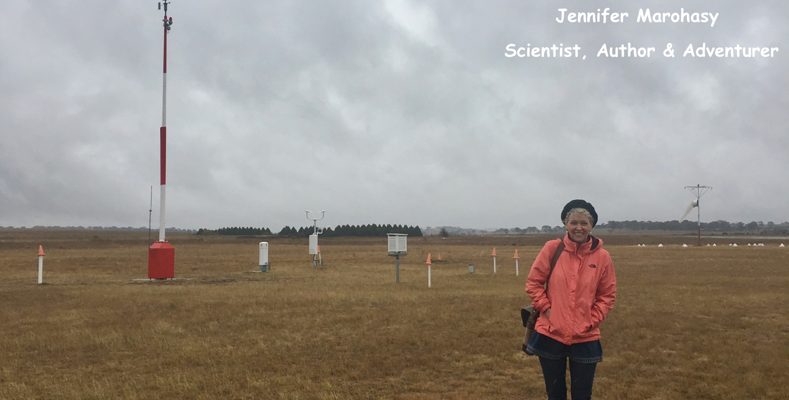
Jennifer Marohasy BSc PhD has worked in industry and government. She is currently researching a novel technique for long-range weather forecasting funded by the B. Macfie Family Foundation. Read more

Subscribe For News Updates

Subscribe Me

Contact Me

To get in touch with Jennifer call 0418873222 or international call +61418873222.

Email: jennifermarohasy at gmail.com

Connect With Me

  • Facebook
  • LinkedIn
  • RSS
  • Twitter
  • YouTube

Copyright © 2014 - 2018 Jennifer Marohasy. All rights reserved. | Legal

Website by 46digital