• Skip to primary navigation
  • Skip to main content
  • Skip to primary sidebar
  • Skip to footer
Jennifer Marohasy

Jennifer Marohasy

a forum for the discussion of issues concerning the natural environment

  • Home
  • About
  • Publications
  • Speaker
  • Blog
  • Temperatures
  • Coral Reefs
  • Contact
  • Subscribe

Blog

Wettest September on Record in Murray Darling

October 12, 2016 By jennifer

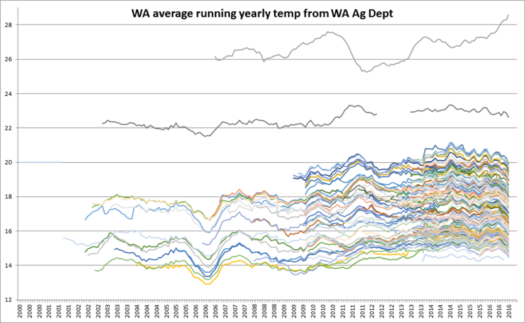
FOR over a decade the Bureau of Meteorology, and CSIRO have been predicting on-going drought in the Murray Darling Basin. Hundreds of scientists have been employed –at the expense of tax payers – to run General Simulation Models all predicting the same outcome.  This forecast decline has been blamed on global-warming and has resulted in far-reaching legislative changes, which by reducing the amount of water that can be allocated to grow crops, has affected employment in regional centers.

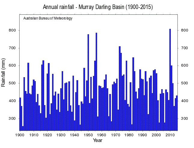
Yet when we look at the hard data, there has been no overall decline in rainfall. The wettest year in the Murray Darling Basin was 2010 – that is the wettest year since 1900 according to the official Bureau of Meteorology statistics.

Annual average rainfall in the Murray Darling Basin, 1900 to 2015.

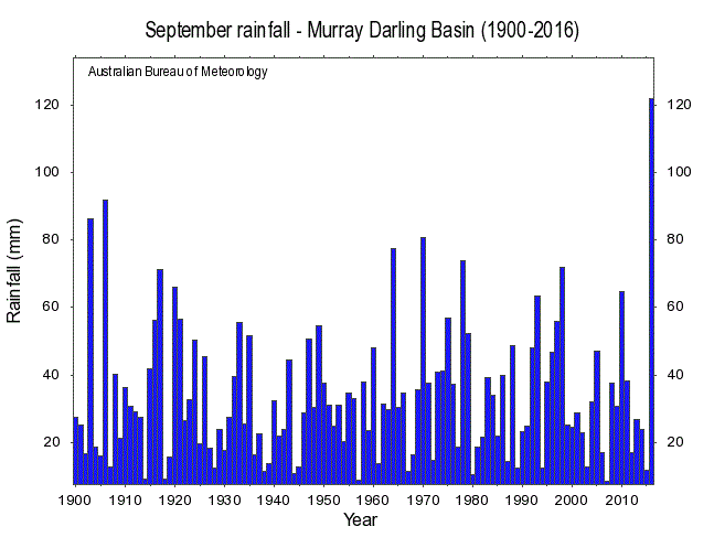
It has also been repeatedly stated that the drought conditions are going to be most pronounced over the cooler months, specifically from April through to October.

Yet the Basin has just experienced its wettest September on record – that is the wettest September since 1900 according to the official Bureau of Meteorology statistics.

September rainfall in Murray Darling Basin, 1900 to 2016

Some argue that the hoarding of water in the dams based on wrong forecasts by the Bureau of Meteorology has exacerbated current flooding particularly along the Murrumbidgee and Murray Rivers – perhaps also in the Lachlan River that runs through Forbes.

The problem is that the Bureau, working with the CSIRO, have become wedded to General Circulation Models, and the failed theory of anthropogenic global warming. Over the last year we have irrigators in the Murray Darling with very limited water allocations, paying ridiculously high prices for temporary water, during a season when even the Bureau was forecating above median rainfall: remember in May while Agricultural Minister Barnaby Joyce was announcing concessional loans, the price of ‘temporary water’, on the market – increasingly controlled by governments – had increased from $30 per megalitres to almost $300 per megalitres as a direct result of the water buybacks – and limited water allocations for ‘general security’ water licence holders.  This is no way to run a productive agricultural sector.


Filed Under: Information Tagged With: Water

Understanding the Wild, Wet Weather across Southern Australia

October 4, 2016 By jennifer

The wild, wet weather across southern Australia this spring is a consequence of an unusually strong temperature gradient, especially evident in the following chart as warm water to the north of Australia (especially in the Timor and Arafura Seas), and the cold waters off the southwest of Australia.

Thanks to NOAA, http://www.esrl.noaa.gov/psd/map/clim/sst.shtml

Former head of Australia’s National Climate Centre, Bill Kininmonth, recently emailed me:

The warm water has increased the supply of moisture feeding into the airflow over Australia. The moisture increases by nearly 7 percent with each degree C temperature rise. The cold water to the south and west of Australia tightens the temperature gradient and increases the potential for storm development (technically it is called increasing baroclinic instability). It is normal to have a period of tightening temperature gradient during spring time – the nearby ocean and land of southern Australia are cold after winter but the approach of summer is warming ocean and water of north Australia. Because of this annual tightening of the gradient, spring is the wettest period with often strong storms over southeast Australia. This year has been particularly wet and stormy because of the pattern of sea surface temperature anomalies. It is not climate change.

As the oceans have a critical influence on land temperatures, this same pattern is evident in the surface temperature data for Western Australia. While Perth has had its coldest September on record, it’s actually been very warm in the north of the state.

A colleague has plotted the following fascinating chart which shows a running yearly average of mean temperatures from 180 sites as recorded by the WA Agriculture Department.

Thanks to a friend and colleague, who wishes to remain anonymous

The top line is Kununurra, in the far north, showing temperatures are still rising. The next line is Carnarvon. The great mass of lines are the southwest corner of WA from just north of Geraldton to east of Esperance and these show temperatures are all falling. The coldest lines are at elevated places like Mt Barker. The brown line starting around 2008, and at 16.7C, is South Perth.

There is a remarkable consistency about the southwest corner where the coolest 12 months ended in mid-2006 and the average then climbed around 2.5C to a peak in late 2014 and has dropped by a little over 1C since then.

So what happens next?

The water to the far northwest is very warm as can be seen by the rise in Kununurra surface temperatures, and the orange in the NOAA sea surface temperature map.  The Leeuwin current that brings the warm water down the coast is normally weakest in the summer months and strongest over the autumn and winter.

Filed Under: Information Tagged With: Temperatures

Transmission Pylons Rather Than Wind Turbines: Collapsed

September 29, 2016 By jennifer

WHILE the storm that hit South Australia yesterday, Wednesday 28 September, was large and intense, the winds do not appear to have been particularly severe – at least not relative to what we often experience in northern Australia.  For example, a Category 2 cyclone has wind gusts of at least 125 kilometres per hour. According to ABC online news reports gusts reached 83 kilometres per hour in South Australia causing the entire state to black-out. This is the maximum speed that I can find at the Bureau of Meteorology website for Ceduna, which is on the South Australian west coast.

[image courtesy of Christian Kerr on Facebook]
[image courtesy of Christian Kerr on Facebook]
At Port Augusta, where I understand transmission towers collapsed, wind gusts of 87 kilometres per hour were recorded; this is the maximum speeds I can find anywhere at the Bureau website. There are reports on Twitter that, somewhere, 130 kilometre per hour winds were recorded; but I have not been able to verify this.

Nevertheless, this is still much less severe than would typically be experienced during a northern Australian cyclone, with the Queensland electricity grid withstanding recent cyclone Marcia (156 km/hr) and even Yasi (285 km/hr gusts) – though there was local damage and power outage.

The Australian Wind Alliance has issued a press release this morning stating that, “South Australia’s wind farms were pumping nearly 1,000 megawatts of energy into the state’s electricity system before yesterday’s mega storm tripped the network.” Specifically 960 megawatts at 4.30pm, covering around 50% of the state’s demand, and that the system failed because “23 transmission pylons” were “knocked out”.

I understand that the particular wind turbines common in South Australia cut-out at 90 kilometres per hour. So, it is plausible given: 1. readings from the Bureau website show wind gusts did not reach 90 kilometres per hour; and 2. data showing wind energy production for South Australia fluctuated between 1200 and 900 megawatts until 4.30pm when it dropped to zero – that the problem was the storm taking out transmission pylons rather than a failure of the wind turbines per se.

Nevertheless, this is unacceptable: the transmission pylons should have been built to withstand much more severe weather events.

UPDATE – 5 OCTOBER 2016

The Australian
Michael Owen, SA Bureau Chief, Adelaide  @mjowen

South Australian Premier Jay Weatherill’s insistence that last week’s statewide blackout was wholly related to severe storms has been cast into doubt by the release of a preliminary report by the Australian Energy Market Operator, which shows there was a reduction in wind farm generation at connection points leading up to the outage.  The report said more analysis was required to determine what that cause was.

A summary of the AEMO interim report said the storms caused multiple transmission system faults, including the loss of three major 275 kV transmission lines north of Adelaide in the space of 12 seconds.

The report said generation initially flowed through the damaged systems but “following an extensive number of faults in a short period [seconds], 315 MW of wind generation disconnected”.

“The uncontrolled reduction in generation resulted in increased flow on the main Victorian interconnector to make up the deficit,” AEMO said.

This resulted in the interconnector overloading and an automatic-protection mechanism tripping the interconnector to protect it from damage, causing the rest of the state to go black.

…  A transmission tower carrying power lines was toppled by high winds near Melrose in South Australia during the storm.

… The AEMO investigation found that the uncontrolled disconnection of 315MW of wind power “increased the flow on the main Victorian interconnector (Heywood) to make up the deficit and resulted in the interconnector overloading”, he said.

“To avoid damage to the interconnector, the automatic-protection mechanism activated, tripping the interconnector and resulting in the remaining customer load and electricity generation in SA being lost.”

“That is not how the electricity system should be operating and the Premier has been badly exposed by this preliminary report… ”

The report can be downloaded here: https://www.aemo.com.au/Media-Centre/-/media/BE174B1732CB4B3ABB74BD507664B270.ashx


Filed Under: Information Tagged With: wind

Unsettled Malcolm Roberts queries United Nation’s science

September 18, 2016 By jennifer

THERE is nothing new under the sun according to both the Bible and Shakespeare; and One Nation Senator Malcolm Roberts would not purport to be the first to claim the atmosphere cools the surface of the earth that is warmed by the sun. He stated this in his maiden speech in the Australian parliament on Tuesday. Apparently perplexed by the concept, Guardian Australia’s environmental reporter Michael Slezak, could have sought expert advice, but instead he rephrased the statement concluding that Roberts’ was wrong because “the atmosphere is not freezing”. Another journalist, Latika Bourke writing in The Sydney Morning Herald, was less inclined to provide her own expert commentary, instead simply concluding that this statement (that the atmosphere cools the surface of the earth that is warmed by the sun) places Roberts at odds with the world’s leading scientific and research bodies including NASA, the CSIRO, and the UN’s Intergovernmental Panel on Climate Change.

Image courtesy of the Guardian

Yet it is generally acknowledged that approximately 51% of incoming solar energy is absorbed by the land and oceans, and that winds will move heat around via convection such that some areas are cooled; then of course there is evaporation.

But did Slezak and Bourke assume Roberts meant something else with his statement, or do they really believe that because the atmosphere contains carbon dioxide it must be hotter than the earth? We ask this, because Roberts did go on to immediately state in his speech: “How can anything that cools the surface warm it? It can’t.” Given Roberts’ professional training as an engineer, he would most likely have been referring to the second law of thermodynamics as originally formulated which states, heat can never pass from a colder to a warmer body without some other change, connected therewith, occurring at the same time. This is somewhat intuitive, yet the concept does appear at odds with IPCC science. How can anything that cools the surface warm it? It can’t.

Indeed, one of the key arguments put forward by the IPCC and its supporting teams, is that half of the radiation from greenhouse gases (chiefly carbon dioxide and water vapour), is directed downwards (sometimes referred to as back radiation) causing warming of the earth’s surface; and that this effect increases as the concentration of atmospheric carbon dioxide increases.

The IPCC mantra, which replaces any detailed scientific analysis of the spectral behaviour of these active gases, appears in the “scientific” section of the IPCC report AR4 (2007) and subsequently in the CSIRO’s own report of that year, “Climate Change in Australia – 2007”. The report simply states: “We believe that most of the increase in the global temperature during the latter part of the twenty first century, was very likely due to the increase in the concentration of atmospheric carbon dioxide.”

Roberts made the point in his maiden speech that from the 1930’s to the 1970’s – during the period of the greatest industrialisation in human history when our carbon dioxide output increased greatly – atmospheric temperatures actually cooled for forty years straight. At least this cooling trend is evident in some unadjusted global temperature series, and this is at odds with the CSIRO and IPCC claim that temperatures were generally trending up during the 20th Century. Currently there is arguably an approximately 18 year pause in global temperatures, as measured by NASA’s own UAH satellite-record of global temperature change in the lower atmosphere.

In fact, while not disputing that carbon dioxide is a greenhouse gas, applying an alternative model to that used in IPCC science it is possible to show how an increase in carbon dioxide could cause global cooling.

The standard hypothesis has, at its core, the unproven assumption that the heat-energy absorbed by the increase in carbon dioxide distributed throughout the atmosphere, leads to re-radiation with half of this re-radiation directed downwards – such that the temperature of the earth’s surfaces, both solid (land) and liquid (ocean), are increased. That the corresponding, increased, concentration in layers below those radiating, will simultaneously increase the re-absorption of such radiation, thus reducing the heating effect to an insignificant level, is ignored. Yet this is what calculations by university physicists and engineers shows, contrary to IPCC “science”. In addition, the higherconcentration of this same energy in this region of denser greenhouse gas, will raise the temperature of the local air sample, giving rise to enhanced convection, an effect which leads, in general, to very slightly increased lateral winds, and thus increased surface cooling.

At high altitudes, the greenhouse gases provide the only mechanism for the radiation of heat from the atmosphere to space – the other main constituents of oxygen and nitrogen being unable to do so because of their electronic structures. At these heights, the rarefied absorbers, situated above the radiating layers, are less able to re-absorb the radiation which consequentially escapes to space, thus providing a mechanism of cooling for the earth. Yes, cooling.

Indeed, increases in the concentration of carbon dioxide in these strata of very low pressure, results in increased outwards radiation not balanced by the re-absorption! Hence increased carbon dioxide – ironic as it may sound to the lay person – will result in more efficient cooling of the earth. This was a point made perhaps too subtlety by Roberts, and clearly not understood by those reporting upon his maiden speech.

****

This article was first published at On Line Opinion


Filed Under: Information, Opinion, Physics Tagged With: carbon dioxide

Speaking Truth to Power, and Correcting Brian Cox

August 19, 2016 By jennifer

IN the comments thread following my article published at On Line Opinion yesterday, someone asked:  “Does Jennifer believe that NASA and the UN are faking temperature data?”

I replied: “I don’t believe that NASA and the IPCC are faking the data: I provide compelling evidence to show this. Indeed, they, and the Bureau of Meteorology are remodelling temperature series so that they fit the theory of anthropogenic global warming.  In the case of both Amberley and Rutherglen cooling trends have been changed into warming trends without any reasonable justification.”

You can read the article here: http://onlineopinion.com.au/view.asp?article=18459

And I’m republishing it here:

CELEBRITY physicist Brian Cox misled the ABC TV Q&A audience on at least 3 points-of-fact on Monday night. This is typical of the direction that much of science is taking. Richard Horton, the current editor of the medical journal, The Lancet, recently stated that, “The case against science is straightforward: much of the scientific literature, perhaps half, may simply be untrue.”

Prof Brian Cox, image courtesy of the BBC

Firstly, Cox displayed an out-of-date NASA chart of remodelled global temperatures as proof that we have catastrophic climate change caused by industrial pollution. Another panellist on the program, One Nation Senator Malcolm Roberts, tried to raise the issue of cause and effect: querying whether there really was a link between rising temperature and carbon dioxide. This is generally accepted without question. But interestingly – beyond experiments undertaken by a chemist over 100 years ago – there is no real proof only unreliable computer simulation models.

Indeed, in 2006, John Nicol (a former Dean of Science at James Cook University) wrote to Penny Whetton (then meteorologist-in-charge of the climate science stream at CSIRO) asking if she could provide him with copies notes, internal reports, references (“peer reviewed” of course) which would provide details of the physics behind the hypothesis of global warming. She wrote back immediately promising to find some – which he thought was odd since he had assumed her office was stacked-to-the-ceiling with such literature.

Whetton even went to the trouble of contacting other colleagues – one of whom sent Nicol an inconsequential article in a Polish journal. After eighteen months of their exchanging letters and all of her promises to be helpful, all she could finally offer was the “scientific” section of “Climate Change in Australia 2007”. There, to Nicol’s amazement he found nothing apart from the oft quoted: “We believe that most of the increase in global temperatures during the second half of the 20th century was very likely due to increases in the concentration of atmospheric carbon dioxide”.

“Believe”, “most”, and “very likely” are jargon, perhaps meaning “we don’t have a clue”.

The chart Cox held up on Monday night – now all-over-the-internet as proof of global warming – essentially represents a remodelling of observed surface temperature measurements to confirm a belief, that we most likely have catastrophic global warming.

The accurate UAH satellite record shows a spike in temperatures in 1997-1998 associated with the El Nino back then, followed by a long pause of about 17 years, before the recent spike at the end of 2015-beginning of 2016. The recent spike was also caused by an El Nino event. Global-temperatures have been plummeting since March, and are now almost back to pause-levels. Indeed, Roberts was more correct than Cox, when he claimed there had been no warming for about 21 years – despite the rise in atmospheric levels of carbon dioxide.

The second misleading statement from Cox on Monday night concerned the nature of the modern sceptic – often harshly labelled a denier. Cox suggested that sceptics were the type of people that would even deny the moon-landing. In making this claim he was no doubt alluding to research, since discredited, funded by the Australian Research Council, that attempted to draw a link between scepticism of anthropogenic global warming and believing in conspiracies.

In fact, astronaut Harrison Schmitt – who actually stood on the moon, drilled holes, collected moon rocks, and has since returned to Earth – is a well-known sceptic of anthropogenic global warming. In short, Astronaut Harrison knows the moon-landing was real, but does not believe carbon dioxide plays a significant role in causing weather and climate change. In fact, Schmitt has expressed the view – a very similar view to Roberts – that the risks posed by climate change are overrated. Harrison has even suggested that climate change is a tool for people who are trying to increase the size of government – though he does not deny that he has been to the moon and back.

Thirdly, Cox has qualifications in particle physics, yet on Monday night he incorrectly stated that Albert Einstein devised the four-dimensional-space-time continuum. Those with a particular interest in the history of relativity theory know that while Einstein reproduced the Lorenz equations using a different philosophical interpretation, he was not the first to put these equations into the context of the 4-dimensional continuum – that was done by Hermann Minkowski. Minkowski reformulated in four dimensions the then-recent theory of special relativity concluding that time and space should be treated equally. This subsequently gave rise to the concept of events taking place in a unified four-dimensional space-time continuum.

Then again, Cox may not care too much for facts. He is not only a celebrity scientist, but also a rock star. Just the other day I was watching a YouTube video of him playing keyboard as the lead-singer of the band screamed, “We don’t need a reason”.

There was once a clear distinction between science – that was about reason and evidence – and art that could venture into the make-believe including through the re-interpretation of facts. This line is increasingly blurred in climate science where data is now routinely remodeled to make it more consistent with global warming theory.

For example, I’m currently working on a 61-page expose of the situation at Rutherglen. Since November 1912, air temperatures have been measured at an agricultural research station near Rutherglen in northern Victoria, Australia. The data is of high quality, therefore, there is no scientific reason to apply adjustments in order to calculate temperature trends and extremes. Mean annual temperatures oscillate between 15.8°C and 13.4°C. The hottest years are 1914 and 2007; there is no overall warming-trend. The hottest summer was in 1938-1939 when Victoria experienced the Black Friday bushfire disaster. This 1938-39 summer was 3°C hotter than the average-maximum summer temperature at Rutherglen for the entire period: December 1912 to February 2016. Minimum annual temperatures also show significant inter-annual variability.

In short, this temperature data – like most of the series from the 112 locations used to concoct the historical temperature record by the Australian Bureau of Meteorology – does not accord with global warming theory.
So, adjustments are made by the Australian Bureau of Meteorology to these individual series before they are incorporated into the Australian Climate Observations Reference Network – Surface Air Temperature (ACORN-SAT); and also the UK Met Office’s HadCRUT dataset, which informs IPCC deliberations.

The spike in maximum temperatures in 1938-1939 is erroneously identified as a statistical error, and all temperatures before 1938 adjusted down by 0.62°C. The most significant change is to the temperature minima: all values before 1974, and 1966, are adjusted-down by 0.61°C and 0.72°C, respectively. For the year 1913, there is a 1.3°C difference between the annual raw minimum value as measured at Rutherglen and the remodelled value.

The net effect of the remodelling is to create statistically significant warming of 0.7 °C in the ACORN-SAT mean temperature series for Rutherglen: in general agreement with anthropogenic global warming theory.

NASA applies a very similar technique to the thousands of stations used to reproduce the chart that Cox held-up on Monday night during the Q&A program. I discussed these change back in 2014 with Gavin Schmidt, who oversees the production of these charts at NASA. I was specifically complaining about how they remodel the data for Amberley, a military base near where I live in Queensland.

Back in 2014, the un-adjusted mean annual maximum temperatures for Amberley – since recordings were first made in 1941 – showed temperatures trending up from a low of about 25.5°C in 1950 to a peak of almost 28.5°C in 2002. The minimum temperatures – minima are a measure of lowest temperatures – for Amberley showed cooling from about 1970. Of course this does not accord with anthropogenic global warming theory. To quote Karl Braganza from the Bureau as published by that online rag The Conversation, “Patterns of temperature change that are uniquely associated with the enhanced greenhouse effect, and which have been observed in the real world include… Greater warming in winter compared with summer… Greater warming of night time temperatures than daytime temperatures”.

So, the Bureau has “corrected” this inconvenient truth at Amberley by jumping-up the minimum temperatures twice through the homogenisation process: once around 1980 and then around 1996 to achieve a combined temperature increase of over 1.5°C.

This is obviously a very large step-change, remembering that the entire temperature increase associated with global warming over the 20th century is generally considered to be in the order of 0.9°C.

According to various peer-reviewed papers, and technical reports, homogenisation as practiced in climate science is a technique that enables non-climatic factors to be eliminated from temperature series – by making various adjustments.

It is often done when there is a site change (for example from a post office to an airport), or equipment change (from a Glaisher stand to a Stevenson screen). But at Amberley neither of these criteria can be applied. The temperatures have been recorded at the same well-maintained site within the perimeter of the air force base since 1941. Through the homogenisation process the Bureau have changed what was a cooling trend in the minimum temperature of 1.0°C per century, into a warming trend of 2.5°C per century. This has not resulted in some small change to the temperatures as measured at Amberley, but rather a change in the temperature trend from one of cooling to dramatic warming; this is also what was done to the minimum temperature series for Rutherglen – and also without justification.

NASA’s Goddard Institute for Space Studies (GISS) based in New York also applies a jump-up to the Amberley series in 1980, and makes other changes, so that the annual average temperature for Amberley increases from 1941 to 2012 by about 2°C.

The new Director of GISS, Gavin Schmidt, explained to me on Twitter back in 2014 that: “@jennmarohasy There is an inhomogenity detected (~1980) and based on continuity w/nearby stations it is corrected. #notrocketscience”.

When I sought clarification regarding what was meant by “nearby” stations I was provided with a link to a list of 310 localities used by climate scientists at Berkeley when homogenising the Amberley data.

The inclusion of Berkeley scientists was perhaps to make the point that all the key institutions working on temperature series (the Australian Bureau, NASA, and also scientists at Berkeley) appreciated the need to adjust-up the temperatures at Amberley. So, rock star scientists can claim an absolute consensus?

But these 310 “nearby” stations, they stretch to a radius of 974 kilometres and include Frederick Reef in the Coral Sea, Quilpie post office and even Bourke post office. Considering the un-adjusted data for the six nearest stations with long and continuous records (old Brisbane aero, Cape Moreton Lighthouse, Gayndah post office, Bundaberg post office, Miles post office and Yamba pilot station) the Bureau’s jump-up for Amberley creates an increase for the official temperature trend of 0.75°C per century.

Temperatures at old Brisbane aero (the closest of these stations), also shows a long-term cooling trend. Indeed perhaps the cooling at Amberley is real. Why not consider this, particularly in the absence of real physical evidence to the contrary? In the Twitter conversation with Schmidt I suggested it was nonsense to use temperature data from radically different climatic zones to homogenise Amberley, and repeated my original question asking why it was necessary to change the original temperature record in the first place. Schmidt replied, “@jennmarohasy Your question is ill-posed. No-one changed the trend directly. Instead procedures correct for a detected jump around ~1980.”

If Twitter was around at the time George Orwell was writing the dystopian fiction Nineteen Eighty-Four, I wonder whether he might have borrowed some text from Schmidt’s tweets, particularly when words like, “procedures correct” refer to mathematical algorithms reaching out to “nearby” locations that are across the Coral Sea and beyond the Great Dividing Range to change what was a mild cooling-trend, into dramatic warming, for an otherwise perfectly politically-incorrect temperature series.

Horton, the somewhat disillusioned editor of The Lancet, also stated recently that science is, “Afflicted by studies with small sample sizes, tiny effects, invalid exploratory analyses, and flagrant conflicts of interest, together with an obsession for pursuing fashionable trends of dubious importance, science has taken a turn towards darkness.” I would not go that far! I am not sure it has taken a turn for darkness – perhaps just a turn towards the make-believe. Much of climate science, in particular, is now underpinned with a postmodernist epistemology – it is simply suspicious of reason and has an acute sensitivity to the role of ideology in asserting and maintaining particular power-structures including through the homogenisation of historical temperature data.

Filed Under: Information Tagged With: Temperatures

Auditor-General Dismisses Need for Scrutiny of Bureau’s Homogenization Methodology

June 21, 2016 By jennifer

SURFACE air temperatures, as measured at weather stations across Australia, are routinely remodeled through a process of homogenization.  After the remodeling of approximately 100 individual temperature series, various area weightings are applied to these individual series, then the average annual temperature is calculated for each state and territory, the entire continent, and used to report climate change.

Issues of concern are the process of homogenization, the choice of stations, the way the homogenized data series are combined, and whether this provides an accurate representation of the historic temperature record for Australia.

There has been no independent assessment of this methodology.  I made a request for the same in a letter to Grant Hehir, Auditor-General of Australia, with supporting information on 11th November 2015.  This requested was rejected without any consideration of the evidence.  I used Rutherglen as a case study, and queried the rational for dropping down temperatures in the early part of the Rutherglen record when their had been no site move or equipment change.  These adjustments turned a slight cooling trend in the minimum temperatures as recorded at Rutherglen, into dramatic warming, as illustrated in this chart.

Green squares show annual mean minimum temperatures, red dots show these values after homogenization. In dropping down the early mean minima the Bureau changes slight cooling at Rutherglen, into warming of 1.7 degrees Celsius per century.

My submission to the Auditor General can be downloaded here.

I am currently working on an alternative temperature reconstrution for Australia.   By the end of the year I hope to be able to publish an accurate reconstruction for the state of Victoria, and also Australia’s East Coast lighthouses.

Filed Under: Information Tagged With: Temperatures

  • « Go to Previous Page
  • Go to page 1
  • Interim pages omitted …
  • Go to page 24
  • Go to page 25
  • Go to page 26
  • Go to page 27
  • Go to page 28
  • Interim pages omitted …
  • Go to page 607
  • Go to Next Page »

Primary Sidebar

Recent Comments

  • Ian Thomson on Vax-ed as Sick as Unvax-ed, Amongst My Friends
  • Dave Ross on Vax-ed as Sick as Unvax-ed, Amongst My Friends
  • Dave Ross on Vax-ed as Sick as Unvax-ed, Amongst My Friends
  • Alex on Incarceration Nation: Frightened of Ivermectin, and Dihydrogen monoxide
  • Wilhelm Grimm III on Incarceration Nation: Frightened of Ivermectin, and Dihydrogen monoxide

Subscribe For News Updates

  • This field is for validation purposes and should be left unchanged.

December 2025
M T W T F S S
1234567
891011121314
15161718192021
22232425262728
293031  
« Jan    

Archives

Footer

About Me

Jennifer Marohasy 
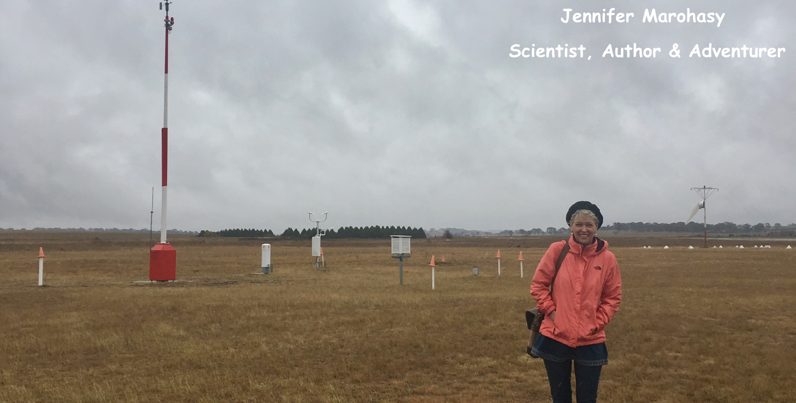
Jennifer Marohasy BSc PhD has worked in industry and government. She is currently researching a novel technique for long-range weather forecasting funded by the B. Macfie Family Foundation. Read more

Subscribe For News Updates

Subscribe Me

Contact Me

To get in touch with Jennifer call 0418873222 or international call +61418873222.

Email: jennifermarohasy at gmail.com

Connect With Me

  • Facebook
  • LinkedIn
  • RSS
  • Twitter
  • YouTube

Copyright © 2014 - 2018 Jennifer Marohasy. All rights reserved. | Legal

Website by 46digital