• Skip to primary navigation
  • Skip to main content
  • Skip to primary sidebar
  • Skip to footer
Jennifer Marohasy

Jennifer Marohasy

a forum for the discussion of issues concerning the natural environment

  • Home
  • About
  • Publications
  • Speaker
  • Blog
  • Temperatures
  • Coral Reefs
  • Contact
  • Subscribe

Information

Speaking Truth to Power, and Correcting Brian Cox

August 19, 2016 By jennifer

IN the comments thread following my article published at On Line Opinion yesterday, someone asked:  “Does Jennifer believe that NASA and the UN are faking temperature data?”

I replied: “I don’t believe that NASA and the IPCC are faking the data: I provide compelling evidence to show this. Indeed, they, and the Bureau of Meteorology are remodelling temperature series so that they fit the theory of anthropogenic global warming.  In the case of both Amberley and Rutherglen cooling trends have been changed into warming trends without any reasonable justification.”

You can read the article here: http://onlineopinion.com.au/view.asp?article=18459

And I’m republishing it here:

CELEBRITY physicist Brian Cox misled the ABC TV Q&A audience on at least 3 points-of-fact on Monday night. This is typical of the direction that much of science is taking. Richard Horton, the current editor of the medical journal, The Lancet, recently stated that, “The case against science is straightforward: much of the scientific literature, perhaps half, may simply be untrue.”

Prof Brian Cox, image courtesy of the BBC

Firstly, Cox displayed an out-of-date NASA chart of remodelled global temperatures as proof that we have catastrophic climate change caused by industrial pollution. Another panellist on the program, One Nation Senator Malcolm Roberts, tried to raise the issue of cause and effect: querying whether there really was a link between rising temperature and carbon dioxide. This is generally accepted without question. But interestingly – beyond experiments undertaken by a chemist over 100 years ago – there is no real proof only unreliable computer simulation models.

Indeed, in 2006, John Nicol (a former Dean of Science at James Cook University) wrote to Penny Whetton (then meteorologist-in-charge of the climate science stream at CSIRO) asking if she could provide him with copies notes, internal reports, references (“peer reviewed” of course) which would provide details of the physics behind the hypothesis of global warming. She wrote back immediately promising to find some – which he thought was odd since he had assumed her office was stacked-to-the-ceiling with such literature.

Whetton even went to the trouble of contacting other colleagues – one of whom sent Nicol an inconsequential article in a Polish journal. After eighteen months of their exchanging letters and all of her promises to be helpful, all she could finally offer was the “scientific” section of “Climate Change in Australia 2007”. There, to Nicol’s amazement he found nothing apart from the oft quoted: “We believe that most of the increase in global temperatures during the second half of the 20th century was very likely due to increases in the concentration of atmospheric carbon dioxide”.

“Believe”, “most”, and “very likely” are jargon, perhaps meaning “we don’t have a clue”.

The chart Cox held up on Monday night – now all-over-the-internet as proof of global warming – essentially represents a remodelling of observed surface temperature measurements to confirm a belief, that we most likely have catastrophic global warming.

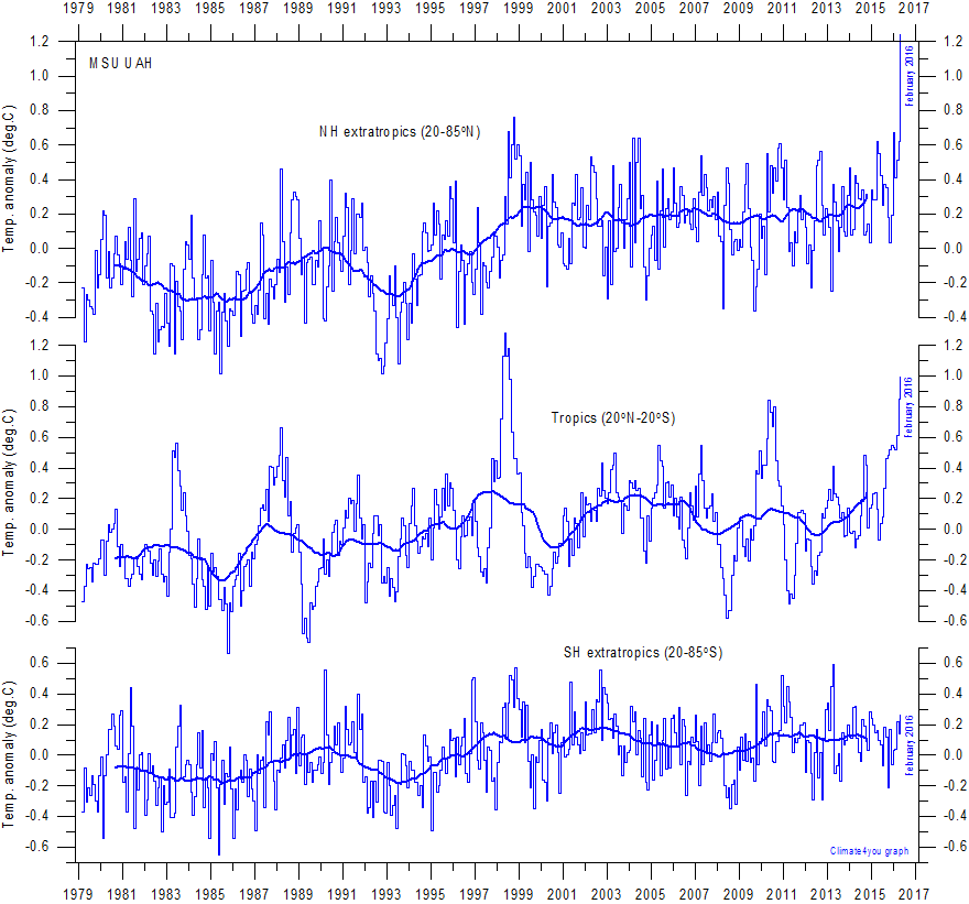
The accurate UAH satellite record shows a spike in temperatures in 1997-1998 associated with the El Nino back then, followed by a long pause of about 17 years, before the recent spike at the end of 2015-beginning of 2016. The recent spike was also caused by an El Nino event. Global-temperatures have been plummeting since March, and are now almost back to pause-levels. Indeed, Roberts was more correct than Cox, when he claimed there had been no warming for about 21 years – despite the rise in atmospheric levels of carbon dioxide.

The second misleading statement from Cox on Monday night concerned the nature of the modern sceptic – often harshly labelled a denier. Cox suggested that sceptics were the type of people that would even deny the moon-landing. In making this claim he was no doubt alluding to research, since discredited, funded by the Australian Research Council, that attempted to draw a link between scepticism of anthropogenic global warming and believing in conspiracies.

In fact, astronaut Harrison Schmitt – who actually stood on the moon, drilled holes, collected moon rocks, and has since returned to Earth – is a well-known sceptic of anthropogenic global warming. In short, Astronaut Harrison knows the moon-landing was real, but does not believe carbon dioxide plays a significant role in causing weather and climate change. In fact, Schmitt has expressed the view – a very similar view to Roberts – that the risks posed by climate change are overrated. Harrison has even suggested that climate change is a tool for people who are trying to increase the size of government – though he does not deny that he has been to the moon and back.

Thirdly, Cox has qualifications in particle physics, yet on Monday night he incorrectly stated that Albert Einstein devised the four-dimensional-space-time continuum. Those with a particular interest in the history of relativity theory know that while Einstein reproduced the Lorenz equations using a different philosophical interpretation, he was not the first to put these equations into the context of the 4-dimensional continuum – that was done by Hermann Minkowski. Minkowski reformulated in four dimensions the then-recent theory of special relativity concluding that time and space should be treated equally. This subsequently gave rise to the concept of events taking place in a unified four-dimensional space-time continuum.

Then again, Cox may not care too much for facts. He is not only a celebrity scientist, but also a rock star. Just the other day I was watching a YouTube video of him playing keyboard as the lead-singer of the band screamed, “We don’t need a reason”.

There was once a clear distinction between science – that was about reason and evidence – and art that could venture into the make-believe including through the re-interpretation of facts. This line is increasingly blurred in climate science where data is now routinely remodeled to make it more consistent with global warming theory.

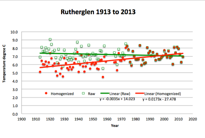
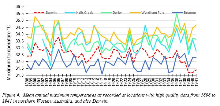
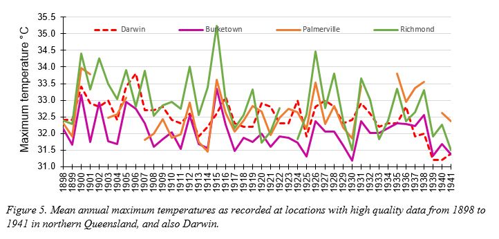
For example, I’m currently working on a 61-page expose of the situation at Rutherglen. Since November 1912, air temperatures have been measured at an agricultural research station near Rutherglen in northern Victoria, Australia. The data is of high quality, therefore, there is no scientific reason to apply adjustments in order to calculate temperature trends and extremes. Mean annual temperatures oscillate between 15.8°C and 13.4°C. The hottest years are 1914 and 2007; there is no overall warming-trend. The hottest summer was in 1938-1939 when Victoria experienced the Black Friday bushfire disaster. This 1938-39 summer was 3°C hotter than the average-maximum summer temperature at Rutherglen for the entire period: December 1912 to February 2016. Minimum annual temperatures also show significant inter-annual variability.

In short, this temperature data – like most of the series from the 112 locations used to concoct the historical temperature record by the Australian Bureau of Meteorology – does not accord with global warming theory.
So, adjustments are made by the Australian Bureau of Meteorology to these individual series before they are incorporated into the Australian Climate Observations Reference Network – Surface Air Temperature (ACORN-SAT); and also the UK Met Office’s HadCRUT dataset, which informs IPCC deliberations.

The spike in maximum temperatures in 1938-1939 is erroneously identified as a statistical error, and all temperatures before 1938 adjusted down by 0.62°C. The most significant change is to the temperature minima: all values before 1974, and 1966, are adjusted-down by 0.61°C and 0.72°C, respectively. For the year 1913, there is a 1.3°C difference between the annual raw minimum value as measured at Rutherglen and the remodelled value.

The net effect of the remodelling is to create statistically significant warming of 0.7 °C in the ACORN-SAT mean temperature series for Rutherglen: in general agreement with anthropogenic global warming theory.

NASA applies a very similar technique to the thousands of stations used to reproduce the chart that Cox held-up on Monday night during the Q&A program. I discussed these change back in 2014 with Gavin Schmidt, who oversees the production of these charts at NASA. I was specifically complaining about how they remodel the data for Amberley, a military base near where I live in Queensland.

Back in 2014, the un-adjusted mean annual maximum temperatures for Amberley – since recordings were first made in 1941 – showed temperatures trending up from a low of about 25.5°C in 1950 to a peak of almost 28.5°C in 2002. The minimum temperatures – minima are a measure of lowest temperatures – for Amberley showed cooling from about 1970. Of course this does not accord with anthropogenic global warming theory. To quote Karl Braganza from the Bureau as published by that online rag The Conversation, “Patterns of temperature change that are uniquely associated with the enhanced greenhouse effect, and which have been observed in the real world include… Greater warming in winter compared with summer… Greater warming of night time temperatures than daytime temperatures”.

So, the Bureau has “corrected” this inconvenient truth at Amberley by jumping-up the minimum temperatures twice through the homogenisation process: once around 1980 and then around 1996 to achieve a combined temperature increase of over 1.5°C.

This is obviously a very large step-change, remembering that the entire temperature increase associated with global warming over the 20th century is generally considered to be in the order of 0.9°C.

According to various peer-reviewed papers, and technical reports, homogenisation as practiced in climate science is a technique that enables non-climatic factors to be eliminated from temperature series – by making various adjustments.

It is often done when there is a site change (for example from a post office to an airport), or equipment change (from a Glaisher stand to a Stevenson screen). But at Amberley neither of these criteria can be applied. The temperatures have been recorded at the same well-maintained site within the perimeter of the air force base since 1941. Through the homogenisation process the Bureau have changed what was a cooling trend in the minimum temperature of 1.0°C per century, into a warming trend of 2.5°C per century. This has not resulted in some small change to the temperatures as measured at Amberley, but rather a change in the temperature trend from one of cooling to dramatic warming; this is also what was done to the minimum temperature series for Rutherglen – and also without justification.

NASA’s Goddard Institute for Space Studies (GISS) based in New York also applies a jump-up to the Amberley series in 1980, and makes other changes, so that the annual average temperature for Amberley increases from 1941 to 2012 by about 2°C.

The new Director of GISS, Gavin Schmidt, explained to me on Twitter back in 2014 that: “@jennmarohasy There is an inhomogenity detected (~1980) and based on continuity w/nearby stations it is corrected. #notrocketscience”.

When I sought clarification regarding what was meant by “nearby” stations I was provided with a link to a list of 310 localities used by climate scientists at Berkeley when homogenising the Amberley data.

The inclusion of Berkeley scientists was perhaps to make the point that all the key institutions working on temperature series (the Australian Bureau, NASA, and also scientists at Berkeley) appreciated the need to adjust-up the temperatures at Amberley. So, rock star scientists can claim an absolute consensus?

But these 310 “nearby” stations, they stretch to a radius of 974 kilometres and include Frederick Reef in the Coral Sea, Quilpie post office and even Bourke post office. Considering the un-adjusted data for the six nearest stations with long and continuous records (old Brisbane aero, Cape Moreton Lighthouse, Gayndah post office, Bundaberg post office, Miles post office and Yamba pilot station) the Bureau’s jump-up for Amberley creates an increase for the official temperature trend of 0.75°C per century.

Temperatures at old Brisbane aero (the closest of these stations), also shows a long-term cooling trend. Indeed perhaps the cooling at Amberley is real. Why not consider this, particularly in the absence of real physical evidence to the contrary? In the Twitter conversation with Schmidt I suggested it was nonsense to use temperature data from radically different climatic zones to homogenise Amberley, and repeated my original question asking why it was necessary to change the original temperature record in the first place. Schmidt replied, “@jennmarohasy Your question is ill-posed. No-one changed the trend directly. Instead procedures correct for a detected jump around ~1980.”

If Twitter was around at the time George Orwell was writing the dystopian fiction Nineteen Eighty-Four, I wonder whether he might have borrowed some text from Schmidt’s tweets, particularly when words like, “procedures correct” refer to mathematical algorithms reaching out to “nearby” locations that are across the Coral Sea and beyond the Great Dividing Range to change what was a mild cooling-trend, into dramatic warming, for an otherwise perfectly politically-incorrect temperature series.

Horton, the somewhat disillusioned editor of The Lancet, also stated recently that science is, “Afflicted by studies with small sample sizes, tiny effects, invalid exploratory analyses, and flagrant conflicts of interest, together with an obsession for pursuing fashionable trends of dubious importance, science has taken a turn towards darkness.” I would not go that far! I am not sure it has taken a turn for darkness – perhaps just a turn towards the make-believe. Much of climate science, in particular, is now underpinned with a postmodernist epistemology – it is simply suspicious of reason and has an acute sensitivity to the role of ideology in asserting and maintaining particular power-structures including through the homogenisation of historical temperature data.
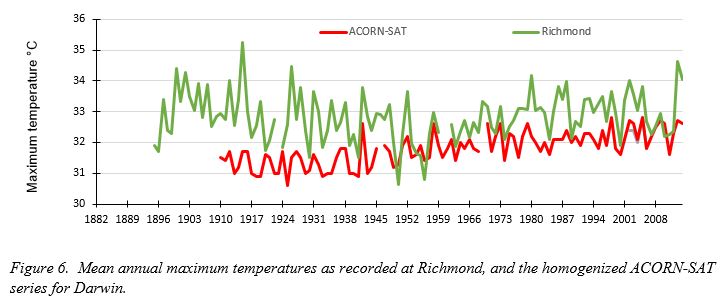
Filed Under: Information Tagged With: Temperatures

Auditor-General Dismisses Need for Scrutiny of Bureau’s Homogenization Methodology

June 21, 2016 By jennifer

SURFACE air temperatures, as measured at weather stations across Australia, are routinely remodeled through a process of homogenization.  After the remodeling of approximately 100 individual temperature series, various area weightings are applied to these individual series, then the average annual temperature is calculated for each state and territory, the entire continent, and used to report climate change.

Issues of concern are the process of homogenization, the choice of stations, the way the homogenized data series are combined, and whether this provides an accurate representation of the historic temperature record for Australia.

There has been no independent assessment of this methodology.  I made a request for the same in a letter to Grant Hehir, Auditor-General of Australia, with supporting information on 11th November 2015.  This requested was rejected without any consideration of the evidence.  I used Rutherglen as a case study, and queried the rational for dropping down temperatures in the early part of the Rutherglen record when their had been no site move or equipment change.  These adjustments turned a slight cooling trend in the minimum temperatures as recorded at Rutherglen, into dramatic warming, as illustrated in this chart.

Green squares show annual mean minimum temperatures, red dots show these values after homogenization. In dropping down the early mean minima the Bureau changes slight cooling at Rutherglen, into warming of 1.7 degrees Celsius per century.

My submission to the Auditor General can be downloaded here.

I am currently working on an alternative temperature reconstrution for Australia.   By the end of the year I hope to be able to publish an accurate reconstruction for the state of Victoria, and also Australia’s East Coast lighthouses.

Filed Under: Information Tagged With: Temperatures

Accepting Regional Variability in Global Temperatures

April 11, 2016 By jennifer

IN the very first report from the United Nation’s Intergovernmental Panel on Climate Change (IPCC) the Medieval Warm Period was evident as a period, about as warm as the present, occurring from AD 950 to 1250. In subsequent IPCC reports there is no such warm period in this historical record. Instead there is a graph, shaped like an ice-hockey stick, which suggests temperatures were flat until the 20th Century, when sudden and sustained warming occurs.

Roy Spencer and John Christy are responsible for compiling the UAH Satellite record.

The change, from the presence of a clear warm period about 1000 years ago to none at all in more recent reports, is justified by the IPCC on the basis that while it may have been warmer in Europe when the Vikings founded settlements on Greenland, and England was exporting wine to France, this warming was not global. The warming, according to the IPCC, was restricted to the North Atlantic region. Which begs the question, how important is regional variability when we are discussing global warming?

Furthermore, no-one lives in a world climate. It’s what happens locally and regionally that is most important to individual communities. We should expect that an El Nino event in the Pacific Ocean, for example, is going to affect the western United States very differently from eastern Australia. Indeed, such events are often associated with wetter conditions in southwest USA, and hotter, drier conditions in eastern Australia.

The focus on mean global temperatures, rather than regional variability, has been a consequence of the politicization of climate science and the desire to use the authority of science to force political change. Many of those opposed to this political agenda, often labelled sceptics or deniers, have focused on temperature series that show little or no global warming, while the mainstream climate science community has gone to ever more extreme lengths to make particular temperature time series conform to their theory of anthropogenic global warming.

Some so-called sceptics had been focusing on the satellite record over recent years, because that component of this record based on the mean global temperature, showed no increase since the El Nino event of 1997/98, Chart 1a. However, more recently, and largely as a consequence of the relatively warm and wet winter in the northern hemisphere, there has been another spike in the global mean temperature based on this satellite record.

This signifies the end of “the pause” in the mean global temperature for the UAH satellite record. Though, interestingly, some have simply changed their geographic focus, much as the IPCC did with the Medieval Warm Period.  In particular, some so-called sceptics now emphasis the geographic variability in the satellite record, in particular, that southern hemisphere temperatures showing no recent spike.

This is the lower troposphere component of the UAH satellite record, for select regions.
CHART 1. This is the lower troposphere component of the UAH satellite record.  Anomalies, not actual temperatures are plotted.

The satellite record as compiled by scientists John Christy and Roy Spencer, at the University of Alabama (UAH), Huntsville, includes monthly updates for the entire globe, for the northern and southern hemispheres, the south and north poles, the tropics, the United States of America, and also for Australia. The UAH satellite record also separates out ‘land’ and ‘ocean’. So, for the northern hemisphere, as an example, it is possible to understand temperature trends for the land versus ocean components of this record. When we consider the land component of the UAH satellite record for the northern hemisphere, the recent spike in temperatures is particularly pronounced, Chart 1b. Meanwhile, for Australia, there is no such recent spike in temperatures. Rather temperatures appear to cycle within an approximate 4 degree Celsius band, Chart 1c.

Patterns in the historical temperature record, and geographic variability in temperature trends, potentially gives us insight into the drivers of climate change. Many, however, would argue that as the satellite temperature record only goes back 38 years to 1978, that this is too short a period for discerning correlations with sunspots, and other extraterrestrial phenomena. In fact, consistency between the UAH satellite record for Australia, and records from individual weather station in Australia over this same period (December 1978 – March 2016), potentially gives us the opportunity to infer what temperatures would have been like at least back to when these weather stations were first installed. There is, for example, a reliable thermometer temperature record for Richmond in north eastern Australia back to 1893. Considering just the trends, not the absolute temperatures, the thermometer record for this location shows a remarkably good correlation with the satellite record for all of Australia for the period December 1978 to March 2016, Chart 2.

The monthly thermometer record for Richmond, NE Australia, compared with the UAH satellite record for all of Australia. [Note, chart 1 was a plot of anomalies, this is a plot of actual temperatures.]
CHART 2.  The monthly thermometer record for Richmond, NE Australia, compared with the UAH satellite record for all of Australia.  While chart 1 was a plot of anomalies, this is a plot of actual temperatures.  The satellite measurements are significantly cooler than surface measurements as they are measuring a volume of lower atmosphere extending up about 10 kilometers. 
The much longer unadjusted historical temperature record for Richmond also shows significant intra-annual variability but broadly with a cooling trend to 1950, following by warming to the present. The hottest year in the entire record for Richmond, consistent with many locations in eastern Australia, is 1915.

The pattern in the unadjusted thermometer record for Richmond, and the shorter satellite records for all of Australia, the northern hemisphere and the globe, are not consistent with carbon dioxide as a significant driver of temperature change.

Additional Information: 

For more information on the UAH satellite record compared with other global data bases consider reading a recent post by Bob Tisdale at WUWT: https://wattsupwiththat.com/2016/03/12/february-2016-global-surface-landocean-and-lower-troposphere-temperature-anomaly-update/

For more information on the temperature record for Richmond, and why this unadjusted series is so unique and important consider reading a recent post focused on Darwin, but also considering other sites in northern Australia, here:  https://jennifermarohasy.com.dev.internet-thinking.com.au/2016/02/12910/

I have commented in more detail on the ‘end of the pause’ and the likely reason for the recent surge in the global mean temperature, as measured by satellites, in a recent popular article at On Line Opinion here: http://www.onlineopinion.com.au/view.asp?article=18111

Filed Under: Information Tagged With: Temperatures

Satellite-based global temperatures, trending up

March 16, 2016 By jennifer

LEADING climate scientists were not acknowledging “the pause” in global warming, even though it was very apparent in the satellite-based temperatures of the lower troposphere. That was until last month.

The February update to this satellite record has broken previous records for the northern hemisphere, and indicates that global temperatures are once again on the rise, Chart 1.

chart from http://www.climate4you.com/
Chart 1, from http://www.climate4you.com/

Some have attributed this warmth to an El Nino. Mean sea level pressures, and sea surface temperatures, are consistent with an El Nino, but not a super-El Nino that would result in record high temperatures.

Most of the warmth in the lower troposphere appears to have been recorded in the northern hemisphere, Chart 1 (top).

The super-El Nino in 1997, manifested as a record hot year in the tropics in 1998, Chart 1 (middle). This is what we might expect of an El Nino, which is often defined as extensive warming of the central and eastern tropical Pacific.

The apparent lack of warming in the southern hemisphere in February, could be due to the huge recent melt at the Antarctic. Yes, melt. While the Artic has been melting, there had been growth in the extent of ice at the Antarctic over recent years.  Until February 2016, when it crashed, Chart 2.

chart from https://nsidc.org/data/seaice_index/
Chart 2, from https://nsidc.org/data/seaice_index/

A friend, Lance Pidgeon, emailed me: “The heat sucked into the melting ice would be a very large amount. It looks like the southern hemisphere sea ice anomaly went rapidly from about +1.8 million square kilometers to -0.5. This is 2.3 million of the total southern hemisphere area (255 million). Close enough to 1% of the area suddenly also began to absorb rather than reflect back due to the decrease in albedo.”

I can’t explain the apparent sudden surge in global warmth, and I don’t know anyone who predicted its magnitude.

Long range weather forecaster, Ken Ring, who bases his forecasts on lunar, solar and planetary cycles, correctly forecast the El Nino.

While the Australian Bureau of Meteorology started forecasting an El Nino from 2013, back in March 2014, Ken Ring is on record specifying that the next El Nino wouldn’t manifest until late 2015 to correspond with the minimum declination of the moon, and following what he predicted would be the year of Solar Minimum.  For those interested in lunar cycles, a minimum declination occurs every 18.6 years, so the last one corresponded with the super El Nino of 1997/1998.

The late Bob Carter would assure us that climate always changes, and that the warming that occurred this February 2016 is still very much within the range of natural variability.

I’m not going to quibble with this, and global temperatures may be dropping again by April, once the El Nino has decayed. Nevertheless, the capacity of sceptics to thumb their nose at the scientific consensus by drawing attention to “the pause” has been dealt a blow by the recent melt at the Antarctic, and the February update to the Satellite record.

Filed Under: Information Tagged With: El Nino, Temperatures

Rainfall Forecasts Should be Benchmarked

February 23, 2016 By jennifer

ACCORDING to Bill Gates, “You can achieve incredible progress if you set a clear goal and find a measure that will drive progress towards that goal.” This may seem basic, but it’s not practiced enough, and certainly not when it comes to rainfall forecasting.

John Abbot's corvette which was submerged in the Brisbane flooding of January 2011.
John Abbot’s corvette which was submerged in the Brisbane flooding of January 2011.

The Bureau of Meteorology increasingly use their weather and climate forecasts to warn of looming catastrophe. This use of ‘forecasts’ to advance an agenda is common in politics, but it’s not something the Bureau should be engaged in.

A key Bureau goal should be the best possible rainfall forecast for the public. Their rainfall forecast should be presented and reported in a measurable and understandable way. Instead we are given vague probabilities, which research has shown are often misinterpreted by farmers.

Furthermore, there should be some follow-up. For example, at the end of a week, a month, or a season we should be told how reliable their daily, monthly and seasonal forecasts have actually been.

Its five years now since Brisbane flooded, so about five years since I started working with John Abbot and artificial neural networks to see if was possible to actually forecast the extraordinary wet season of summer 2010/2011 in south eastern Queensland.

Back in 2010, sea surface temperature and sea surface pressures profiles across the Pacific suggested we were in for a big wet. Yet the Wivenhoe reservoir upstream of Brisbane, a dam actually built for flood mitigation, was kept full of water.

John Abbot’s little red corvette sports car was drown in the Brisbane flood. It was in a river-side garage in St Lucia, Brisbane, and totally submerged for 36 hours. He was heartbroken. The loss spurred us to see if we couldn’t apply the technique he had used to make the money to buy that car, to rainfall forecasting. In particular, we were keen to see if artificial neural networks with the right algorithms, and high quality historical temperature and rainfall data, could have forecast the flooding. John Abbot regularly used artificial neural networks and historical trading data to successful forecast directional trends in the share market.

By August 2011 we had monthly rainfall forecasts for 20 sites across Queensland, and we wanted for compare our output from the best general circulation model (POAMA) used by the Bureau of Meteorology. But try as we might we couldn’t actually get the taxpayer-funded Bureau to give us the data we needed to make proper comparisons.

The Bureau were not doing the one thing that Bill Gates says is critical to improvement: benchmarking.

After flying to Melbourne, and threatening to jump out a sixth floor window if the data wasn’t handed over (well I exaggerate somewhat), we got access to only enough data to enable us to publish a series of papers. Indeed, the Bureau still refuses to make available the most basic of data which would allow their rainfall forecasts to be objectively scored.

Back in 2011 it was evident that John Abbot and I could do a better monthly rainfall forecast than the Bureau. To our surprise key science managers at the Bureau agreed: conceding that our forecasts were more skillful. But, they argued, climate was on a new trajectory so our method would not work into the future!

This claim is, of course, based on the theory of anthropogenic global warming. This is the same theory that continues to underpin all the forecasts provided by the Bureau through the use of general circulation models.

An alternative approach using artificial neural networks, fits under the umbrella of ‘Big Data’ and ‘machine learning,’ that relies on pattern analysis, and is proving successful at forecasting, where results are properly benchmarked, in fields as diverse as medical diagnostics, financial forecasting and marketing analysis.

I will be in Deniliquin, NSW, on Friday 26th February, showing both temperature and rainfall data for the Murray Darling region that indicate our climate is not on a new trajectory. I will also be explaining the principles of rainfall forecasts using artificial neural networks, and making some forecasts.

I will also show how proxy data giving an indication of climate change over the last 2,000 years can be deconstructed into sine curves. Seven sine curves of different frequency and amplitude potentially corresponding to natural climate cycles driven by variations in the Earth’s orbit and solar activity (e.g. magnetic field) can be used to generate a sinusoidal projection, suggesting future global cooling. Cooling in the Murray Darling Basin is typically associated with period of below average rainfall.

Five sine curves which can be fitted to proxy data corresponding to a temperature reconstruction from a South African stalagmite.

The information session is being held by West Berriquin Irrigators at the local Deniliquin RSL from 6pm. RSVP to Linda Fawns on 0409 044 754 or westberriquinirrigators@gmail.com.

Filed Under: Information Tagged With: Floods, Temperatures

Why we should rally against homogenization, and I don’t mean of milk

February 9, 2016 By jennifer

I was invited to speak at the Liberal Democrats Conference in Sydney last Sunday.   I began by explaining that while the delegates may have though homogenization was a term used exclusively for milk, that homogenization is also a technical term used in climate science, but with an altogether different meaning. It allows scientists to remodel historical temperature data so it’s closer to the heart’s desire.

These few words – closer to the heart’s desire – have been borrowed from that famous poem the Rubaiyat of Omar Khayyam. The stanza reads:

Ah, Love! could thou and I with Fate conspire
To grasp this sorry Scheme of Things entire!
Would not we shatter it to bits-and then
Re-mould it nearer to the Heart’s Desire!

Omar used the word “remould”, climate scientists say they are improving the data.

The end result is the same: something has been changed.

The scientific revolution rejected unnatural causes to explain natural phenomena, rejected appeals to authority, and rejected revelation, in favor of empirical evidence. Today, the biggest threat to science is from the sophisticated remodeling of data, known in climate science as homogenization.

An analogy can be made between the remodeling of scientific data, which is now common in a variety of disciplines from conservation biology to climate science, and “fitting up” people the police know to be guilty, but for whom they can’t muster enough forensic evidence for a conviction. This is also a form of “noble cause corruption”.

Why is it a form of corruption? Because we expect the criminal justice system to be fair, to be based on legitimate evidence. Science should also be about facts, and evidence.

Let’s consider a real world example of homogenization, specifically the maximum temperature record for Darwin.

There are very few continuous, surface temperature recording from northern Australia that extend beyond 60 years. The Australian Bureau of Meteorology, Hadley Centre (UK Met Office), Goddard Institute for Space Studies (NASA GISS), and other institutions concerned with the calculation of global temperature trends, join temperatures recorded at the Darwin post office from 1882 until January 1942 with temperatures from the Darwin airport recorded from February 1941 to the present, and then make adjustments. There is no temperature record at the post office after 1942 because the Darwin post office was bombed in Japanese air raids.

Temperatures were recorded at the Darwin post office from 1882, but are only shown in Figure 1 from 1895, which is the first full year of recordings in a Stevenson screen.

Fig1

In the above chart I’m only showing the temperatures from 1895, even though they were measured from 1882, because I’ve excluded the early years when measurements were not recorded in a Stevenson screen. So, I’m only showing temperatures recorded from recognized official standard equipment.

The temperatures as recorded from the mercury thermometer in a Stevenson screen at the post office from 1895 to 1942 show statistically significant cooling of almost 2 degrees Celsius per century.

This clearly does not accord with the theory of anthropogenic global warming. And indeed these raw observational values are not incorporated into official temperature time series used to calculate national and global temperature trends. First the data is homogenized.

In particular, the Bureau of Meteorology truncate the record so it starts in 1910, rather than 1895. Then they drop down the temperatures as recorded at the post office by -0.18 degree for all values before February 1941, and by a massive -1.12 for all values before January 1937. This has the effect of creating a warming trend, as shown by the red line in the following chart, Figure 2.

Fig2

The homogenized series for Darwin, which is incorporated into official data sets, shows warming of 1.3 degree Celsius, which accord much better with global warming theory.

Is this drop-down justified? Let’s consider some other series from northern Australia.

There are very few long continuous temperature records for northern Australia. The records for Broome, Derby, Wyndham and Halls Creek in Western Australia, and for Richmond, Burketown and Palmerville in Queensland are the only continuous high quality series that extend from 1898 to at least 1941. This includes the period of the adjustments to the Darwin post office data. These towns are marked in red on the map of northern Australia, Figure 3.

Fig3

To be clear, I have compared Darwin post office against the series for these locations because they were recorded at the same site, in proper equipment (mercury thermometer in a Stevenson screen), and the individual series do not show any discontinuities when appropriate statistical tests are applied.

Considering the series from Western Australia, Figure 4, it is apparent that there is much inter-annual variation. This is typical of observational temperature data from around the world. While annual temperatures fluctuate from year to year, it is apparent that there is considerable synchrony between locations. Indeed, there are synchronous peaks in 1900, 1906, 1915, 1928, 1932 and 1936. Note that temperatures at Wyndham, Derby and Halls Creek all dip together in 1939, while temperature at Darwin decline from 1936, Figure 4.

Fig4

Temperatures at Darwin are less synchronous with temperatures from northern Queensland, Figure 5. In particular the peaks in the Darwin temperature series appear to lag the Queensland series.

Fig5

There is considerably synchrony between the Queensland locations with Burketown, Palmerville and Richmond all showing spikes in 1915. Of course this was an El Nino drought year, and the year that the Murray River ran dry in south eastern Australia. Interestingly the Queensland series all show a significant drop-down from 1939, Figure 5.

None of the temperature series, either from Western Australia or Queensand, show the expected global warming from 1898 to 1941.

Only one of these northern locations has a continuous temperature record from 1898 to the present, that location is Richmond in Queensland. The maximum temperature series for Richmond, which is shown by the green line in Figure 6, doesn’t actually look anything like the homogenized series for Darwin, which is shown by the red line.

Fig6

The series for Richmond, which represents temperatures for the one location recorded by a mercury thermometer in a Stevenson screen, is actually remarkably similar to the un-homogenized series for Darwin, Figure 7.

Fig7-V3

What I’ve discovered, after looking at hundreds of such raw time series from eastern Australia, is that they tend to follow a similar pattern: there is almost always cooling in the first part of the record and then warming at least from 1960. Yet whenever I look at the homogenized official records for these same locations they all show statistically significant warming from the beginning of the record.

Let’s now consider the Bureau’s justifications for the homogenization of Darwin.

The first thing that the Bureau does to the Darwin temperature series is discard all the data recorded before 1st January 1910 on the basis it might not be reliable. Yet we know that a mercury thermometer in a Stevenson screen was the primary instrument used to record temperatures at the Darwin post office from March 1894, and that there was no site move, or equipment change, for the period to 1910. Yet this valuable 15 whole years of data from 1895 to 1910 are just discarded.

Then the Bureau drop the maximum temperature series down by -0.18 degree Celsius for all data/all recorded observations from February 1941 back to January 1910, and then again by -1.12 degree Celsius for all data before January 1937 back to January 1910. So the adjusted/homogenized series has a statistically significant warming trend of 1.3 degree Celsius per century for the period from 1910 to 2014.

This largest drop-down of -1.12 degree Celsius is justified on the basis that the site became “overshadowed by trees, especially after 1937”. This is what is written in the official catalogue. If shading from trees were the cause of the cooling, then it’s curious that the adjustment is made for the period before the site ‘deteriorated’ because of shading. This is not rational. If the problem occurred from 1937, the correction should be for this period.

Furthermore, photographic evidence from the Northern Territory State Library does not support the hypothesis that the site became progressively more shaded, Figure 8.

PicsPO
In particular, the trees behind the Stevenson screen along the front of the post office building are tallest in the first photograph taken in 1890. In the middle 1930 photograph, the trees immediately in front of the post office appear to have been removed. In the 1940 photograph (third), the trees have apparently regrown in front of the post office and there appears to be some shrubbery where the modified Greenwich thermometer stand was positioned in 1890.

What all of this ignores, is the cyclone that hit Darwin on 10th March 1937. According to the Northern Standard newspaper reporting immediately after the cyclone, “it raged and tore to such vicious purpose that hardly a home or business in Darwin did not suffer some damage… Telephone wires and electric mains were torn down by falling trees and flying sheets of iron, windmills were turned inside out, garden plants and trees were ruined, roads and tracks were obstructed by huge trees…”.

Is it possible that rather than the cooling being due to ‘shading’ from 1937, there was actually less vegetation following the cyclone? In fact, the drop in maximum temperatures is likely to have been due to removal of trees and shrubbery by cyclonic winds. It is more likely that vegetation which had previously screened the post office from the prevailing dry-season south easterlies that have a trajectory over Darwin Harbor, was removed by the cyclone.

While shading can create cooling at a site, a similar effect can be achieved through the removal of wind breaks.
In a study of modifications to orchard climates in New Zealand it has been shown that screening could increase the maximum temperature by 1°C for a 10 meter high shelter.

In conclusion, the homogenization of the record at Darwin is by no means unusual. I used the example of Rutherglen, in north eastern Victoria, in my request late last year to the Auditor-General of Australia for a performance audit of the procedures, and validity of the methodology used by the Bureau of Meteorology.

At Rutherglen a cooling trend of 0.35 degree Celsius per century in the minimum temperature series is homogenized into warming of 1.73 degree Celsius.

In support of this request to the Auditor-General a colleague, Tom Quirk, showed how the raw record for Dubbo in NSW is changing from cooling of 0.16 into warming of 2.42 degree Celsius per century through homogenization. Brisbane in Queensland is changed from cooling of 0.68 to warming of 2.25. Warming at Carnarvon in Western Australia is increased from 0.18 degree per century to 2.02, and so the list goes on.

At an online thread at The Australian newspaper’s website last Monday – following a terrific article by Maurice Newman further supporting my call for an audit of the Bureau of Meteorology – I noticed the following comment:

“Don’t you love the word homogenise? When I was working in the dairy industry we used to have a homogeniser. This was a device for forcing the fat back into the milk. What it did was use a very high pressure to compress and punish the fat until it became part of the milk. No fat was allowed to remain on the top of the milk it all had to be to same consistency… Force the data under pressure to conform to what is required. Torture the data if necessary until it complies…”

Clearly the Bureau uses force to remodel historical temperature data so it’s closer to what they desire.

This is not science. But given the Bureau’s monopoly, and the extent of the political support they received from both Labor and the Coalition, they can effectively do whatever they want.

Western elites are beset by the fear of a coming environmental apocalypse, and climate scientists at the Bureau of Meteorology have undertaken industrial scale homogenization of the historical temperature data to support this phobia.

The late Professor Bob Carter wrote in 2003:

“To the extent that it is possible for any human endeavor to be so, science is value-free. Science is a way of attempting to understand the world in which live from a rational point of view, based on observation, experiment and tested theory.”

“The alternative to a scientific approach”, according to Prof Carter, “is one based on superstition, phobia, religion or politics.”

What the Bureau does to the data from Darwin could even be described as a form of art, based on a mix of desire and phobia. It is not science, and we need to rally against it, against this homogenization.

*****

A PDF version of this presentation with charts can be downloaded here:  https://jennifermarohasy.com.dev.internet-thinking.com.au/wp-content/uploads/2014/08/Marohasy-LibDemNationalConvention-Darwin-Feb2016-VERSIONF.pdf

Filed Under: Information Tagged With: Temperatures

  • « Go to Previous Page
  • Go to page 1
  • Interim pages omitted …
  • Go to page 21
  • Go to page 22
  • Go to page 23
  • Go to page 24
  • Go to page 25
  • Interim pages omitted …
  • Go to page 71
  • Go to Next Page »

Primary Sidebar

Recent Comments

  • Ian Thomson on Vax-ed as Sick as Unvax-ed, Amongst My Friends
  • Dave Ross on Vax-ed as Sick as Unvax-ed, Amongst My Friends
  • Dave Ross on Vax-ed as Sick as Unvax-ed, Amongst My Friends
  • Alex on Incarceration Nation: Frightened of Ivermectin, and Dihydrogen monoxide
  • Wilhelm Grimm III on Incarceration Nation: Frightened of Ivermectin, and Dihydrogen monoxide

Subscribe For News Updates

  • This field is for validation purposes and should be left unchanged.

November 2025
M T W T F S S
 12
3456789
10111213141516
17181920212223
24252627282930
« Jan    

Archives

Footer

About Me

Jennifer Marohasy Jennifer Marohasy BSc PhD has worked in industry and government. She is currently researching a novel technique for long-range weather forecasting funded by the B. Macfie Family Foundation. Read more

Subscribe For News Updates

Subscribe Me

Contact Me

To get in touch with Jennifer call 0418873222 or international call +61418873222.

Email: jennifermarohasy at gmail.com

Connect With Me

  • Facebook
  • LinkedIn
  • RSS
  • Twitter
  • YouTube

Copyright © 2014 - 2018 Jennifer Marohasy. All rights reserved. | Legal

Website by 46digital