I lent my underwater camera (Olympus TG-6) to a dear friend who recently visited Lady Elliot Island at the Great Barrier Reef. She came over last Sunday to return the camera, and to show me some of her photographs. My favourite is of the Parrot fish just beyond the magenta-coloured corals, shared above. Over the ledge the water is deeper, and the corals have a blue haze. This is because wavelengths in the blue part of the visible light spectrum penetrate water to some few metres, while all the wavelengths in the red part of the spectrum are absorbed by 5 metres under the water.
For those who have never snorkelled or scuba-dived, and who like to lament the dying Great Barrier Reef, the corals beyond the parrot fish in Jessica’s picture might all look bleached. But that is how corals look in the distance when visibility is good, because the water is so clear. It is only when you swim up to them, when you are nearer to the corals, that you can see their real colour.
When I see photographs online and in newspapers of corals described as bleached, I often wonder how the photograph was taken – at what depth and whether it was colour corrected. I wrote to a journalist, Michael Foley from the Sydney Morning Herald, back in April about a picture purportedly showing bleached coral.
Hi Michael
I’m really impressed with your interview with Terry Hughes and particularly how much online media has republished your article ‘Reef on path to destruction and clever science can’t fix it’ and that photograph.
I was curious about the image of the bleached corals. Where it was taken, and how it was colour adjusted. I sent an email via the Catlin Seaview Survey contact page, asking for this information last Tuesday (13th April) and to Sara Naylor at UQ. The email to Sara bounced, Catlin hasn’t replied.
This image was featured in many news reports back in April 2021, republished from a Sydney Morning Herald article with the Catlin Survey credited for the image, but otherwise providing no details.
What I would really like is the original full resolution raw image. Could you please send me this?
Also, where was the image taken/which reef, and when/which year?
If it was taken back in 2015 or 2016 or 2017 it would be important to know the state of that coral now?
Michael Foley never replied.
There is a wonderful library on Lady Elliot Island, at the resort in a room tucked behind the museum. I spent some time there most evening when I was on the island for a week back in May. I found a photograph very similar to the one I queried Michael Foley about. It is in a book entitled ‘Coral Whisperers’ by Irus Braverman published by the University of California Press in October 2018.
This picture is from the introduction to Irus Braverman’s book ‘Coral Whisperers’
The caption to this photograph provides a lot more information than the Sydney Morning Herald article by Michael Foley published on 8th April this year (2021). So, the photograph used in the article by Michael Foley was perhaps taken at Heron Island and back in February 2016.
It would seem somewhat disingenuous for a news story published on 8th April 2021 to be accompanied by a photograph from 2016 but without including this important information: that the photograph is five years old. It would also be useful if the publisher explained that visible light of a blue wavelength penetrates water, while red is absorbed, so corals even just a few metres away can have a blue haze and even appear bleached.
Also, if the Sydney Morning Herald are going to include a photograph from five years ago in a news story, why don’t they also show a more recent photograph – so we have some idea whether the coral is still there, or not?
The Sydney Morning Herald/ Catlin Seaview Survey photograph with the coral changed to beige by my friend Michael who first alerted me to this photograph and how easy it was for him to ‘fix’ what he described as the ‘blue cast’.
Of course, beige is the most common colour of corals at reefs around the world, as I explained in my short documentary film ‘Beige Reef’, that you can watch on YouTube.
Update Tuesday 28th September 2021
Much thanks to Steve Messer for finding a higher resolution image of the ‘bleached corals’ here: https://www.flickr.com/photos/stopadani/33675818851
(more detail with his comment in the following thread). Reproducing just a section of this photograph from Flickr (below) it is apparent that the branches are a dark tan in colour with white axial corallites and/or white tentacles extended from the corallites. This coral is not bleached at all.
A section of the photograph from Flicker and closeup to show that each branch of coral is a brown stem with white corallites and/or white tentacles.
Considering my SST course notes on low visibility and night diving it is apparent that with depth orange/beige begins to look very dark and then eventually black. So, if we could lift this coral to the surface the stems would perhaps be orange/beige and covered in white corallites with white tentacles extended.
Reproduced from my SSI Scuba diving course notes/ manual.
I’m including a picture of an Acropora cervicornis from page 206 (volume 1) of Charlie Vernon’s ‘Corals of the World’, see below. This species of coral is from the Caribbean, not the Great Barrier Reef, but the photograph illustrates my point.
This is an example of a beige coral with white axial corallites.
So, which species of Acropora, or perhaps Anacropora, have the experts mistaken for bleached?
****
The feature image, at the very top of this blog post, was taken at Lady Elliot Island in September 2021 by Jessica with my TG-6 camera. I also like how Jessica’s photograph so clearly shows that the Parrot fish’s teeth are fused together. These fishes eat live coral. I’ve seen them scrap the massive Porites and bite into pretty Acropora.
Temperatures are always changing, and the pattern of change tends to follow cycles. But most science reporters don’t understand this, because they have very little understanding of the solar system and are promoted within their organisations based on their capacity to repeat and repackage rather than to analysis.
For most locations on this Earth, temperatures change daily as the Earth spins on its axis relative to the Sun creating day and night. (Where I live daily changes in temperature are in the order of 10 degrees Celsius.) Temperatures change with the seasons because of the tilt of the Earth relative to its orbit around the Sun. Then there are the ice ages, because of changes in the orbital path of the Earth around the Sun. All these changes are essentially driven by the Sun, or at least the Earth’s distance and position relative to the Sun’s irradiance that is ever changing but in measurable and predictable ways.
Yet the elites, who control our once-independent scientific institutions, would have you believe that carbon dioxide is more powerful and has a more significant effect on temperatures than the Sun.
Instead of acknowledging the cycles, they would have you believe that temperatures are rising in a linear way and that this has created an imbalance that is causing the world to overheat and that this is all your fault. They have an agenda, it is not about communicating the complexities of the solar system, but rather about social and economic revolution.
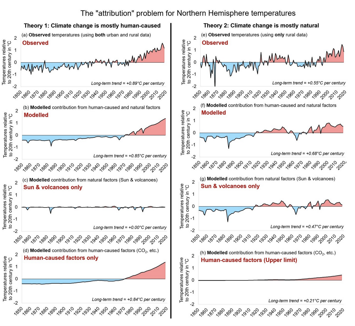
A recent paper with many authors, including my friend and colleague Willie Soon, explains in detail that the institutions (most notably the IPCC) are mistaken in their assessment of the importance of carbon dioxide relative to the Sun, at least in part because in making their calculations they fail to adequately consider all the relevant measures of solar irradiance and are somewhat muddled when it comes to actual temperature trends for specific locations. (Of course, the Australian Bureau of Meteorology deliberately muddles temperature trends by remodelling the raw data.)
The paper by Willie and colleagues is rather long, 71 pages in the pre-print that I have. It is long because it goes into detail, explaining the potential complexity of solar irradiance including the sixteen different ways of measuring changes in ‘total solar variability’ since the 19th century and earlier, and even how the sun-climate effect is more pronounced at certain places on Earth.
This is an important contribution to our understanding of not only total solar irradiance and how this is measured, but also how the institutions muddle the temperature, and also the solar irradiance, measurements. Perhaps not surprisingly, there is an all-out campaign to discredit this important research by Willie Soon and his colleagues. The campaign appears to be openly supported by Facebook as detailed in the following correspondence from Willie and two of the papers co-authors, Ronan and Michael Connolly.
In defence of their recent paper, and in a letter to a ‘Facebook Fact Checkers’, Willie Soon et al. suggest how science journalists might report contentious issues. Specifically, with reference to a recent paper by Danish philosopher Mikkel Gerken. They suggest:
1. Inclusive Reliable Reporting
Science reporters should, whenever feasible, report hypotheses in a manner that favours the most reliably based ones by indicating the nature and strength of their respective scientific justifications.
2. Epistemically Balanced Reporting
Science reporters should, whenever feasible, report opposing hypotheses in a manner that reflects the nature and strength of their respective scientific justifications or lack thereof.
Obviously, this type of reporting would be somewhat time consuming, certainly much more so than the current approach where journalists tend to simply and conveniently assume that the more important the affiliation the more reliable the science. Of course, in this age of disinformation where the populous is mostly held in contempt by the elites, it would be a revolutionary way to report science. A first requirement though would be a level of scientific literacy from science reporters.
A chart from the important new paper by Connolly, Soon et al. 2021
The feature image at the top of this blog post is of the Sun going down over Darwin.
Following is the recent letter from Willie and colleagues to the misguided Facebook ‘Fact Checker’.
**********
Dear Drs. Vincent and Forrester,
We are writing this open letter to you because it has recently come to our attention that your Climate Feedback website has published an article making multiple false or misleading claims about an Epoch Times newspaper article (by Alex Newman) that reported on a new peer-reviewed paper we co-authored. Your website’s “fact- check”/”feedback” also made false or misleading claims about our paper.
This means your website is effectively spreading the very misinformation that you purport to be trying to fight. Additionally, because your website is currently one of Facebook’s approved “independent fact-checkers”, anybody who shared or tries to share a link to the Epoch Times article now receives a warning.
In other words, not only is your “fact-check” promoting misinformation, but you are effectively hindering the public from sharing important information with their friends and family.
We are writing to you to ask you to immediately correct this erroneous “fact-check” and to inform any groups that may have been using your website as an “independent fact-checker” (including Facebook) of the error.
We are also cc’ing and bcc’ing various parties who are either directly affected by the consequences of this “fact-check” or may be more generally concerned about the arbitrariness of the “fact-checks” offered by websites such as yours, and the problem of “who will ‘fact-check’ the fact-checkers?”
We believe the discussion below is of relevance for everybody given the recent trend of the media, social media and internet search engines towards using “independent fact-checkers” like yourselves for down-ranking, suppressing or even deleting content. Therefore, we have chosen to make this an open letter. We encourage people to share our letter and our accompanying “fact-check fact-check” with the public – although we ask people to first redact the e-mail addresses.
The article in question is this one edited by Dr. Lambert Baraut-Guinet.
Dr. Baraut-Guinet claims to have “fact-checked” an Epoch Times newspaper article by Alex Newman which compared the findings of our recent scientific review paper to the findings of the UN Intergovernmental Panel on Climate Change (IPCC) Working Group 1’s recent 6th Assessment Report (AR6).
Baraut-Guinet alleges that Newman made false claims that were “incorrect” and “misleading” in his reporting. He similarly asserts that several other media outlets publishing articles repeating some of Newman’s reporting were “incorrect” and “misleading”. Baraut-Guinet also asserts that our peer-reviewed paper makes “incorrect” and “misleading” claims.
Background to Newman’s article:
Our paper that Newman was reporting on is a detailed scientific review on the complex challenges of establishing how much of a role solar activity has played in northern hemisphere temperature trends since the 19th century (and earlier). It was co-authored by 23 experts in the fields of solar physics and of climate science from 14 different countries and was published in the peer-reviewed journal Research in Astronomy and Astrophysics (RAA).
The title of our paper is, “How much has the Sun influenced Northern Hemisphere temperature trends? An ongoing debate”, and it was published online in early August. Coincidentally, a few days later, the UN’s IPCC AR6 was published. While the IPCC AR6 had concluded that it was “unequivocal” that recent climate change was human- caused, our findings were much more circumspect and cautious, e.g., from the abstract of our RAA paper:
For all five Northern Hemisphere temperature series, different TSI estimates suggest everything from no role for the Sun in recent decades (implying that recent global warming is mostly human-caused) to most of the recent global warming being due to changes in solar activity (that is, that recent global warming is mostly natural). It appears that previous studies (including the most recent IPCC reports) which had prematurely concluded the former, had done so because they failed to adequately consider all the relevant estimates of TSI and/or to satisfactorily address the uncertainties still associated with Northern Hemisphere temperature trend estimates. Therefore, several recommendations on how the scientific community can more satisfactorily resolve these issues are provided.
That is, the IPCC was offering a remarkably confident claim about the “attribution” of recent climate change, whereas we were explicitly warning that it was too premature to be drawing such conclusions. Our analysis found an alarmingly wide range of plausible estimates for a solar contribution (in the paper itself we elaborate on how plausible estimates for the solar contribution range from 0%-100% of the long-term warming since the mid-19th century!).
Newman was apparently intrigued by the contrast between the two studies both coincidentally published at around the same time. He interviewed several of us to learn more about our findings. He also reached out to the IPCC for their response, as well as to other scientists who might disagree with our analysis as well as some who might agree. If you read his article, his efforts to carefully and openly present multiple perspectives are self-evident.
If you compare Newman’s ‘balanced reporting’ journalistic approach to the framework you provide at Science Feedback for informative reporting, it is clear that Newman was taking considerable care to avoid any of the aspects of misinformation that you identify as problematic. In contrast, as we will detail in the attached ‘fact-check fact-check’, Baraut-Guinet’s ‘fact-checking’ of Newman’s article is littered with almost all of the hallmarks of misinformation which your framework warns against.
Yet, ironically, Baraut-Guinet’s “fact-check” is currently being used by Facebook (and probably other platforms) as a justification for censoring Newman’s article.
According to your website’s “About” page “Our first mission is to help create an Internet where users will have access to scientifically sound and trustworthy information. We also provide feedback to editors and journalists about the credibility of information published by their outlets.” Therefore, we hope you share at least some of our concern about the fact that this article by Baraut-Guinet on your website is now promoting misinformation – and as a result effectively misleading editors, journalists and also several of your partners & funders that you list on your website, e.g., Facebook’s “Third Party Fact Checking program”.
We hope that after reviewing the information in this e-mail, you will get Baraut-Guinet to correct his erroneous analysis, update his flawed verdict of “Incorrect” & “Misleading” to “Correct” & “Accurate”, and also to contact the various groups (including Facebook’s fact checking program) who have mistakenly used his flawed analysis to warn them that your website had posted an erroneous “fact-check”.
In our “fact-check fact-check” we explain how the approach we took to reviewing the scientific literature in our RAA paper was fundamentally different to that taken by the IPCC. We also explain that our objectives were fundamentally different too.
The IPCC explain on their website that they were set up by the UN Environment Program (UNEP) in conjunction with the World Meteorological Organization (WMO) with the primary objective of providing “scientific information that [governments] can use to develop climate policies” (https://www.ipcc.ch/about/, accessed 5th September 2021). As we explain in the fact-check fact-check, the specific climate policies the IPCC are interested in are those that will help the UNEP in arranging international agreements to reduce greenhouse gas emissions.
On the other hand, our primary objective was “to convey to the rest of the scientific community the existence of several unresolved problems, as well as to establish those points where there is general agreement”.
That is, the IPCC’s scientific assessments are carried out to help governments in implementing the UN’s political goals, while our scientific assessments are carried out to help the scientific community (of which all 23 of us are members) to improve our collective understanding of the causes of climate change.
So, different goals. But, we also used different methods.
The IPCC’s approach is a “consensus-driven” one of trying to identify a “scientific consensus” on each of the key issues. This approach works very well when there is indeed universal scientific agreement on the point. However, it is problematic whenever there is scientific disagreement on a given issue. And ironically, most scientific research occurs when there is ongoing scientific disagreement on the subject. Therefore, this is a surprisingly common occurrence. The IPCC’s general approach to dealing with scientific disagreement appears to be to use “expert judgement” to identify the most “likely” perspective on the subject (ideally one which best suits the UNEP’s aims) and then use “expert judgement” to dismiss those studies which dissent from that perspective.
Several researchers have praised the IPCC for this “consensus-driven” approach as they say it allows the IPCC to “speak with one voice for climate science” (e.g., see Beck et al. 2014; Hoppe & Rödder 2019). This is very helpful for the UNEP’s goals, since it allows the governments to focus on their negotiations without being distracted by scientific disagreements within the scientific community. However, we believe that it is unfortunately hindering scientific progress and the process of scientific inquiry.
For this reason, we explicitly avoided the IPCC’s “consensus-driven” approach and instead chose “…to emphasize where dissenting scientific opinions exist as well as where there is scientific agreement”. As Francis Bacon noted in the 17th century, “if we begin with certainties, we shall end in doubts; but if we begin with doubts, and are patient in them, we shall end in certainties.”
These are different goals and different methods. So ultimately, it is not that surprising that we came to different conclusions on several key scientific questions.
When different scientists come to different conclusions by following different scientific approaches, it is very challenging to decide which one is “factual” and which is not. We appreciate that this can create problems for an “independent fact-checker” like your organization when asked to weigh in on a scientific disagreement. However, as we will discuss later, maybe this is not something that you should even be trying to do.
Science thrives best when scientists are allowed to disagree with each other. Rather than trying to shut down one side of a given scientific disagreement as “incorrect” and promoting the other side as “correct”, maybe we should be welcoming the fact that scientists are still “doing science”.
Who has been cc’ed and bcc’ed?
A major problem with the current set-up of your website is that you purport to provide “fact-checks” or “feedbacks” on articles, but if anybody disputes your “feedback”, the only formal mechanism you currently offer on the website is to submit a comment through your on-line “contact us” form. We were unable to find an e-mail address for Dr. Baraut- Guinet, the editor in charge of the article in question. However, you are currently listed on the Science Feedback website as the Founder & Director (Dr. Vincent) and Science Editor, Climate and Ecology (Dr. Forrester), and we were able to find your e-mails on-line. Therefore, we assume that you are the appropriate people from your website to contact, and that you can contact him.
We have also cc’ed and bcc’ed several people whose professional reputations have been directly attacked by Dr. Baraut-Guinet through his accusations, as well as several people whose reputations have directly or indirectly been used by Dr. Baraut-Guinet to justify his claims.
Specifically, we have cc’ed Alex Newman, since Dr. Baraut-Guinet is (falsely) accusing him of not having carried out his journalistic duties. We have also bcc’ed our 20 co-authors on the research paper in question (Connolly et al., 2021, Research in Astronomy and Astrophysics, https://doi.org/10.1088/1674-4527/21/6/131), since Dr. Baraut-Guinet is smearing our scientific reputations by (falsely, as we explain in our ‘fact-check fact-check’) accusing us of making “incorrect” and “misleading” claims in our scientific research.
Additionally, we have bcc’ed Prof. Tim Osborn, Dr. Britta Voss and Prof. Patrick Brown. Dr. Baraut-Guinet has taken quotes from each of them from previous reviews on your website, and copied-and-pasted them the “Scientists’ feedback” for his “fact-check” on Alex Newman’s article.
Your Science Feedback framework claims that the “Scientists’ feedback” is needed before the editor can reach a verdict:
“Process for deciding on a verdict
The final ruling regarding the verdict attributed to the claim is made by a Science Feedback editor based on suggestions by the scientists contributing to the review.”
Therefore, it should have been a warning flag that none of the three scientists listed in the “Scientists’ feedback” section had contributed suggestions specifically about Alex Newman’s reporting. Instead, their ”feedback” was copied- and-pasted from feedback on previous articles or claims.
We appreciate that Baraut-Guinet did include an explanatory note for each of them saying, “[ This comment comes from a previous review…”. But, many casual readers would miss this. Indeed, we have already heard from several friends who independently told us about the article and none of them had noticed this caveat.
At any rate, we have bcc’ed these three scientists to let them know that Baraut-Guinet is using quotes from them on different articles to imply that they had also directly commented on Alex Newman’s article.
We have also cc’ed Jonathan Lynn (Head of Communications and Media Relations of IPCC), the representative from the IPCC that provided statements to Alex Newman for his article, since Baraut-Guinet misleadingly implies in his article that Newman failed to present the IPCC’s position on the various points made. This is factually inaccurate as well as misleading, lacking in context and also a Strawman argument (i.e., 4 of the types of misinformation criticised by your framework), since Newman states clearly in his article that he specifically reached out to the IPCC for comment, and reported the IPCC’s responses. This included a clarifying statement from Prof. Panmao Zhai (co-chair of Working Group 1 AR6), who we have bcc’ed.
Finally, we have bcc’ed multiple people who we know are concerned about how influential “fact-checking” organizations like yours have become and are wondering “who will fact-check the fact-checkers?” We think they will find our “fact-check fact-check” of your fact-checker, Dr. Baraut-Guinet’s article helpful. We suspect they will also be interested to see how your organisation will respond to this problem.
Recommendation 1: We recommend you correct the existing “fact-check”/”feedback” on Alex Newman’s article. Currently, your website asserts that his reporting was “Incorrect” and “Misleading”. This should be changed to “Correct” and “Accurate” immediately.
Recommendation 2: Those groups that are using Climate Feedback as a “fact-checker” should be contacted to let them know of your website’s erroneous analysis of this article.
Recommendation 3: All of your editors should be reminded that your “framework for claim-level reviews” was
presumably not to be used as an inspiration for what to do, but rather for identifying misinformation.
However, once this is done, we would also encourage you (and others reading this open letter) to consider whether the very idea of “fact-checking” on science reporting is as good an idea as it might initially seem.
Commentary on whether this plan of “fact-checking” is working
Finally, we think that it is time for society to reflect on whether this recent trend in “fact-checking” is wise. We note that a lot of this trend can be specifically traced back to debates over journalistic approaches to the scientific reporting of climate change.
Specifically, in the early 2000s, some researchers who believed that the IPCC reports offered the definitive “scientific consensus” on climate change were frustrated that journalists would still report the perspectives of scientists who disagreed with the IPCC reports. In particular, the Boykoff & Boykoff (2004) paper argued that the journalistic norm of “balanced reporting” was leading to a ‘false balance’ by implying that the supporters of the IPCC reports and the critics represented a 50:50 split among the scientific community.
This study (and more generally the argument) was highly influential and convinced many journalists that they had a duty to stop carrying out what they assumed was ‘false balance’ and instead only report on the scientific perspectives they believed were “correct”. That is, on any given scientific disagreement, the journalists would be obliged to find out what the “scientific consensus” was. If a scientific study disagreed with this consensus, it was not to be reported on.
This alternative journalistic approach is often referred to by its supporters as “reliable reporting”, although critics might call it “narrative-driven journalism” (or “ideological reporting” if the critic disagreed with the journalist’s political ideology).
A major problem with relying on this “reliable reporting” approach to journalism is that it effectively requires the journalist to act as the arbiter of an often complex scientific disagreement. When even the scientists themselves are in disagreement, this puts a very heavy burden on the journalist. Nonetheless, over the years, the argument about ‘false balance’ has convinced many journalists to abandon the classical ‘balanced reporting’ approach.
Today, it is very rare to find journalists like Alex Newman who continue to apply the ‘balanced reporting’ approach when covering scientific disagreements. As a result, over the last decade or so, it has become increasingly difficult to find open-minded and honest discussions on these scientific issues in the traditional media.
However, until recently, it was still relatively easy to find those discussions elsewhere by using social media and internet searches. Therefore, social media platforms and internet search engines are now being criticised for still allowing people to find out about ongoing scientific disagreements. As a result, these platforms are being increasingly pressured to actively suppress “misinformation”. Essentially, they are being pressured to adopt the same techniques of suppression described above which were applied to the media.
But, since the original premise of most social media platforms and internet search engines was to allow users to share and search for the information they wanted, if these platforms engage in this suppression, it is an especially draconian form of censorship.
To try and justify this censorship as “reducing the spread of ‘fake news’ and ‘misinformation’”, platforms such as Facebook, Twitter, Google/Youtube and others have started relying on “independent fact-checkers” such as Climate Feedback. However, as we demonstrated in our “fact-check fact-check”, attempting to “fact-check” on issues where there are ongoing scientific disagreements (as Dr. Baraut-Guinet did here) is very risky – and can easily result in generating misinformation (as Dr. Baraut-Guinet did here).
Therefore, we suggest that it is time for a re-think on the current reliance on “fact-checkers”, and also for journalists to re-think the “reliable reporting” approach.
Personally, we think that a return to encouraging “balanced reporting” would be a good option. However, we note that there was a recent paper by the Danish philosopher, Prof. Mikkel Gerken, which presents several options: Gerken (2020), “How to balance Balanced Reporting and Reliable Reporting”, Philosophy Studies, https://doi.org/10.1007/ s11098-019-01362-5 [The paper is paywalled. However, if you don’t have access, but are comfortable using the controversial “sci-hub” website, you could probably find a copy that way].
Gerken describes the above approaches to journalism when it comes to science reporting as follows:
1. Balanced Reporting. Science reporters should, whenever feasible, report opposing hypotheses in a manner that does not favor any one of them.
2. Reliable Reporting. Science reporters should, whenever feasible, report the most reliably based hypotheses and avoid reporting hypotheses that are not reliably based.
He agrees that there are valid concerns about both approaches. The first approach can potentially lead to “false balance”, while the second approach can potentially lead to narrative-driven journalism, or even propaganda.
Therefore, he suggests two potential compromises:
3. Inclusive Reliable Reporting. Science reporters should, whenever feasible, report hypotheses in a manner that favors the most reliably based ones by indicating the nature and strength of their respective scientific justifications.
4. Epistemically Balanced Reporting. Science reporters should, whenever feasible, report opposing hypotheses in a manner that reflects the nature and strength of their respective scientific justifications or lack thereof.
He favours the 4th option. However, either the 3rd or 4th option rules out the necessity for the 2nd option of suppressing the existence of genuine scientific disagreements, and also avoids the risk with the 1st option of potentially creating a ‘false balance’.
In our opinion, the public are not as prone to ‘false balance’ as the proponents of Option 2 insist. We think that most people recognise that if a journalist provides two competing perspectives on a scientific issue it does not necessarily mean that the scientific community is split 50:50 on it. However, for journalists who are concerned about the risk of ‘false balance’, options 3 and 4 might be suitable alternatives to option 1.
Indeed, arguably, Alex Newman’s approach in his Epoch Times article combines elements of Options 1, 3 and 4.
Importantly, it is only with Option 2 that there is a necessity for “independent fact-checkers” for science reporting. For the other options, the readers are made aware of the existence of differing scientific perspectives and it is up to them to investigate further if they are interested.
Regards,
Dr Ronan Connolly, Dr. Willie Soon and Dr. Michael Connolly
Update 30th September 2021
Interestingly when I cross posted this at Facebook it was very popular with more than 10,000 impressions:
Everyone loves the Great Barrier Reef, particularly its corals. Everyone knows that a reef has different species of coral. But how many species should an average inshore reef have? How many corals are there at Pixie Reef, which is so close to the city of Cairns.
Such inshore reefs are apparently in terminal decline.
Flying at 150 metres altitude above Pixie Reef on 22nd March 2016 Peter Ridd’s nemesis, Terry Hughes, classified this reef as more than 65% bleached. This result was incorporated with flypasts from other reefs and reported by the media around the world as the Great Barrier Reef being more than half dead. But the names and numbers of the actual coral species that were bleached was never recorded.
School children around the world are now taught, based on the work of Hughes and others, that there is a need to fundamentally reject current sources of energy and many of our freedoms, in order to avoid mass ecosystem collapse — most specifically of the Great Barrier Reef. In short, the flypasts have become a source of Ativan great anxiety and a reason to support an economic and social reset.
I first visited Pixie Reef with marine biologist Stuart Ireland on 25th November 2020. Stuart suggested we dive Pixie because we didn’t have much time to test a method for measuring the diameter of the massive bolder corals that have growth rings like tree rings before leaving for a week at sea. We went back to Pixie reef in February 2021, again because it was conveniently close to Cairns, and I wondered how much photographic and video data on that one small reef we could gather via transects in just two days. Two days was as far was my budget would stretch at that time.
I wasn’t particularly surprised that we found the reef in such obviously good health and without bleaching, despite being listed in the supplement to an article in a most prestigious of marine science journals as mostly bleached. Indeed, there is no longer a good correspondence between what is reported in newspapers or scientific journals and reality when it comes to coral reefs.
Nine of the 360 photographs from Pixie Reef taken in February 2021, after importing into Adobe Lightroom. The first arrow is pointing to that section of photograph shown at the top of this blog post, and which two species of coral do you think are shown? Could one of them be a Porites? The second arrow is of course pointing to a massive Porites colony. The third arrow is to that section of photograph reproduced at a much finer scale at the bottom of this blog, showing the coral colony to be Echinopora lamellose (see below).
From the two days of diving, and thanks to the hard-work and expertise of both Stuart and underwater photographer Leonard Lim, I came away with 36 video transects and also 360 photographs taken at regular intervals along 36 x 10 metre transects across three habitats: back lagoon to 11 metres depth, front of the reef to 6 metres, and also at the shallow reef crest. Each of these 360 photographs has been uploaded at my ‘Pixie Reef Data Page 2021’. The videos will be incorporated into a documentary film about Pixie Reef.
This reef may have experienced some bleaching in March 2016 — coincident with a period of minimum lunar declination and a super El Nino. But I am unaware of any photographs or video taken at that time that document in any systematic way the extent of the bleaching. And to reiterate, it is unclear which species of coral bleached. My 360 photographs were taken five years after the acclaimed bleaching of 2016. These photographs, from February 2021, suggest Pixie reef has recovered from that cycle of bleaching.
I hypothesis that this coral reef will bleach again in the summer of 2034/2035, so in about 13 years time corresponding with the next period of minimum lunar declination which I forecast will contribute to a super El Nino.
In the meantime there is perhaps an opportunity to document the number of species of coral at Pixie Reef that I hypothesis will increase over this next ten year period. In short, I’m curious to know how many coral species there are at Pixie reef for this moment in time, and if the number increases at least until 2034.
Does anyone want to guess how many different species of coral are in just the nine photographs (shown above), that are part of Table 2.1 at the Pixie Reef Data Page 2021.
Does anyone want to guess how many different species of coral might be listed for this inshore reef as at February 2021 when all the photographs are assessed? I want to know out of curiosity, and also because these same corals are essentially denied by the experts who have told the world that such coral reefs are so badly bleached they are to be pitied rather than acknowledged. Interestingly, Peter Ridd also has little time for such coral reefs, referring to them in his book (Reef Heresy) as the “mediocre fringing reefs” simply because they are “inshore reefs”. Yet as I will show, Pixie reef is not only incredibly biologically diverse but also beautiful.
I want to show and quantify this diversity, and also I’m most curious to know how long the list for the back lagoon will be, relative to the crest. At the moment the experts make no distinction between these very different habitat types at the one inshore reef when they lament coral bleaching in the popular press.
It is going to be a lot of work classifying all the species in the 360 photographs. But not impossible because the original photographs are of such high quality, providing extraordinary resolution at the scale of the corallite. Then there are such wonderful resources, including the three volumes of Charlie Vernon’s ‘Corals of the World’.
This is a close-up section of photograph #113. Colonies of the coral species Echinopora lamellose are thin laminae typically arranged in whorls or tiers, and in this section of photograph, I can also see some tubes. The red arrow is pointing to a corallite, a structure used extensively for identification to species. Photo credit: Leonard Lim.
****
This research is funded by the B. Macfie Family Foundation through the Institute of Public Affairs. All images are from photographs taken by Leonard Lim at Pixie Reef on 22nd or 24th February 2021.
I am so grateful to Peter Ridd for gifting me the three volumes of Charlie Vernon’s fabulous ‘Corals of the World’.Have I got these four species of bottlebrush coral correctly ID-ed?
Next time you read that such and such a percentage of the Great Barrier Reef has already been destroyed by humankind, laugh out loud! I say that not to offend, and not because I don’t care about the corals, but because it is better to laugh than to be drawn into their madness.
According to a completely mad research paper published by John Pandolfi and ten other reef researchers – each a high-profile marine biologist including Terry Hughes from the Australian Research Council Centre of Excellence for Coral Reef Research – the Great Barrier Reef was pristine before the arrival of humans. According to Pandolfi et al. published in the prestigious journal Science in 2003 (entitled ‘Global Trajectories of the Long-Term Decline of Coral Reef Ecosystems’) a rather large 25 percent of the inner Great Barrier Reef was destroyed with the arrival of Australian aborigines.
Except that when the Aborigines arrived much of the region known today as the Great Barrier Reef was open Eucalyptus woodland.
There was no Great Barrier Reef!
Back then, the Pacific Ocean began at the edge of Australia’s continental shelf that is now 100 to 200 kilometres offshore.
Sea levels began to rise some 18,000 years ago, after the arrival of the Aborigines. In fact, 100 percent of the Great Barrier Reef was formed after the arrival of humankind.
The first Australians predate the Great Barrier Reef by some 40,000 years. The first Australian walked across from New Guinea during the depth of the last ice age when there was no Great Barrier Reef. In fact, sea levels were about 120 metres lower than they are today.
It is only in the last 10,000 years, since the beginning of this geological epoch known as the Holocene, that the Great Barrier Reef has formed. It formed after sea levels rose by more than 120 metres during a period from 18,000 to 10,000 years ago when the coastline was being eroded by up to 50 metres each year.
On the subject of laughing: next time one of those expert professors in the ilk of Pandolfi or Hughes tell you to be fearful of 36 centimetres of sea level rise, remember that since the arrival of humankind in Australia some 40,000 years ago, sea levels have risen not by some few centimetres, but by around 120 metres! Oh, and all of that was before the industrial revolution that was just a couple of hundred years ago.
If there is one thing that these experts lack, especially the professors running Great Barrier Reef research, it is perspective. While they lack perspective it is the case that they are successfully drawing much of our civilization into their madness.
Just yesterday, I read that News Ltd, which publishes The Australian newspaper, has changed its editorial policy and will now, like the rest of the legacy media, be cheering madly for net zero emissions. Whatever that means. Do you know what it means? Read yesterday’s editorial in The Australian (7th September, entitled ‘National must prepare to deal with Glasgow summit’) and mention is made of Australia being ‘carbon neutral’ preferably before 2050.
I wonder if the newspaper’s editor, Michelle Gunn, has any real appreciation of what that means in practical terms. My husband is an Imperial College trained chemist, I asked him what he understood it to mean. He said it means that there is to be no additional carbon dioxide emitted into the atmosphere by us dreadful Australians, with the potential for offset through carbon capture and so on. He doesn’t believe any of this is realistic, unless the Prime Minister Scott Morrison, bans petrol cars, stops immigration and also childbirth. Though in yesterday’s editorial mention is only made of banning coal-fired powered stations in Australia. According to the editorial, given the rules governing such things, coal-fired powered stations will still operate in China, South Africa, Indonesia, Russia and Vietnam. Coal-fired power stations will just be banned in Australia and a few other countries. Yet I’m sure the sea level rise of some 40 centimetres since the Industrial Revolution that the university professors and newspaper editors profess to be so concerned about is a global phenomenon that shows no respect for national coastlines.
To be sure, they mostly write and publish politics and madness.
There are antidotes to such madness. You could begin by cancelling your subscription to the journal Science and The Australian newspaper.
Instead, spend more time at the beach and in the ocean. Australia has a long coastline and most of us live not far from a beach – from the ocean.
I visited Lady Elliot Island at the Great Barrier Reef earlier this year with my husband, John Abbot. Scuba diving, I was unable to find any coral bleaching. Walking along the seashore with John (Abbot, not Pandolfi) I could only find evidence of sea level fall, not sea level rise. Indeed, the image featured at the top of this blog post shows John looking at a Porites sp. microatoll whose growth is constrained by sea level. The coral colony is flat topped, and dead-on top. A thin veneer of live coral grows around it’s margin and down to the sand. The live coral would thus be invisible to the surveys by Terry Hughes from 150 metres up in an airplane. (That is another mad story written up in prestigious journals and repeated in the press. It is everywhere, the madness.)
There are so many microatolls at the Great Barrier Reef, which are live corals that can not grow-up because in reality there is no catastrophic sea level rise.This is a close-up of the corallites with their tentacle extended, of a coral microatoll along the seashore at Lady Elliot Island.I should love to go walking, along a shoreline, with Michelle Gunn and John Pandolfi, and show them how mostly in the real world along the east coast of Australia, which is where they live, it appears we have sea level fall not sea level rise. Should we believe what they write or what we can see with our own eyes when we get outside and into nature.
I was at the Australian National University in October 2018, when the largest supercomputer in the Southern Hemisphere began running the simulations that have now been published as the IPCC’s Assessment Report No. 6 (AR6). It’s being touted as the most comprehensive climate change report ever. It is certainly based on a suite* of very complex simulation models (CMIP6).
Many are frightened by the official analysis of the model’s results, which claims global warming is unprecedented in more than 2000 years. Yet the same modelling is only claiming the Earth is warming by some fractions of a degree Celsius! Specifically, the claim is that we humans have caused 1.06 °C of the claimed 1.07 °C rise in temperatures since 1850, which is not very much. The real-world temperature trends that I have observed at Australian locations with long temperature records would suggest a much greater rate of temperature rise since 1960, and cooling before that.
Allowing some historical perspective shows that the IPCC is wrong to label the recent temperature changes ‘unprecedented’. They are not unusual in magnitude, direction or rate of change, which should diminish fears that recent climate change is somehow catastrophic.
To understand how climate has varied over much longer periods, over hundreds and thousands of years, various types of proxy records can be assembled derived from the annual rings of long-lived tree species, corals and stalagmites. These types of records provide evidence for periods of time over the past several thousand years (the late Holocene) that were either colder, or experienced similar temperatures, to the present, for example the Little Ice Age (1309 to 1814) and the Medieval Warm Period (985 to 1200), respectively. These records show global temperatures have cycled within a range of up to 1.8 °C over the last thousand years.
Indeed, the empirical evidence, as published in the best peer-reviewed journals, would suggest that there is no reason to be concerned by a 1.5 °C rise in global temperatures over a period of one hundred years – that this is neither unusual in terms of rate nor magnitude. That the latest IPCC report, Assessment Report 6, suggests catastrophe if we cannot contain warming to 1.5 °C is not in accordance with the empirical evidence, but rather a conclusion based entirely on simulation modelling falsely assuming these models can accurately simulate ocean and atmospheric weather systems. There are better tools for generating weather and climate forecasts, specifically artificial neural networks (ANNs) that are a form of artificial intelligence.
Of course, there is nowhere on Earth where the average global temperature can be measured; it is very cold at the poles and rather warmer in the tropics. So, the average global temperature for each year since 1850 could never be a direct ‘observation’, but rather, at best, a statistic calculated from measurements taken at thousands of weather stations across the world. And can it really be accurately calculated to some fractions of a degree Celsius?
AR6, which runs to over 4,000-pages, claims to have accurately quantified everything including confidence ranges for the ‘observation’ of 1.07 °C. Yet I know from scrutinising the datasets used by the IPCC, that the single temperature series inputted for individual locations incorporate ‘adjustments’ by national meteorological services that are rather large. To be clear, even before the maximum and minimum temperature values from individual weather stations are incorporated into HadCRUT5 they are adjusted. A key supporting technical paper (eg. Brohan et al. 2006, Journal of Geophysical Research) clearly states that: ‘HadCRUT only archives single temperature series for particular location and any adjustments made by national meteorological services are unknown.’ So, the idea, that the simulations are based on ‘observation’ with real meaningful ‘uncertainty limits’ is just not true.
According to the Australian Bureau of Meteorology (BOM), which is one of the national meteorological services providing data for HadCRUT, the official remodelled temperatures are an improvement on the actual measurements. This may be so that they better accord with IPCC policy, with the result being a revisionist approach to our climate history. In general they strip the natural cycles within the datasets of actual observations, replacing them with linear trends that accord with IPCC policy.
The BOM’s Blair Trewin, who is one of the 85 ‘drafting authors’ of the Summary for Policy Makers, in 2018 remodelled and published new values for each of the 112 weather stations used to calculate an Australian average over the period 1910 to 2016, so that the overall rate of warming increased by 23 %. Specifically, the linear trend (°C per century) for Australian temperatures had been 1 °C per century as published in 2012 in the Australian Climate Observations Reference Network − Surface Air Temperature (ACORN-SAT) database version 1. Then, just in time for inclusion in this new IPCC report released on Tuesday, all the daily values from each of the 112 weather stations were remodelled and the rate of warming increased to 1.23 °C per century in ACORN-SAT version 2 that was published in 2018. This broadly accords with the increase of 22% in the rate of warming between the 2014 IPCC report (Assessment Report No. 5) which was 0.85 °C (since 1850), and this new report has the rate of warming of 1.07 °C.
Remodelling of the data sets by the national meteorological services generally involves cooling the past, by way of dropping down the values in the first part of the twentieth century. This is easy enough to check for the Australian data because it is possible to download the maximum and minimum values as recorded at the 112 Australian weather stations for each day from the BOM website, and then compare these values with the values as listed in ACORN-SAT version 1 (that I archived some years ago) and ACORN-SAT version 2 that is available at the BOM website. For example, the maximum temperature as recorded at the Darwin weather station was 34.2 °C on 1 January 1910 (this is the very first value listed). This value was changed by Blair Trewin in the creation of ACORN-SAT version 1 to 33.8 °C. He ‘cooled’ this historical observation by a further 1.4 °C in the creation of ACORN-SAT version 2, just in time for inclusion in the values used to calculate a global average temperature for AR6. When an historic value is cooled relative to present temperatures, then an artificial warming trend is created.
I am from northern Australia, I was born in Darwin, so I take a particular interest in its temperature series. I was born there on 26th August 1963. A maximum temperature of 29.6 °C was recorded at the Darwin airport on that day from a mercury thermometer in a Stevenson screen, which was an official recording station using standard equipment. This is also the temperature value shown in ACORN-SAT version 1. This value was dropped down/cooled by 0.8 °C in the creation of ACORN-SAT version 2, by Blair Trewin in 2018. So, the temperature series incorporated into HadCRUT5, which is one of the global temperature datasets used in all the IPCC reports shows the contrived value of 28.8 °C for 26th August 1963, yet the day I born a value of 29.6 °C was entered into the meteorological observations book for Darwin. In my view, changing the numbers in this way is plain wrong, and certainly not scientific.
The BOM justifies remodelling because of changes to the equipment used to record temperatures and because of the relocation of the weather stations, except that they change the values even when there have been no changes to the equipment or locations. In the case of Darwin, the weather station has been at the airport since February 1941, and an automatic weather station replaced the mercury thermometer on 1 October 1990. For the IPCC report (AR5) published in 2014, the BOM submitted the actual value of 29.6 °C as the maximum temperature for Darwin on 26th August 1963. Yet in November 2018, when the temperatures were submitted for inclusion in the modelling for this latest report (AR6), the contrived value of 28.8 °C was submitted.
The temperature series that are actual observations from weather stations at locations across Australia tend to show cooling to about 1960 and warming since then. This is particularly the case for inland locations from southeast Australia. For example, the actual observations from the weather stations with the longest records in New South Wales were plotted for the period to 1960 and then from 1960 to 2013, for a presentation that I gave to the Sydney Institute in 2014. I calculated an average cooling from the late 1800s to 1960 of minus 1.95 °C, and an average warming of plus 2.48 °C from the 1960s to the present, as shown in Table 1. Yet this new United Nation’s IPCC report claims inevitable catastrophe should the rate of warming exceeds 1.5 °C, yet this can be shown to have already occurred at many Australian locations.
This is consistent with the findings in my technical report as published in the international climate science journal Atmospheric Research (volume 166, pages 141-149) in 2015, which shows significant cooling in the maximum temperatures at the Cape Otway and Wilsons Promontory lighthouses, in southeast Australia, from 1921 to 1950. The cooling is more pronounced in temperature records from the farmlands of the Riverina, including at Rutherglen and Deniliquin. To repeat, while temperatures at the lighthouses show cooling from about 1880 to about 1950, they then show quite dramatic warming from at least 1960 to the present. In the Riverina, however, minimum temperatures continued to fall through the 1970s and 1980s because of the expansion of the irrigation schemes. Indeed, the largest dip in the minimum temperature record for Deniliquin occurs just after the Snowy Hydroelectricity scheme came online. This is masked by the remodelled by dropping down/cooling all the minimum temperatures observations at Deniliquin before 1971 by 1.5 °C.
In my correspondence with the Bureau about these adjustments it was explained that irrigation is not natural and therefore there is a need to correct the record through remodelling of the series from these irrigation areas until they show warming consistent with theory. But global warming itself is not natural, if it is essentially driven by human influence, which is a key assumption of current policy. Indeed, there should be something right-up-front in the latest assessment of climate change by the IPCC (AR6) explaining that the individual temperature series have been remodelled before inclusion in the global datasets to ensure a significant human influence on climate in accordance with IPCC policy. These remodelled temperature series are then incorporated into CMIP6 which is so complex it can only be run only a supercomputer that generates so many scenarios for a diversity of climate parameters from sea level to rainfall.
In October 2018, I visited the Australian National University (ANU) to watch CMIP6 at work on the largest supercomputer in the Southern Hemisphere. It was consuming obscene amounts of electricity to run the simulations for this latest IPCC report, and it is also used to generate medium to long range rainfall forecasts for the BOM. The rainfall forecasts from these simulation models even just three months in advance are, however, notoriously unreliable. Yet we are expected to believe rainfall forecasts based on simulations that make projections 100 years in advance, as detailed in AR6.
There are alternative tools for generating temperature and rainfall forecasts. In a series of research papers and book chapters with John Abbot, I have documented how artificial neural networks (ANNs) can be used to mine historical datasets for patterns and from these generate more accurate medium and long-range rainfall and temperature forecast. Our forecasts don’t suggest an impending climate catastrophe, but rather that climate change is cyclical, not linear. Indeed, temperatures change on a daily cycle as the Earth spins on its axis, temperatures change with the seasons because of the tilt of the Earth relative to its orbit around the Sun, and then there are ice ages because of changes in the orbital path of the Earth around the Sun, and so on.
Taking this longer perspective, considering the sun rather than carbon dioxide as a driver of climate change, and inputting real observations rather than remodelled/adjusted temperature values, we find recurrent cycles greater than 1.07 degrees Celsius during the last 2000 years. Our research paper entitled ‘The application of machine learning for evaluating anthropogenic versus natural climate change’, published in GeoResJ in 2017 (volume 14, pages 36-46) shows a series of temperature reconstructions from six geographically distinct regions and gives some graphic illustration of the rate and magnitude of the temperature fluctuations.
ANNs are at the cutting edge of AI technology, with new network configurations and learning algorithms continually being developed. In 2012, when John Abbot and I began using ANNs for rainfall forecasting we choose a time delay neural network (TDNN), which was considered state-of-the-art at that time. The TDNN used a network of perceptrons where connection weights were trained with backpropagation. More recently we have been using General Regression Neural Networks (GRNN), that have no backpropagation component.
A reasonable test of the value of any scientific theory is its utility – its ability to solve some particular problem. There has been an extraordinary investment into climate change over the last three decades, yet it is unclear whether there has been any significant improvement in the skill of weather and climate forecasting. Mainstream climate scientists, and meteorological agencies continue to rely on simulation modelling for their forecasts such as the CMIP6 models used in this latest IPCC report – there could be a better way and we may not have a climate catastrophe.
* Following comment in the following thread from Greg Goodman on 15th August, I have added in the word ‘suite of’ because it is the case that CMIP6 is a project rather than a model, it is a project that runs a suite of simulation models.
Further Reading/Other Information
The practical application of ANNs for forecasting temperatures and rainfall is detailed in a series of papers by John Abbot and me that are listed here: https://climatelab.com.au/publications/
There is an interactive table based on the maximum and minimum values as originally recorded for each of the 112 Australian weather stations used to calculate the official temperature values as listed in ACORN-SAT version 1 and version 2 at my website, click here: https://jennifermarohasy.com.dev.internet-thinking.com.au/acorn-sat-v1-vs-v2/
The feature image, at the top of this blog post, shows Jennifer Marohasy in front of the supercomputer at the Australian National University in October 2018, which was running simulations for the latest IPCC report.
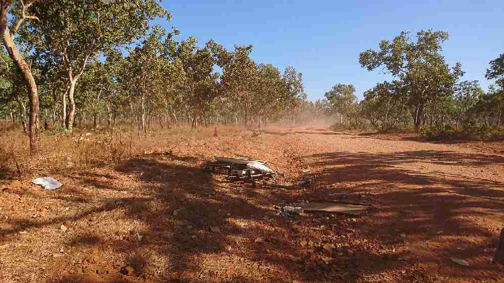
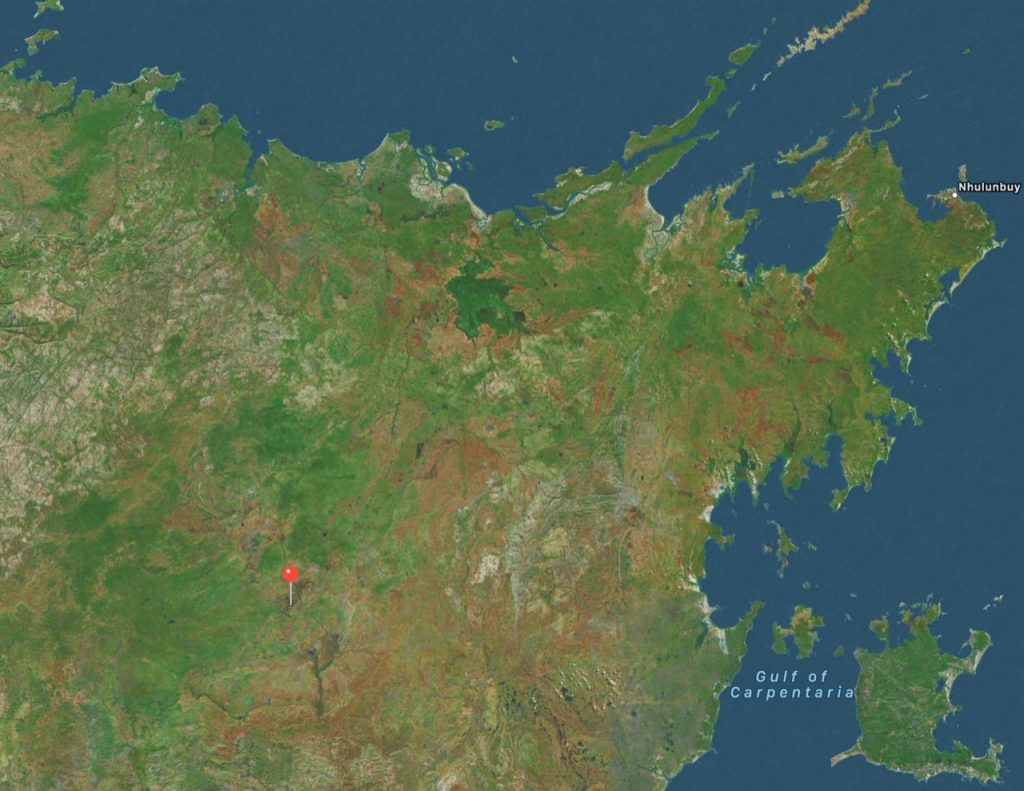
Last Wednesday my son-in-law Christian, who I call Krish, rolled his Toyota Landcruiser about 6 hours to the southwest of Nhulunbuy near a place called Bulman. My daughter, who was in the passenger seat, went into brace position and escaped the crash relatively unscathed, even able to run into Bulman for help. They had just set off on their honeymoon that was planned as a camping adventure all the way across the top-end of Australia to the remote Kimberly region.
Of course, many of us worry about Krish and his risk taking. He has been known to go surfing in crocodile infested waters, but this time he had only packed his fishing rod and had just bought new tyres for the vehicle. I had helped him wash the vehicle (the first time in over a year – obviously bad luck) and he had been up late just before the wedding soldering wires so the main interior light worked again.
He has driven that dirt track out of Nhulunbuy to Katherine many times, but it is well known to be treacherous. He was apparently not even driving that fast, having just got going after stopping to watch buffalo cross the red dirt.
The track not far from Bulman, on the way to Katherine from Nhulunbuy.Christian and Caroline were evacuated from near Bulman in remote East Arnhem Land to Darwin and then Adelaide.
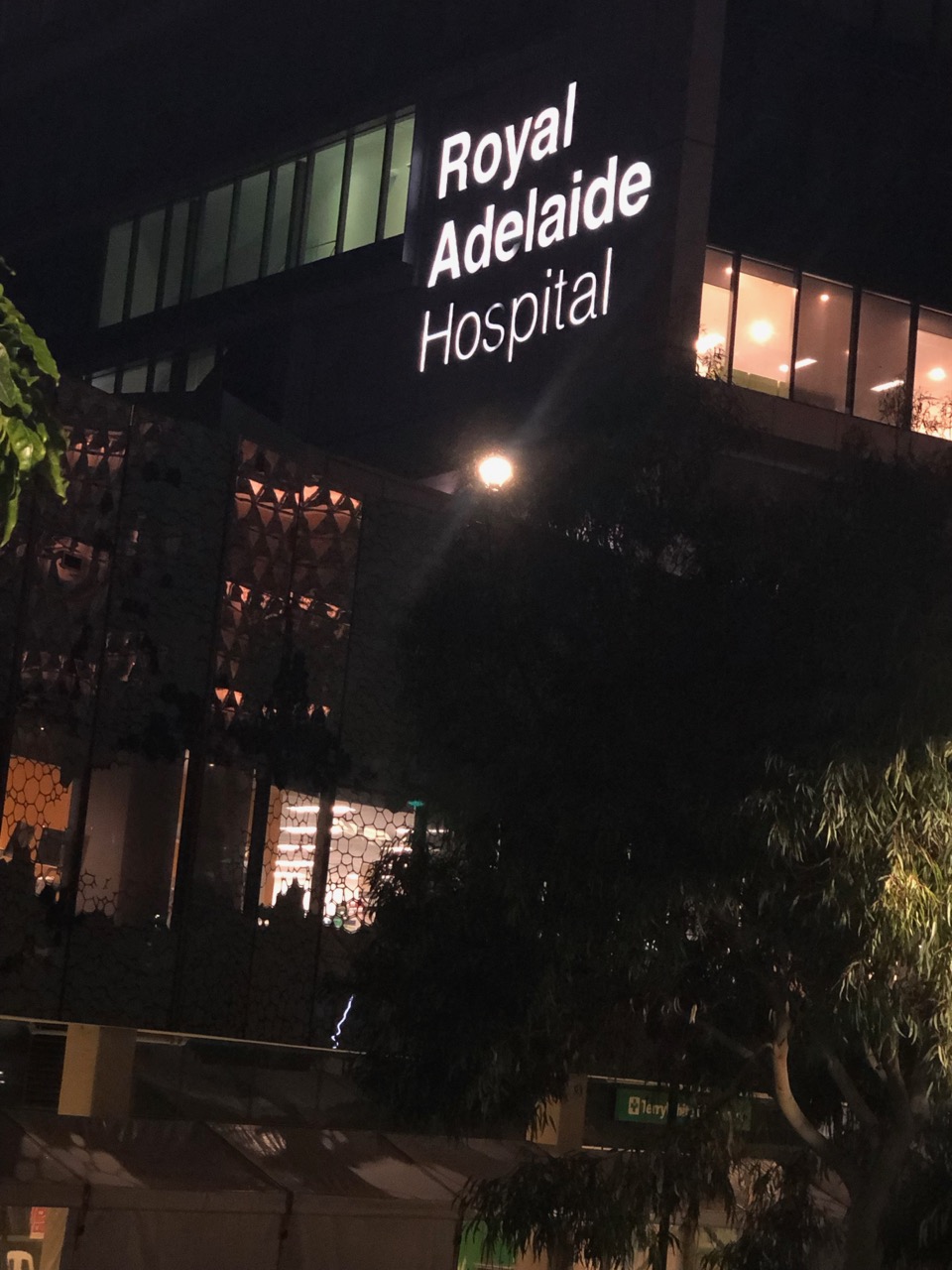
Anyway, all of that is incidental to the fact that Krish is now recovering at the spinal unit of Royal Adelaide Hospital in South Australia with 8 screws, a plate and a bone graft, all skilfully insert by Dr YH Yau. The operation was very successful and Kris is already able to take some steps, but managing the pain and other complications is going to take some time.
I was meant to fly from Nhulunbuy to Cairns, last week but instead flew to Darwin and then onward to Adelaide. I have been here a week now. I would stay forever, or leave tomorrow, if I thought it could take away the pain that Krish is having to endure.
There is a specialist spinal unit at the Royal Adelaide Hospital that has performed what could be considered a miracle, so Christian can walk again.
****
Update 7 August, nickname changed to more traditional spelling of Krish. 🙂


 Jennifer Marohasy BSc PhD has worked in industry and government. She is currently researching a novel technique for long-range weather forecasting funded by the B. Macfie Family Foundation.