After looking at hundreds of temperature series from different locations across Australia, I’ve come to understand that only cities show the type of warming reported by the IPCC, and other such government-funded institutions. Much of this warming is due to what is known as the Urban Heat Island (UHI) effect: bitumen, tall-buildings, air-conditioners, and fewer and fewer trees, means that urban areas become hotter and hotter.
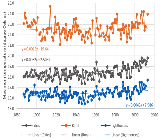
For example, in a recent study of temperature variability and change for south-east Australia it is evident that maximum temperatures in the cities of Melbourne and Hobart are increasing at a rate of about 0.8 degree Celsius per century; while the rate of increase at the nearby lighthouses is half of this.
While the trend of about 0.4 degree Celsius per century at the lighthouses – as shown in Chart 1 – is arguably an accurate record of temperature change, the Australian Bureau of Meteorology changes this. To be clear, the Bureau changes a perfectly good temperature series from Cape Otway lighthouse by remodeling it so that it has Melbourne’s temperature signal – all through the process of homogenisation.

Government agencies in the USA have done exactly the same thing to temperature records for Colorado. This is all explained in detail in this new video by Monte Naylor:
https://vimeo.com/196878603/b9ea716a74
The video runs for about 40 minutes, and is quite technical.
The conclusions from this study have been summarized by Monte as follows:
(1) The USHCN Fort Collins station temperature record was not recognized by NOAA as having the heat bias from expanding UHI which has been easily identified by other researchers.
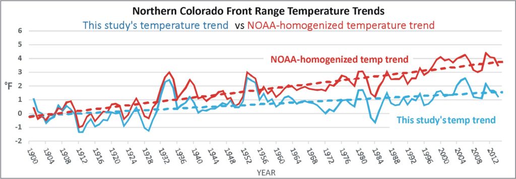
(2) NOAA’s homogenization program adjusted the USHCN Boulder station temperature history in a fashion that does not match any of the four other nearby rural/suburban long-term temperature histories. Nor does the NOAA-homogenized Boulder temperature history resemble the average temperature trend found by this study.
(3) NOAA’s homogenization program adjusted the Boulder temperature history to resemble the UHI-contaminated temperature history of the Fort Collins station.
(4) The best estimate of the northern Colorado Front Range temperature trend is obtained by using the TOB-adjusted Group of 5 average which shows a warming temperature trend of 1.7 °F (0.95 °C) from 1900 to 2015. The NOAA temperature trend, about 4 °F over 115 years, is more than twice the best estimate of this study.
(5) About 70% of the warming shown in the Group of 5 average temperature trend occurred before 1932. Temperatures trends of recent decades do not show anomalous warming. Distinct warm temperature events occurred in the 1930’s and 1950’s that were much warmer than those observed since the turn of the 21st century.
(6) The Northern Front Range Group of 5 average temperature trend does not increase in a fashion consistent with increasing atmospheric carbon dioxide.


 Jennifer Marohasy BSc PhD has worked in industry and government. She is currently researching a novel technique for long-range weather forecasting funded by the B. Macfie Family Foundation.