WINSTON Churchill famously said that, democracy is the worst form of government except for all the others. Indeed when everyone has the opportunity to have a say it can be difficult to keep everyone marching together in the same direction, at the same speed, repeating the same mantra.
Of course, getting to the truth often requires alternative opinions to be heard, and perhaps now, finally, the mainstream media will start to allow those sceptical of the theory of anthropogenic global warming to have their say. Indeed just today the Newcastle Herald published the opinion of Anthony Cox explaining how the Australian Bureau of Meteorology homogenise the data. It’s a good article, but was not published in full, and published without a key chart showing the affect of homogenisation on the temperature trend.

What the chart actually shows is that for the Williamtown RAAF, near Newcastle, the minimum temperature series that begins in 1951 has been homogenised. That is, in the creation of the official temperature series temperatures have been changed from what was originally recorded. Like for Rutherglen in Victoria, and Amberley in Queensland, the temperatures are dropped down starting in about 1971. This has an affect on the overall trend, changing what was a mild warming of 0.4 degree C per century from 1951 to 2012, into dramatic warming of 1.6 degree C per century.
Ignoring this new example of homogenisation at Williamtown RAAF, and the 28-pages of ‘adjustments’ released by the Bureau just last week that show most, if not all the weather stations that make-up the official station network are corrupted, the first person to comment at the thread that is now open at the Newcastle Herald is suggesting that I am “cherry picking” and that the overall trend for Australia is surely one of warming.
In fact I’ve hardly started with my criticisms, and the overall trend for Newcastle, like the rest of Australia, is very much one of cooling.
Let me explain, Williamston RAAF is one of the 112 stations that is used to calculate national trends, but it’s not the best temperature series for the Newcastle region. It only starts in about 1951. A much more comprehensive record, but one that is conveniently ignored by the Bureau in the development of the official temperature network, comes from the Nobby’s Signal Station, Newcastle. This record starts way back in 1862, and guess what, like most of the really long records it shows that it was much warmer in the late 1800s than for any time since. In fact the hottest years on record are 1877 and 1878.
We have been conditioned to believe that temperature have been gradually warming, but this is not what the data shows.
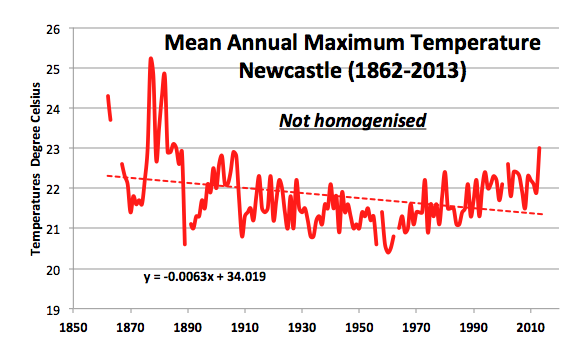
When those early records are taken into account, it is clear that New South Wales experienced cooling from the late 1800s to about 1960. After 1960, temperatures across the state and the nation started to increase. This warming continued until it reached a plateau in 2002. Because the warming of the late twentieth century never completely negated the cooling of the early twentieth century, the overall net trend is actually one of cooling. In the case of Newcastle, its a cooling of 0.63 degree Celsius per century.
****
Also today, Graham Young has republished an earlier blog post by me, ‘Bureau caught in own tangled web of homgenisation’ at On Line Opinion…
http://www.onlineopinion.com.au/view.asp?article=16680
Any comments you can make in this comment thread would be appreciated.
And perhaps also at the Newcastle Herald thread here… http://www.theherald.com.au/story/2558481/opinion-adjusted-temperatures-need-explaining/?cs=308
After all, in a democracy your vote, your opinion, does count even if it does not accord with popular opinion.
If you want to Tweet this, I’ve made a new tiny URL.. http://tinyurl.com/nbm54ts
 Jennifer Marohasy BSc PhD has worked in industry and government. She is currently researching a novel technique for long-range weather forecasting funded by the B. Macfie Family Foundation.