Two bush turkey (Alectura lathami) chicks hatched from the pile of mulch in my back garden recently. I took this photograph yesterday in the back garden in Noosa. 
Archives for January 2014
Open Letter Requesting Verification of 2013 Temperature Record
Dr David Jones
Manager of Climate Monitoring and Predictions
Australian Bureau of Meteorology
Dear Dr Jones
Re: Request Verification of 2013 Temperature Record
I am writing to request information be made publicly available to myself and others so we may have the opportunity to verify the claim made by you on behalf of the Australian Bureau of Meteorology that 2013 was the hottest year on record in Australia. In particular it is claimed that the average temperature was 1.20°C above the long-term average of 21.8°C, breaking the previous record set in 2005 by 0.17°C.
This claim is being extensively quoted, including in a report authored by Professor Will Steffen of the Climate Council, where he calls for the Australian government to commit to further deep reductions in greenhouse gas emissions because of this “record-breaking year”. Accurate climate records are not only of political interest, but are also of importance to those of us who rely on historical temperature data for research purposes. For example, the skill of the medium-term rainfall forecasts detailed in my recent peer-reviewed publications with John Abbot, have been influenced by the reliability of the historical temperature data that we inputted. From a very practical perspective, businesses will adjust their plans and operations based on climate data, and ordinary Australians worry and plan for the future based on anticipated climate trends.
Further, I note that you said in a radio interview on January 3, 2014, following your “hottest year on record” press release that, “We know every place across Australia is getting hotter, and very similarly almost every place on this planet. So, you know, we know it is getting hotter and we know it will continue to get hotter. It’s a reality, and something we will be living with for the rest of this century.”
The Australian Bureau of Meteorology is the custodian of an extensive data network and over a long period now, questions have been asked about the legitimacy of the methodology used to make adjustments to the raw data in the development of the Australian Climate Observations Reference Network – Surface Air Temperatures (ACORN-SAT). Furthermore, questions have been asked about why particular stations that are subject to bias through the Urban Heat Island (UHI) effect continue to be included in ACORN-SAT. In particular why is ‘Melbourne Regional Office’, a station at the corner of Victoria Parade and Latrobe Street (Melbourne CBD) still included in the ACORN-SAT network when this station is known to have become sheltered from previously cooling southerly winds following construction of office towers.
I understand ACORN-SAT was used to calculate the statistics indicating 2013 was the hottest year on record, but it is unclear specifically which stations from this network were used and how data may have been further adjusted in the development of the record breaking temperature anomaly.
Rockhampton-based blogger Ken Stewart, for example, has suggested that in the calculation of the annual average temperature for Australia, the eight sites acknowledged as having anomalous warming due to the UHI would not have been included. Is this the case? I had assumed that the Bureau used all 112 ACORN-SAT locations, and thus that the record hot temperature anomaly announced by you, actually includes a UHI bias.
Radio presenter Michael Smith has given some publicity to claims made by blogger Samuel Gordon-Stewart that the Bureau has overestimated the average Australian temperature by about 4 degrees. Mr Gordon-Stewart calculated average temperatures and temperature anomalies from data from all the weather stations listed by Weatherzone.
Furthermore, given many ACORN-SAT stations have continuous temperature records extending back to the mid-late 1800s and many stations were fitted with Stevenson screens by 1900, why does the Bureau only use data after 1909, all the while claiming that 2013 is the hottest year on record? Indeed it is well documented that the 1890s and early 1900s, years corresponding to the Federation drought, were exceptionally hot.
In summary, given the importance of the historical temperature record, and the claim that 2013 is the hottest year on record, could you please provide details concerning:
1. The specific stations used to calculate this statistic;
2. The specific databases and time intervals used for each of these stations;
3. The history of the use of Stevenson screens at each of these station;
4. How the yearly average temperature is defined; and
5. Clarify what if any interpolation, area weighting, and/or adjustments for UHI bias, may have been applied to the data in the calculation of the annual mean values.
Kind regards
Dr Jennifer Marohasy
Scientist, Blogger, Columnist
PO Box 692
NOOSA HEADS Q. 4567
Tel Mobile: 041 887 32 22
***
The above text was sent as an email to Dr David Jones earlier this evening. The photograph is of a sunset taken in northern Australia by Neil Hewitt of Cooper Creek Wilderness.
Last Year, 2013: A Hot Year for Australia
ANOTHER year, and another announcement from the Australian Bureau of Meteorology that it is getting hotter. Indeed on January 3, 2014, David Jones, Manager of Climate Monitoring and Predictions at the Bureau, explained in a radio interview that: “We know every place across Australia is getting hotter, and very similarly almost every place on this planet. So, you know, we know it is getting hotter and we know it will continue to get hotter. It’s a reality, and something we will be living with for the rest of this century.”
I’m not sure that its going to continue to get hotter, but last year was hot.
According to Dr Jones, the hottest place in 2013 was Moomba in South Australia where a temperature of 49.6°C was recorded in January. What Dr Jones didn’t explain, however, is that temperatures have only been recorded at Moomba since 1995. So we don’t actually know how hot it was at Moomba during the federation drought or in 1939.
I’ve been following trends at Bathurst where temperatures have been recorded at the jail since 1858 and at the agricultural college since 1908. In October, after plotting days when maximum temperatures exceeded 35 degree Celsius, I indicated that there has been no increase in hot days at Bathurst, http://www.mythandthemurray.org/no-increase-in-hot-days-at-bathurst-or-the-misguided-politics-of-attributing-bushfires-to-global-warming/ .
But after plotting the really hot days through until the end of 2013, I’m happy to concede that it’s virtually as hot now as it was back in 1939, Chart 1. On 11th January 1939 temperatures climbed to 40.7 degrees at the Bathurst agricultural station. In January last year it reached 40.2 degrees. Furthermore, when averages maximum temperatures are combined for each year, there appears to be a slight warming trend, Chart 2.
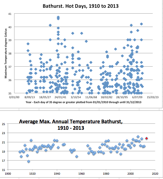
Unfortunately, the average for the year 1939 is not shown in Chart 2 as maximum daily temperatures are not available in the digitized record for May through to September of that year for this site. The hottest year at the Bathurst agricultural college according to this statistic (whereby maximum daily temperatures are averaged for the year) was 2006 with an annual average maximum daily temperature of 22.2 degrees compared to an average maximum for 2013 of 21.8 degrees.
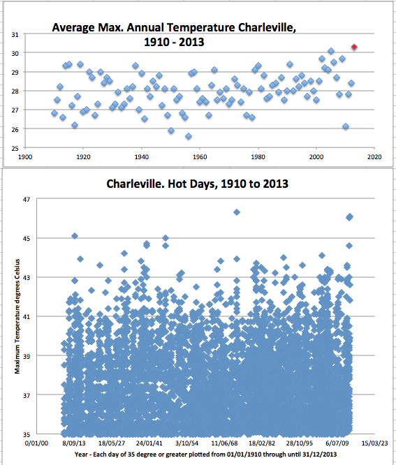
If we go further north to western Queensland and consider the long temperature trend for Charleville, then last year appears to be a record hot year, Chart 3. All years are shown from 1910 based on my averaging of the available daily maximum values from the Bureau’s homogenized ACORN* data set to the end of 2012. I’ve relied on the raw daily values for 2013. I’ve made no adjustments for missing values in this record and have not compared the raw data to the end of 2012 with the ACORN-SAT adjusted data.*
When individual hot days are plotted for Charleville, the hottest day at 46.3 degree Celsius shows as 4th January 1973, Chart 4. This is closely followed by 46.0 degrees recorded just last year on 29th December 2013. And just a few days ago, on 3rd January 2014, it was 46.1 degrees at Charleville.
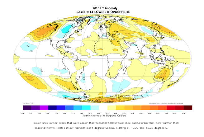
The hotter than average conditions in Australia for 2013 show up in the satellite record as published by the University of Alabama in Huntsville, Chart 5. According to this record, globally 2013 was the fourth warmest year since measurements began in 1978, http://wattsupwiththat.com/2014/01/03/global-temperature-report-december-2013/ .
*****
ACORN-SAT is the Australian Climate Observations Reference Network – Surface Air Temperature. Data can be downloaded here http://www.bom.gov.au/climate/change/acorn-sat/ .
Ken Stewart, John Sayers, Jo Nova and others have shown up many issues with this database, for example, http://joannenova.com.au/2012/06/threat-of-anao-audit-means-australias-bom-throws-out-temperature-set-starts-again-gets-same-results/ . It nevertheless remains a useful source of information. For the Bathurst agricultural station the long unadjusted data set (recently purchased by me from the Bureau) accords well with the publically available ACORN dataset. I have no particular opinion on the reliability of the Charleville ACORN data as I do not have access to the unadjusted Charleville data before 1948.
King Tides at Cleveland Point, and Sea Level Change Over the Holocene
ANOTHER year, and I’ve received another photograph from the Spangled Drongo, a regular commentator at this weblog who visits a waterfront property at Cleveland Point, Moreton Bay, Queensland, Australia, around this time of year.
Spangled is getting older, and back in the late 1940s and early 1950s he remembers the King Tides used to cover the law by about an inch or so.
This time last year, with the barometer reading normal, Spangled saw the King Tide was about 30cm below the lawn height and sent us a photograph, https://jennifermarohasy.com.dev.internet-thinking.com.au/2013/01/king-tide-not-so-high/
This year, according to Spangled, the highest astronomical tides were lower by around 20 cm and 10 cm respectively due to a small surge from the north. The first day of the King Tide, on January 2, Spangled says that the barometer was reading 1012 hPa and then yesterday (January 3) it was reading 1002 hPa.

Of course sea levels vary around a coastline depending not only on the tides, but also melting poles (climate change), land subsidence and vertical land motion (tectonic and isostatic phenomena). So around Britain the deglaciation of Scotland that occurred thousands of years ago means the northern part of that landmass is still adjusting and shows uplift (relative sea-level fall) while southern England shows subsidence (relative sea-level rise).[1]
Along the Australian east coast it is well document in the scientific literature that sea level was higher during the mid-Holocene around 6,000 years ago and have fallen in total about 2 m to more or less the present position over the last few thousand years. This is consistent with global climatic change over this period, in particular an overall trend of global cooling since the early Holocene.
So while the Bureau of Meteorology and CSIRO may nag on about a few centimeters of sea level rise over perhaps the last hundred years, the overall more significant trend during the present geological epoch, the Holocene, is one of sea level fall. The only real point of contention seems to be whether the fall has been smooth or oscillating over the last few thousand years.[2]
PS. I shall make some comment on the latest claims from the Bureau of Meteorology that 2013 was the hottest year ever in due course after I have had time to look properly at the data. In the meantime, my blog post from March is still very relevant https://jennifermarohasy.com.dev.internet-thinking.com.au/2013/03/cooking-books-for-hot-summers/
***
References
1. This is all nicely explained in a paper by Ian Shennan et al. entitled Late Holocene vertical land motion and relative sea-level changes: lessons from the British Isles published in the Journal of Quarternary Science (volume 27, pages 64-70).
2. Lewis et al. published a controversial summary in Terra Nova (volume 20, pages 74-81) entitled Mid-late Holocene sea-level variability in eastern Australia.
 Jennifer Marohasy BSc PhD has worked in industry and government. She is currently researching a novel technique for long-range weather forecasting funded by the B. Macfie Family Foundation.